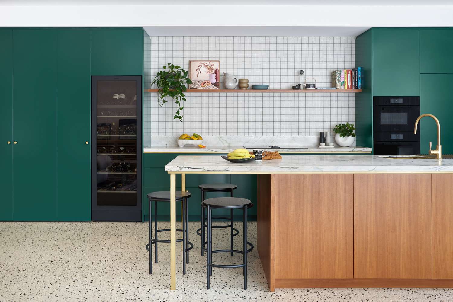
Australian interiors are moving away from colour used as a finishing touch and towards palettes that feel embedded in the architecture itself. Across joinery, stone, tiles, painted surfaces and custom furniture, colour is being used to shape atmosphere, define rooms and give homes a stronger sense of identity.
In this feature, we look at seven Australian projects that approach colour in very different ways, from deep greens and rust tones to soft pinks, mustard cabinetry and richly patterned surfaces. Some are immersive, wrapping entire rooms in colour, while others are more restrained, using a single bold material or piece of joinery to shift the mood of a space.
What connects them is a sense of intention. Colour is not simply layered on at the end, but worked into the material palette from the beginning, helping each home feel warmer, more expressive and distinctly its own.
Elwood by Studio Esar
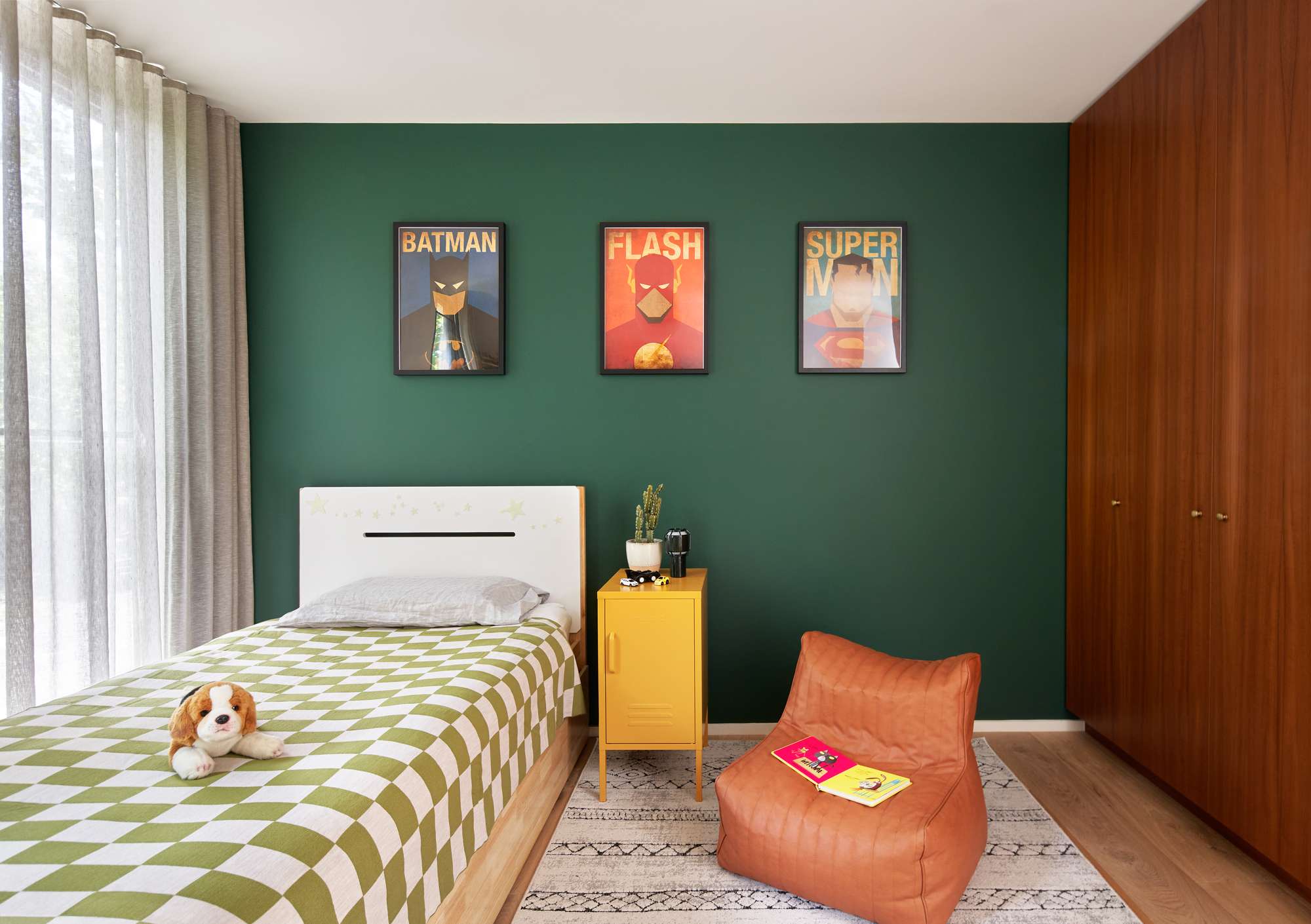
At Elwood, Studio Esar approaches colour as something to be layered rather than applied in isolation. The palette draws from the depth of the existing kitchen joinery and colours already present in the living room rug, allowing the rest of the interior to build naturally from what was there.
Shades of green move through the home alongside greys and muted blues, with smaller accents of rust and mustard bringing warmth. Rather than relying on one dominant colour, the effect comes from the way several tones sit together across furniture, textiles, art and decorative pieces.
That approach suits a home designed to balance family life with quieter spaces for retreat. Colour gives the interiors personality without overwhelming them.
A custom pair of Patagonian marble coffee tables and a painting by Black Rock artist Hannah Nolan add further depth, showing how colour can emerge through collected objects and material choices as much as through walls or joinery.
Caprera by Sara-Ann Interior Design
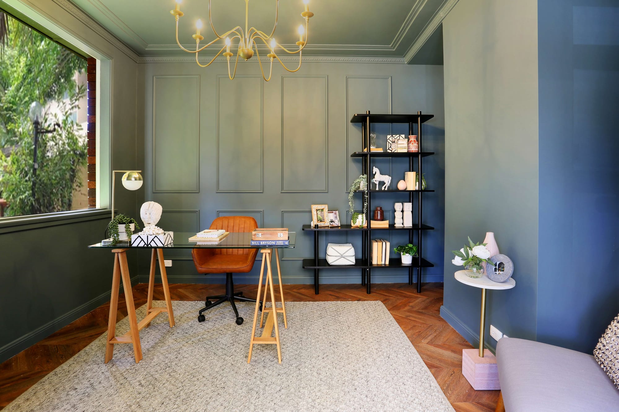
Caprera takes a more immersive approach. Sara-Ann Interior Design uses colour as a defining feature of the renovation, carrying it across joinery, walls and individual rooms rather than limiting it to isolated accents.
The project includes custom joinery, distinctive feature walls and a bold palette shaped around the homeowners' personal style. Colour drenching plays a central role, allowing individual spaces to feel complete rather than simply decorated.
When closely related tones continue across walls, cabinetry and architectural details, colour begins to change the way the room itself is perceived. It becomes part of the spatial experience rather than something added at the end.
One-off lighting pieces and multiple living spaces create variation throughout the home, but the palette gives the project a clear visual identity. Caprera shows the more expressive end of the current return to colour, where commitment to a stronger scheme creates atmosphere rather than relying on a single feature wall or decorative accent.
Enfield House by Matthew James Studio
At Enfield House, colour is closely tied to continuity. Matthew James Studio was working with a Victorian home whose owners had lived there for years, collecting art, furniture and objects along the way. The renovation was therefore about adding to that history rather than replacing it.
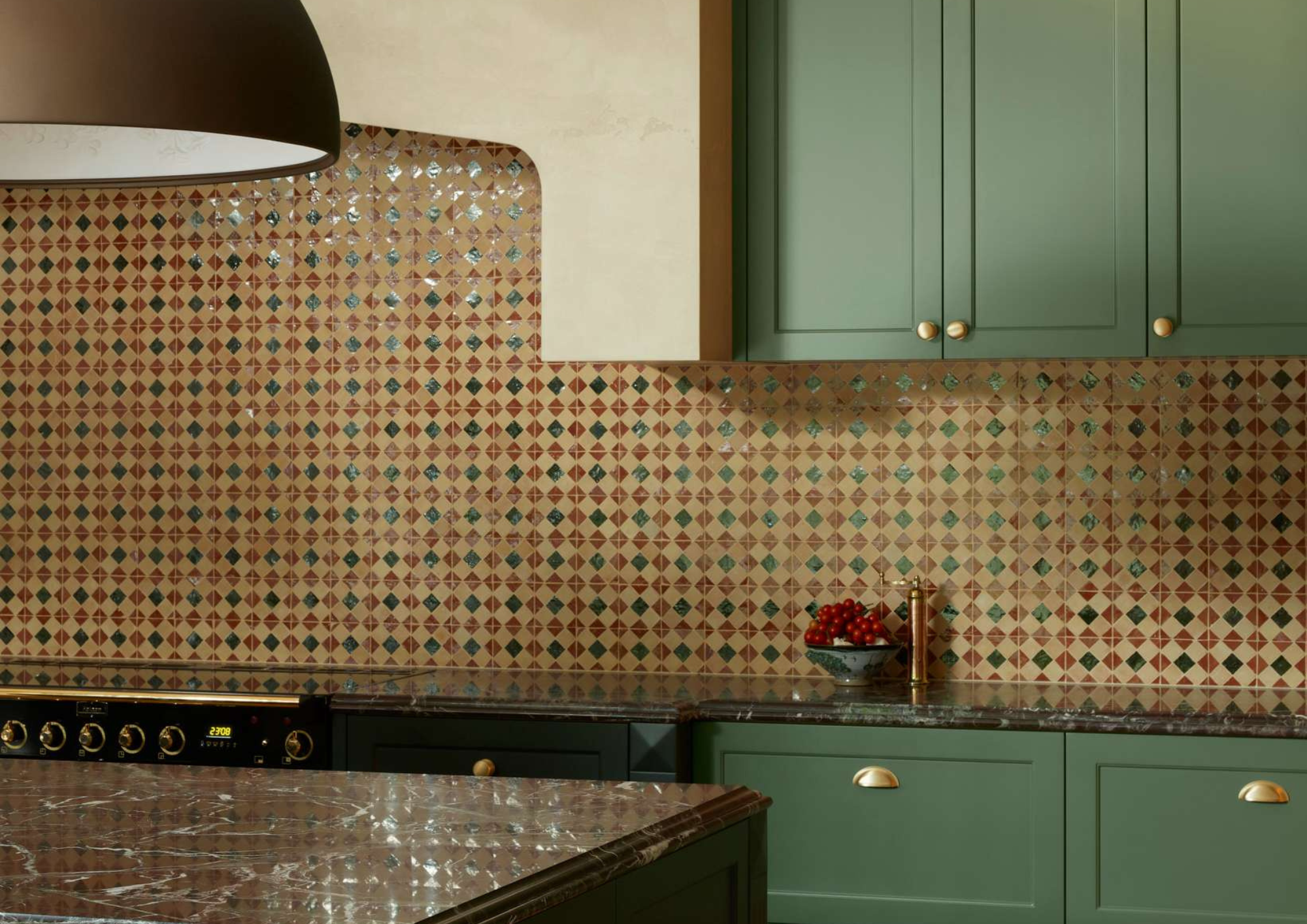
Deep green joinery gives the new kitchen and living areas a strong visual identity, while an adjoining room shifts into rich rust tones. Patterned tiles introduce smaller notes of red and green, and dark red stone benchtops add further depth.
Rather than making each room match, the palette changes in intensity from one space to the next. Those shifts help connect the original home with the contemporary extension without creating a stark divide between old and new.
The result feels accumulated rather than newly assembled. Green joinery, patterned surfaces, stone, furniture and artwork all contribute to the same sense of richness, making colour feel inseparable from the broader material character of Enfield House.
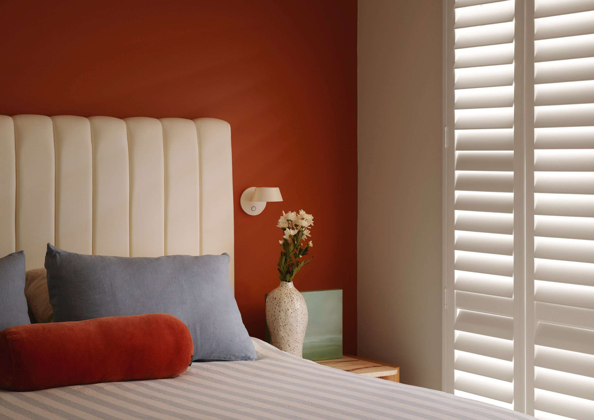
Cheltenham by Hannaford Design Studio
Cheltenham shows that using colour with confidence does not always mean using more of it. Hannaford Design Studio takes a quieter approach, allowing selected surfaces to carry colour within an otherwise restrained interior.
The renovation of the 1970s home centres on improving flow and creating a more contemporary feel while retaining a sense of warmth. Soft neutral tones and natural materials provide the base, with more concentrated moments of colour layered throughout.
Muted olive green tiles appear across the bathroom and kitchen, where their tonal variation brings depth to the surfaces. Brass fittings add warmth, while a rust red bedroom wall creates a more saturated moment elsewhere in the home.
Because these colours are used selectively, they stand out without disrupting the calmness of the overall scheme. Cheltenham is a reminder that colour does not need to dominate a home to have impact. Sometimes a single wall, tiled surface or repeated tone is enough to give a neutral interior more character.
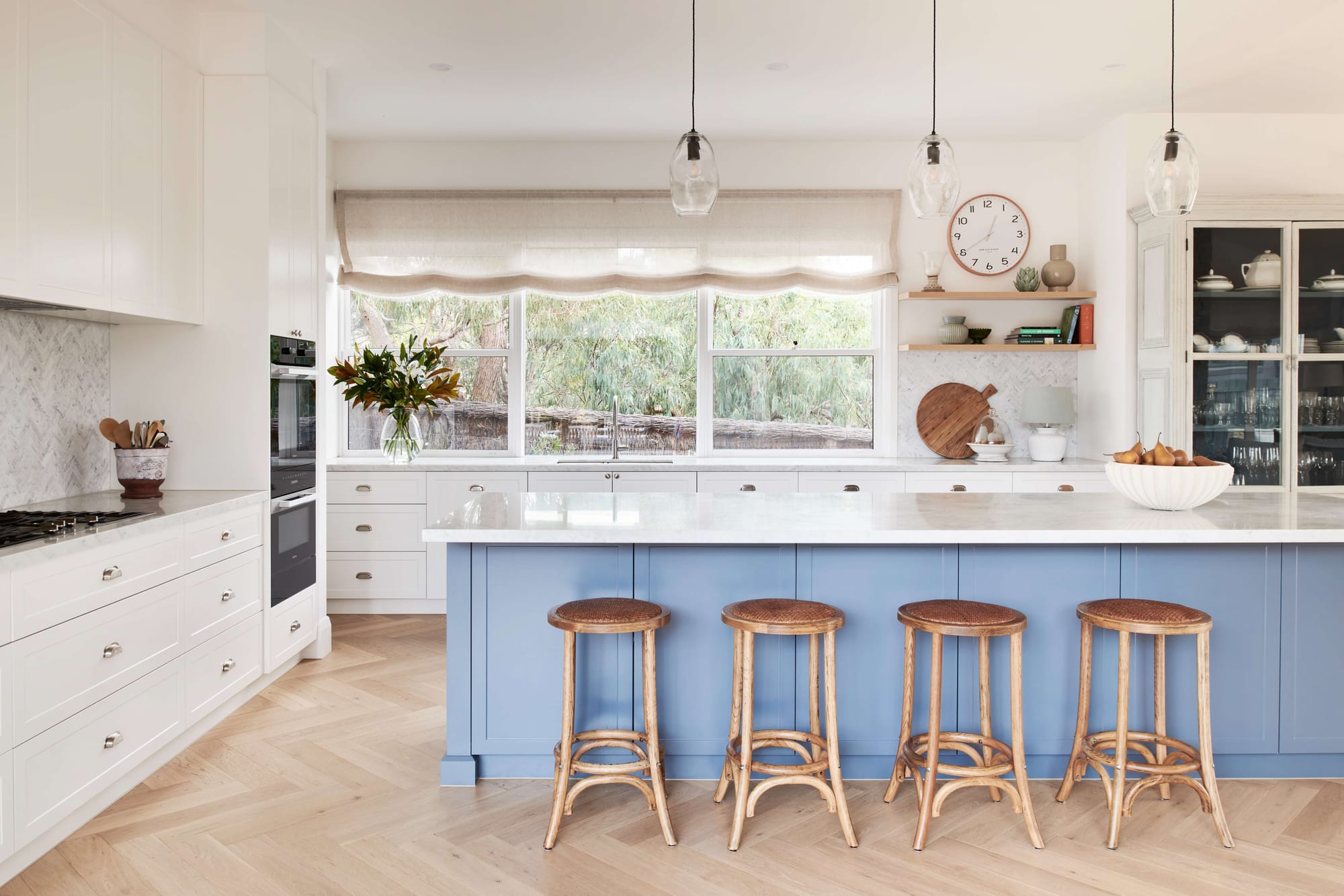
Richman Drive Project by Q + Co Design
At Richman Drive, colour is used to reinforce the relaxed character of a pavilion home overlooking the Mount Eliza foreshore. Q + Co Design combines soft timber finishes with calming blue and green accents, creating a palette that sits naturally within the home’s coastal setting.
Rather than leaning entirely on white and pale neutrals, the project introduces colour with slightly more depth. Blue and green appear as recurring notes against timber, bringing personality while maintaining the sense of warmth that runs through the interiors.
The palette also supports the project’s combination of traditional provincial references and a more relaxed coastal character. The cooler colours soften that relationship without making the spaces feel overly styled.
Richman Drive is one of the more understated examples in the group, but that is what makes it useful. It shows that colour can shape the atmosphere of a home without becoming its defining feature. Sometimes a repeated blue or green accent is enough to give a natural palette a clearer identity.
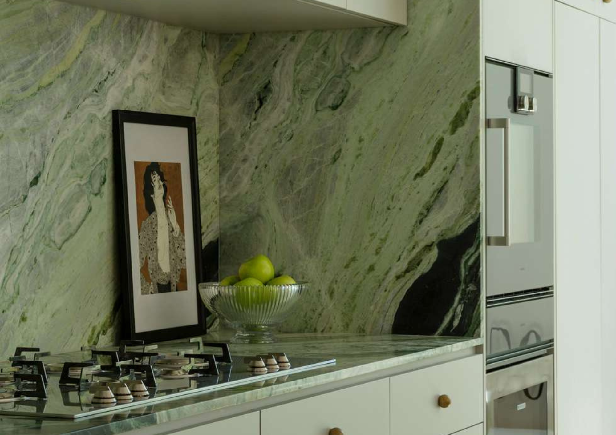
Mount Hawthorn Residence by ZARQ Studio
Mount Hawthorn Residence moves between subtle and more expressive uses of colour. ZARQ Studio introduces a contemporary addition to a modest 1920s Australian interwar home, while allowing individual spaces to carry their own identity.
In the kitchen, colour comes through green-veined stone used across the splashback and benchtop, bringing movement against otherwise pale cabinetry.
Elsewhere, the palette becomes more playful. A powder room combines rich rust tones with teal patterning, veined stone and brass fittings, while a mint green bar creates another distinct colour moment beneath the stair.
What makes the project interesting is that these elements are not required to match. Instead, ZARQ Studio uses colour to give different parts of the home their own character.
The result reflects a broader shift in residential interiors, where colour does not need to run consistently through every room. At Mount Hawthorn Residence, it appears where it can have the greatest effect, whether through stone, pattern or joinery.
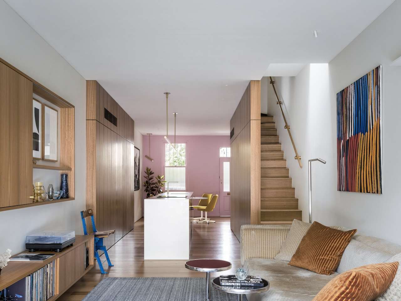
Pink House | Green House by Nick Bell Architects
For Nick Bell Architects, colour is woven into the identity of Pink House | Green House rather than applied as a finishing gesture. The compact Surry Hills terrace pairs a restored pink heritage façade with a lush, planted rear elevation, creating the contrast that gives the project its name.
The pink references the site’s history and the colourful terraces of the surrounding neighbourhood, while continuing inside along the original front wall to maintain a connection between old and new. Beyond it, the palette becomes deliberately restrained, allowing natural light, greenery and carefully detailed joinery to take greater prominence.
That sense of colour is also closely tied to the home’s biophilic approach. A green wall wraps the north-facing rear façade, while planting extends across the garage roof and into the interiors, softening the architecture and strengthening the relationship between the compact home and nature.
On a site just 3.8 metres wide, these choices do more than create visual character. Pink, green and natural materials help distinguish different layers of the home while giving a constrained inner-city terrace a stronger sense of openness, personality and place.