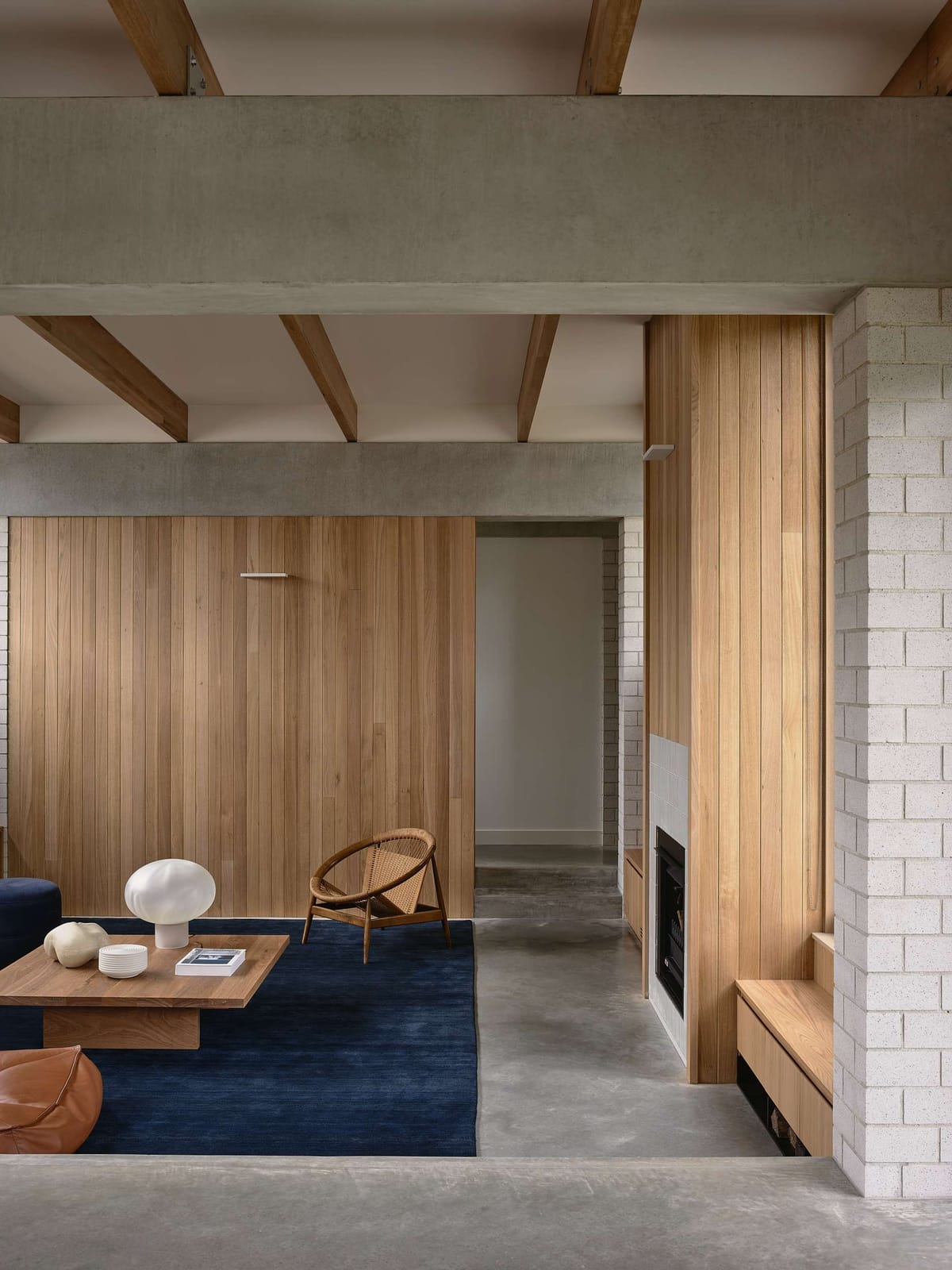
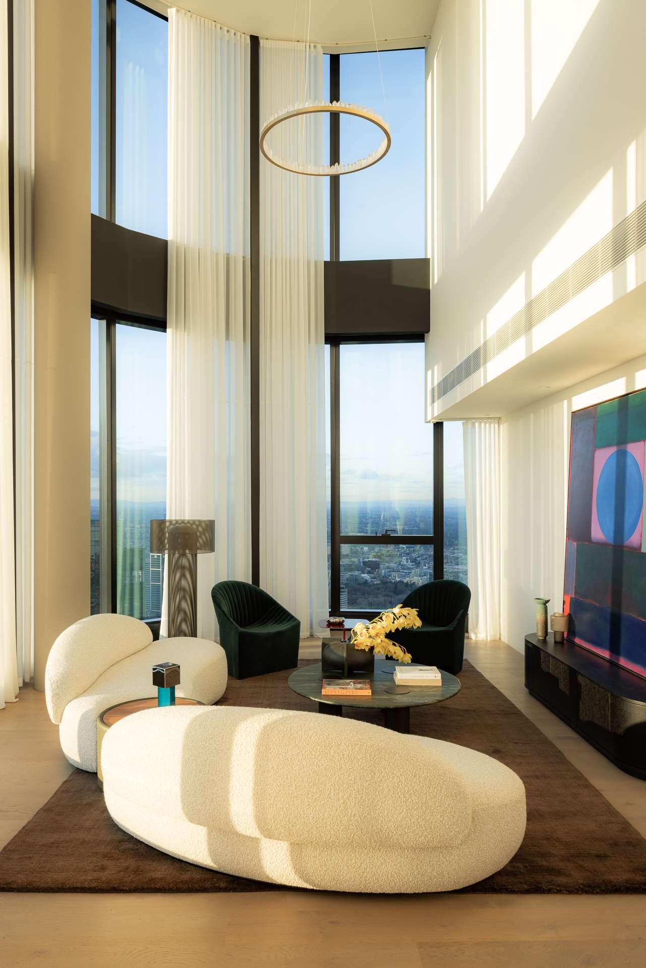
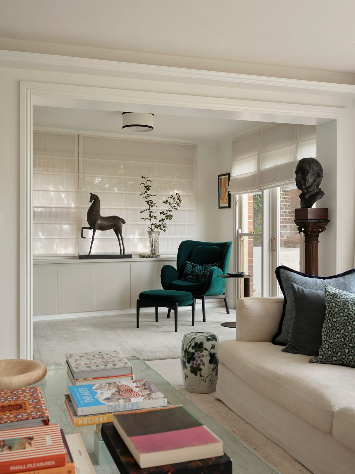
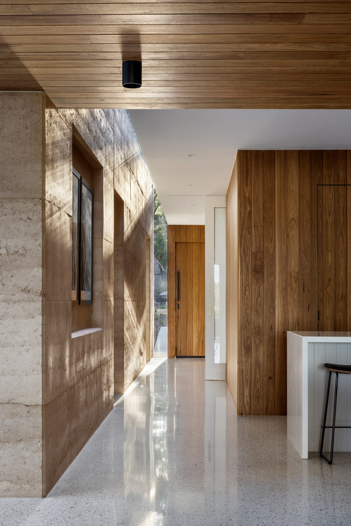
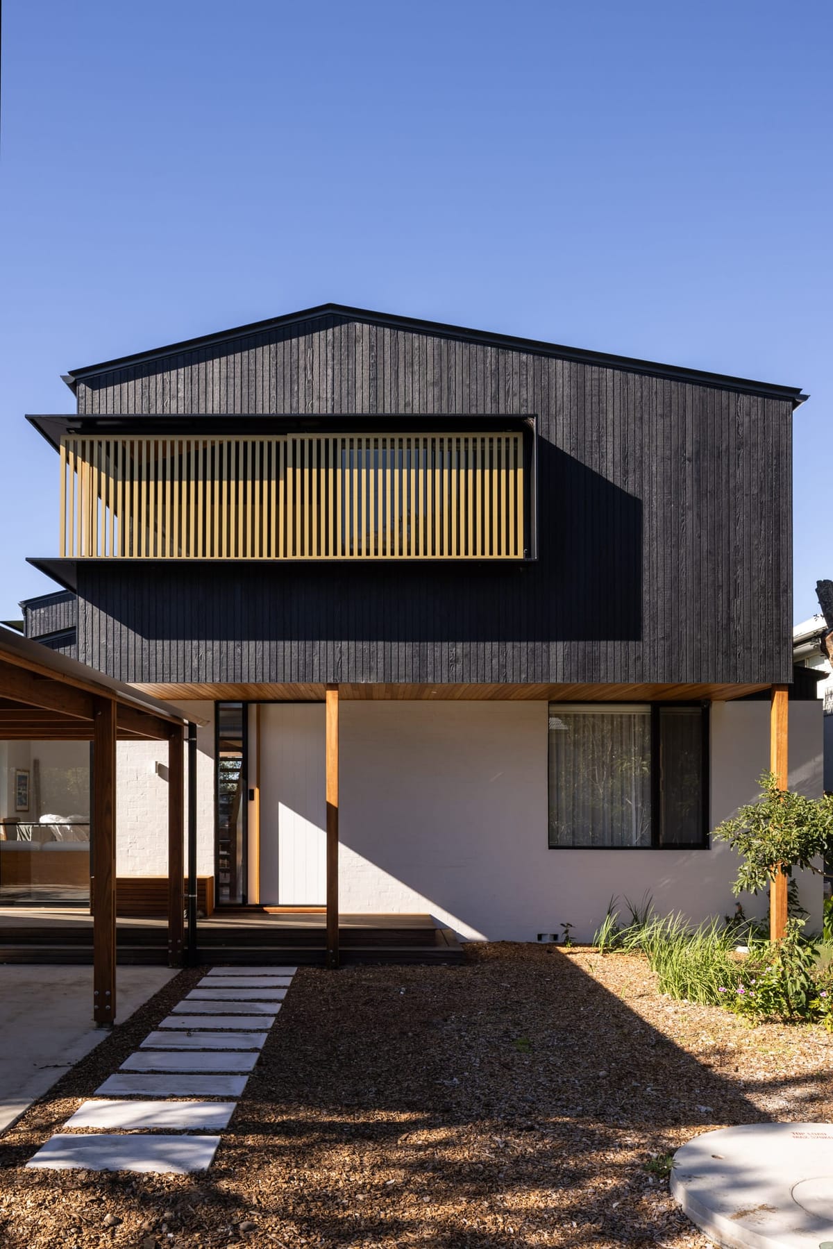
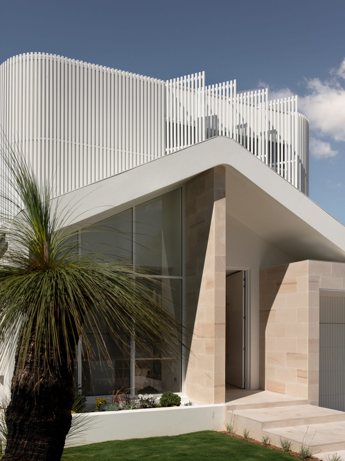
Words by Sandy Anghie. Photography by Dion Robeson. This story was originally published in The Architect magazine, an official publication of the Australian Institute of Architects.
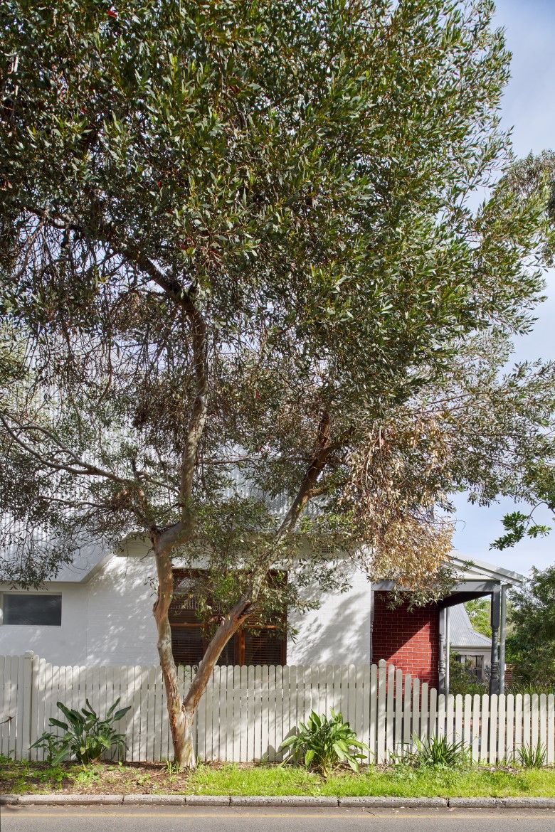
“It was when I was pregnant with our first child that we decided to engage Andrew to see what we could do with the block. He helped us with a new garage to start and this was constructed just as we had our first child. We then decided to progress with the remainder of the renovation given the needs of our growing family,” says Gillian. “We gave Andrew a list of things we wanted for our family home – we wanted to keep the façade of the original 1920s cottage, and we wanted open plan living and four bedrooms – all for a budget of around $400,000.”

Andrew notes that the original 1920s house had a “horrid” 1990s extension. But the home was ideally located and had great character. “We wanted to keep the character,” says Tom. “You can’t rebuild character.” And this turned out to be a benefit when it came to planning – the Council providing some height concessions for the new addition because the character was maintained.
When it came to the design process Gillian and Tom were in no rush, being happy to take the time to get the design right. “While we worked closely with Andrew, we gave him a lot of leeway to get the best result for our block”, says Gillian.
Gillian and Tom knew Andrew through family and had seen his work. In particular, it was a project that Andrew had recently finished in East Fremantle that helped them make their decision. “That project was a very similar style to ours,” says Tom. “It was an original 1930s home with a 1990s extension which Andrew had demolished to make way for a new extension. In fact, I remember a builder once saying that their entire business could be knocking off bad 1990s extensions.” Andrew notes that this is why it’s so important to get extensions right – otherwise they are a waste of money and not sustainable. Given the 400 sqm site with a big front setback, and wanting to maintain a backyard, demolishing the previous extension and starting again became the best option here.

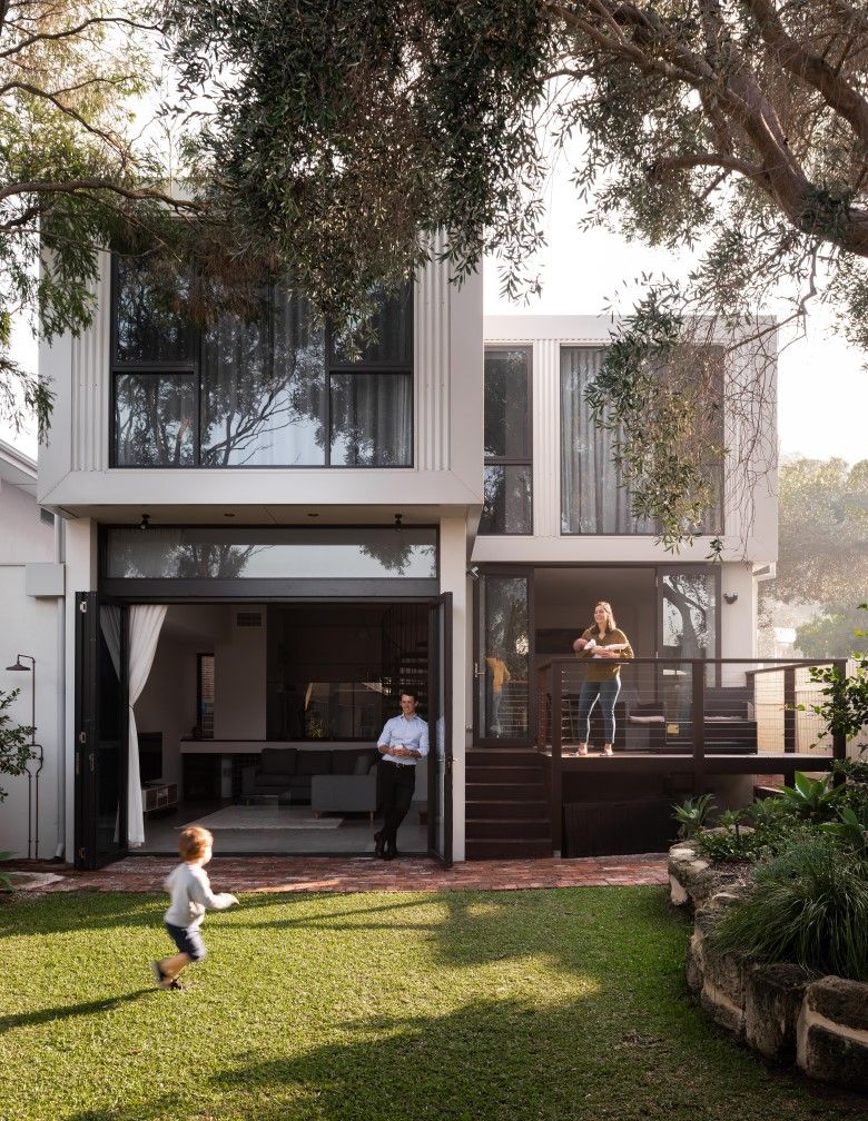
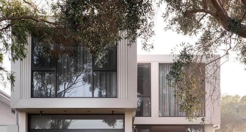
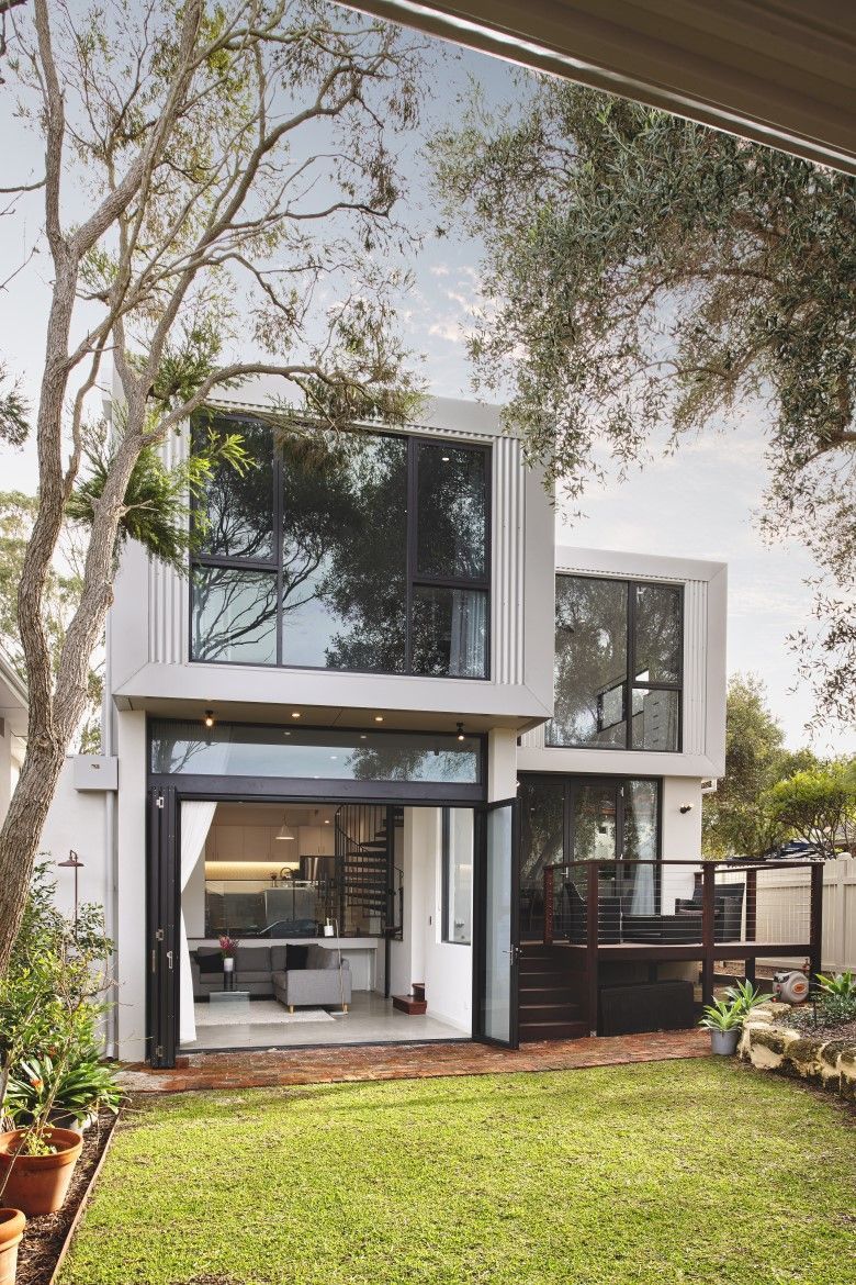
In terms of the design, Andrew avoided the “box on the back” approach and worked hard on the transition between old and new – so that there is a sense that the extension belongs. The spaces are also highly efficient, with only 4-sqm circulation. Sustainability was another important consideration for Andrew, incorporating passive design principles like careful consideration of the orientation of spaces and highlight windows to draw ventilation through the home. “I believe good design is sustainable – and value for money,” says Andrew.
For Gillian and Tom the most rewarding part of the renovation project was achieving a unique and functional family home which retained the character of the original home. “It’s rewarding to have a home that’s different,” says Tom. “While we didn’t set out for this to be our forever home, that’s what it has become,” adds Gillian. “We are so pleased. There’s not much we’d change and we look forward to living here for a very long time”.
Project Details:
Architecture: Andrew Boyne
Photography: Dion Robeson

