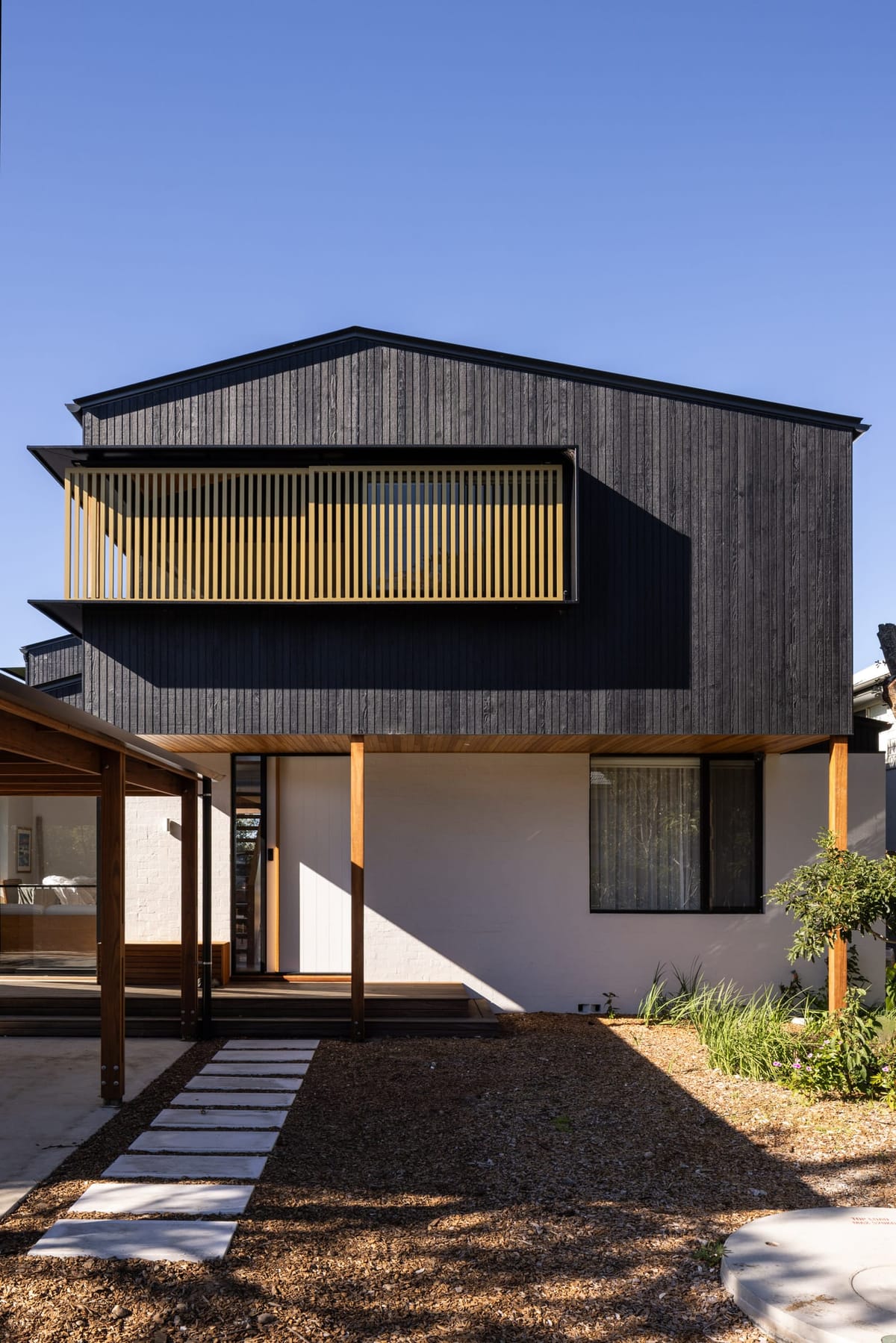
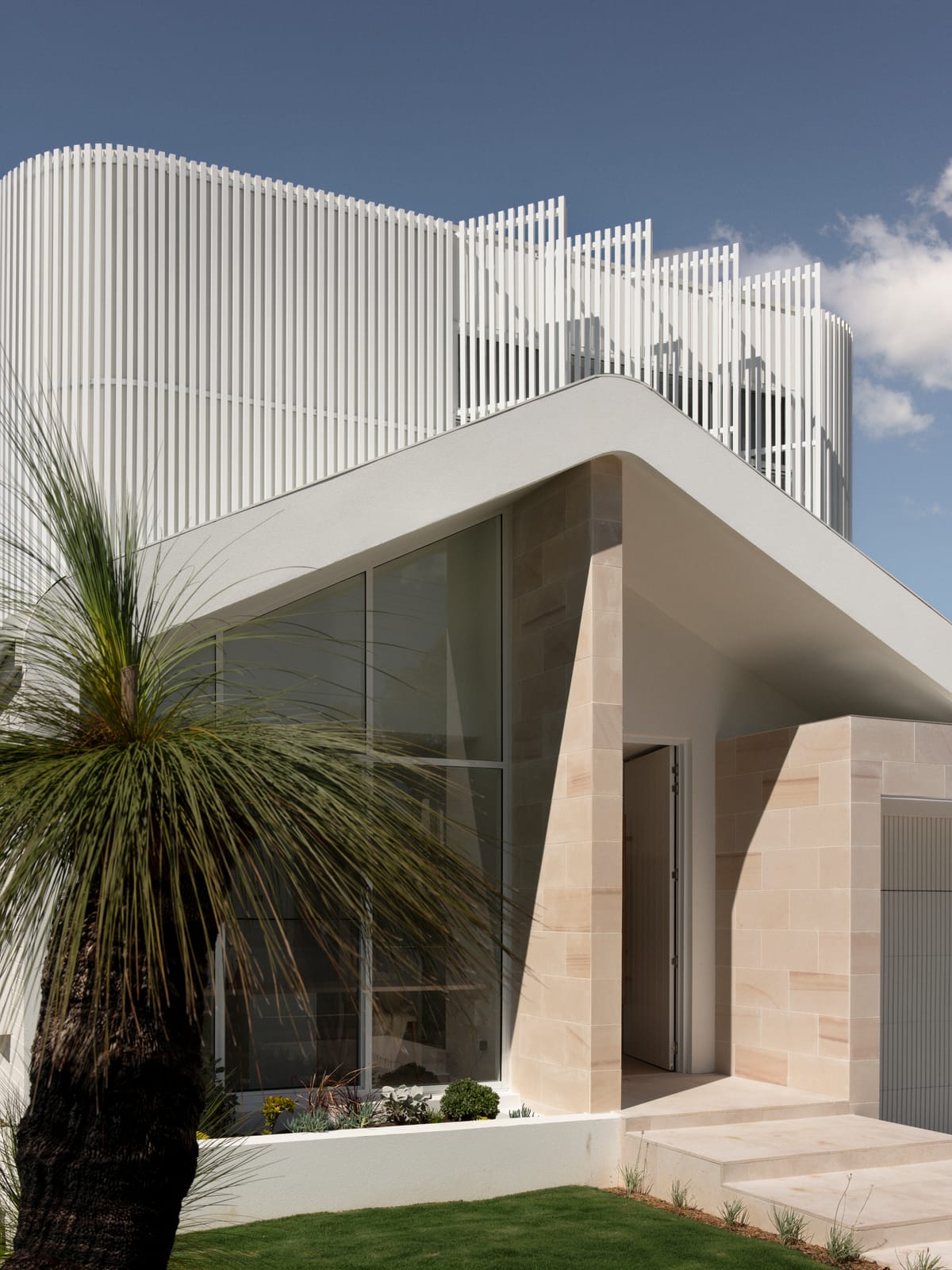
The family home of Jeremy Wortsman, founder of The Jacky Winter Group, is located on a 10-acre bushland site, and is comprised of multiple buildings and yet distinctly lacked well-executed spatial planning. Tasked with a brief to reimagine the currently awkward floorplan whilst blending functionality and fun, Placement have produced a family hub that boasts a 'place for everything' with a palette inspired by New Mexico and Memphis design.
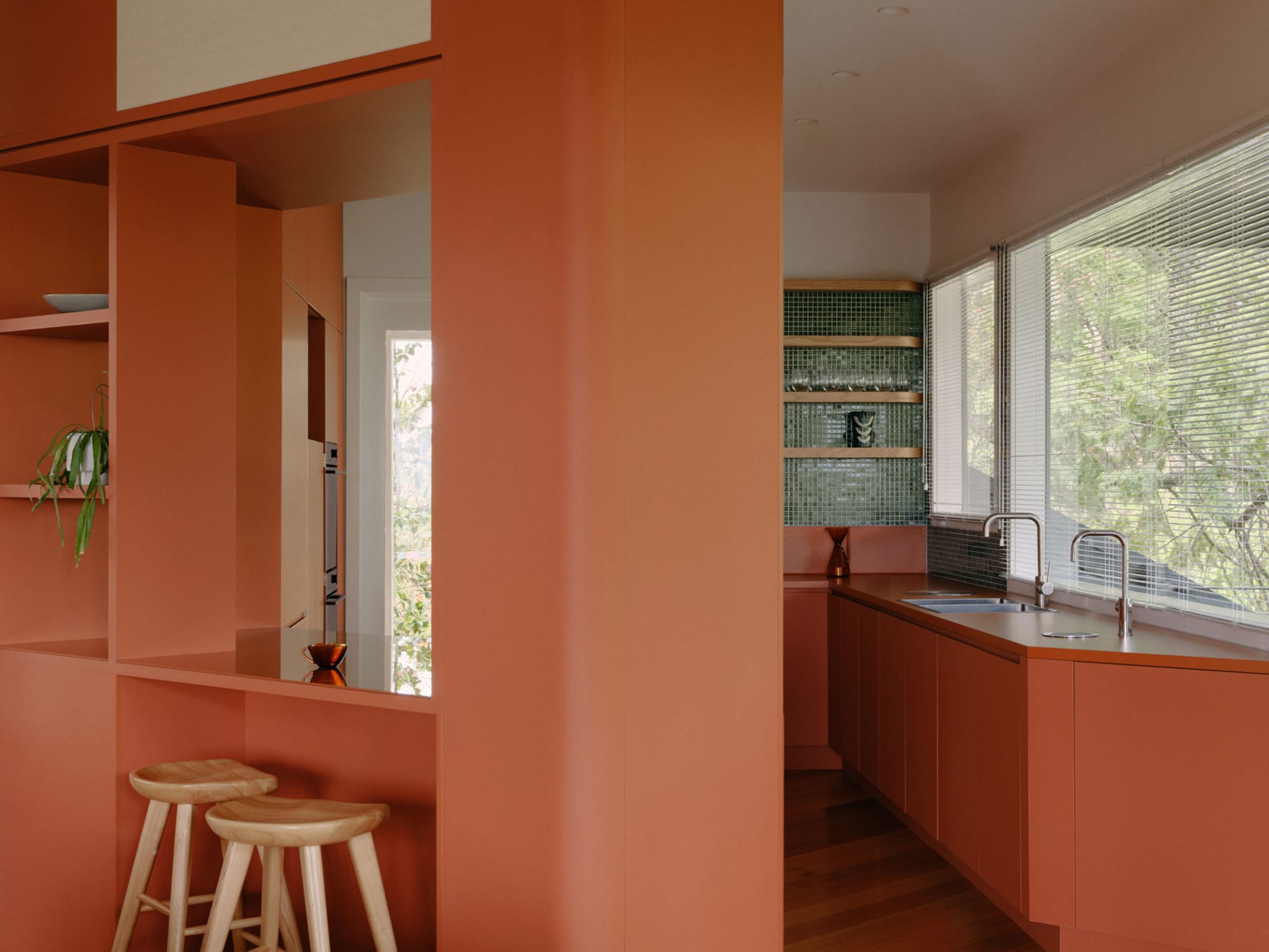
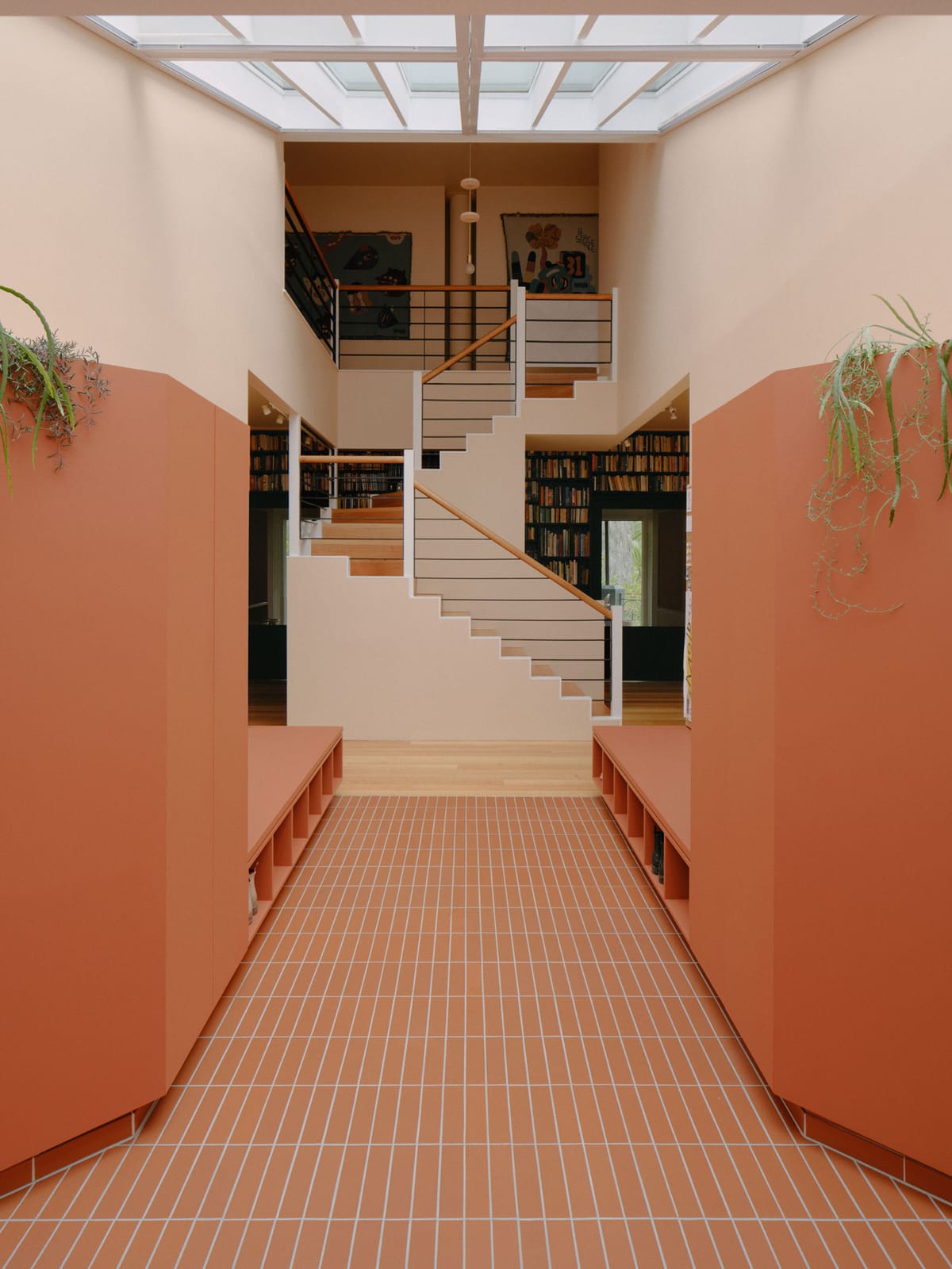
Jeremy's original brief was aimed solely at restructuring the awkward floorplan, toting a hexagonal living space and a cramped kitchen-turned-thoroughfare. Placement however, "came back with some more ambitious ideas that were too good not to explore further!’ Jeremy says. As a result, the floorplan underwent an extensive rehaul, wherein the existing kitchen was turned into an entry foyer and bedroom and a new kitchen, dining and living area where integrated into the hexagonal space to maximise the potential of the asymmetrical floorplan.
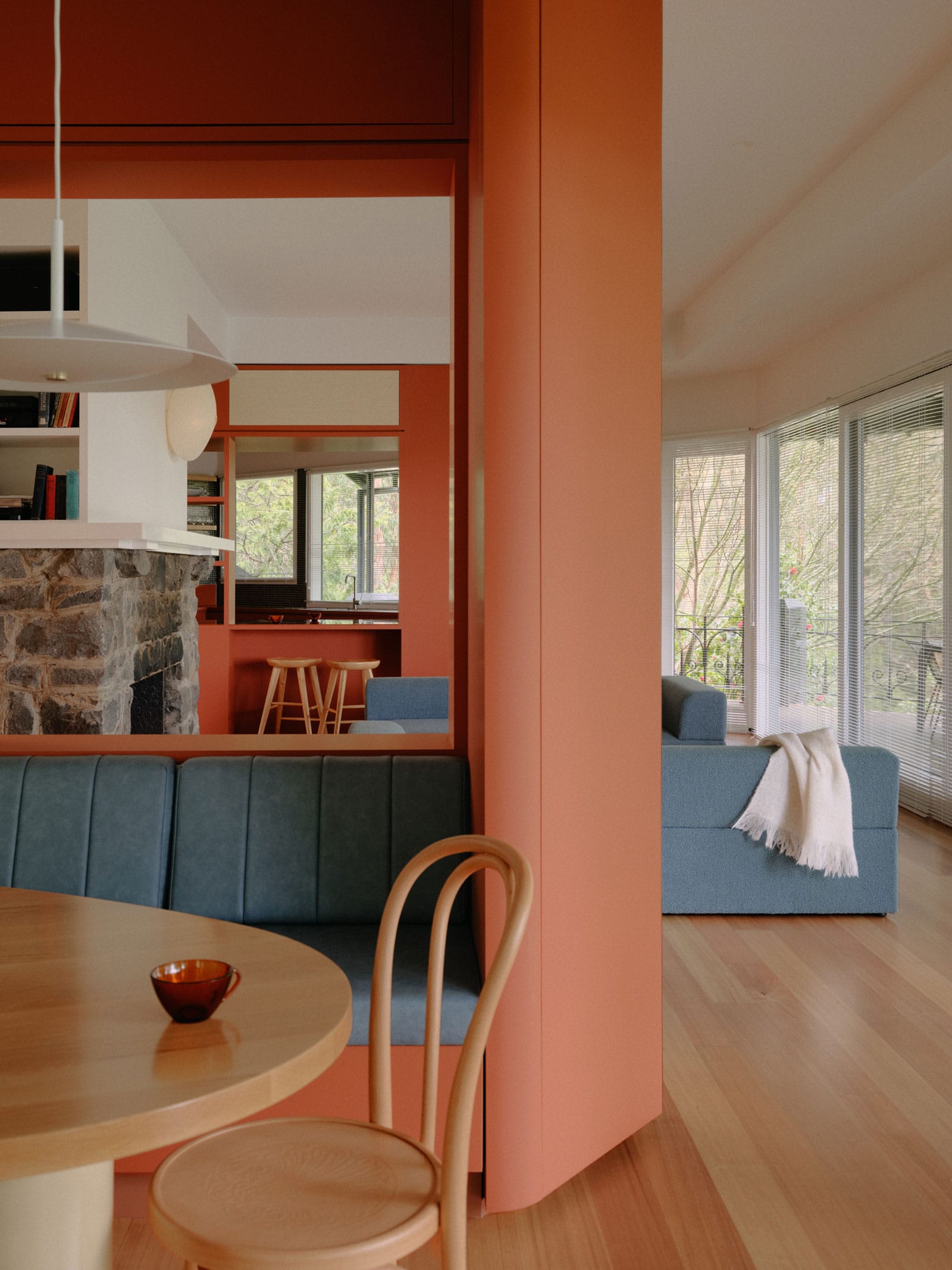
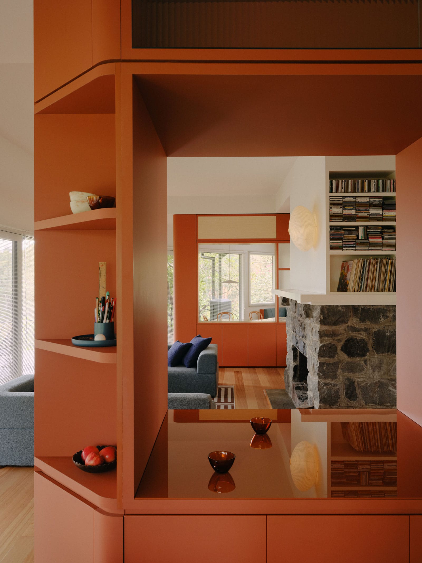
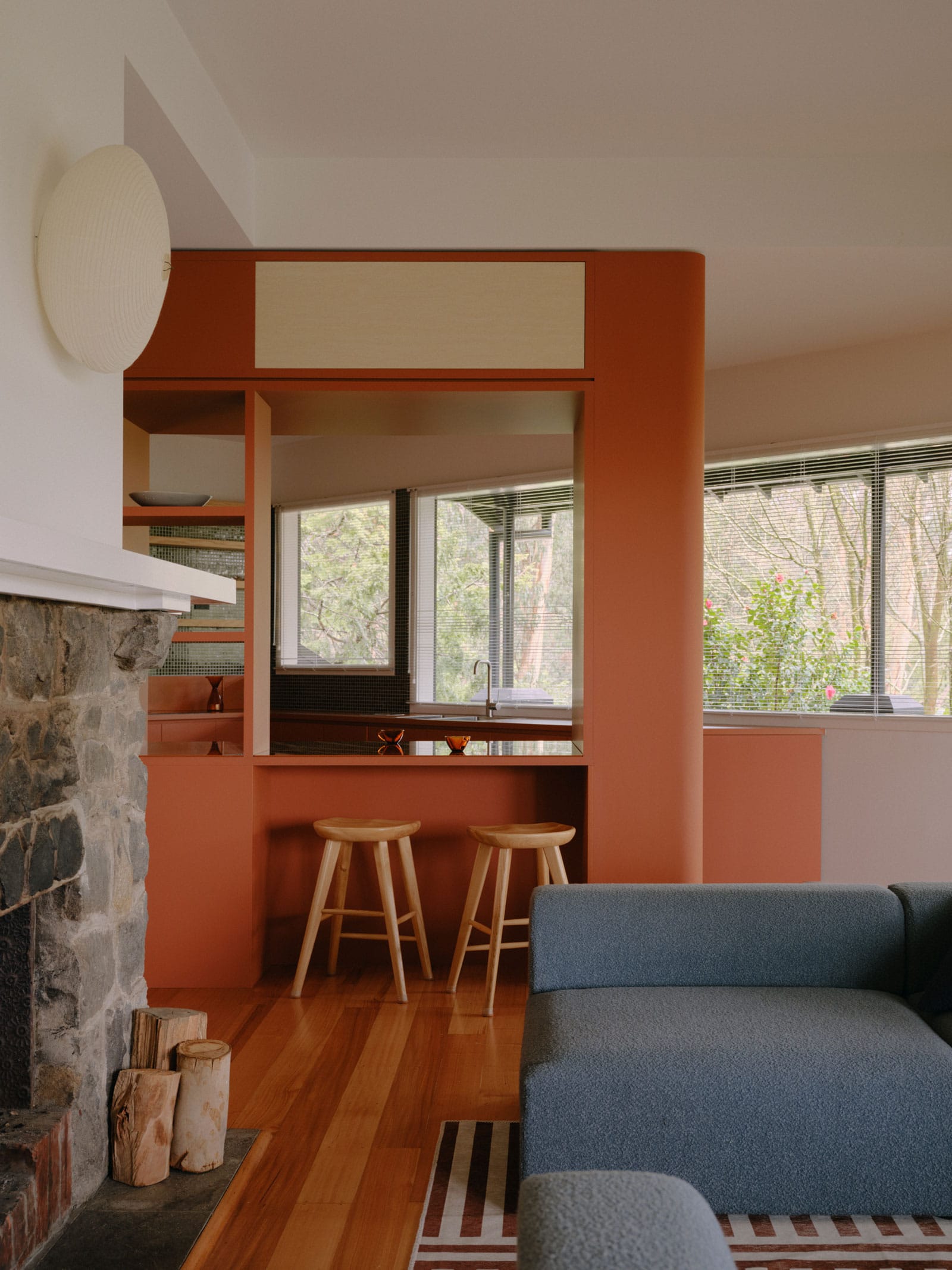
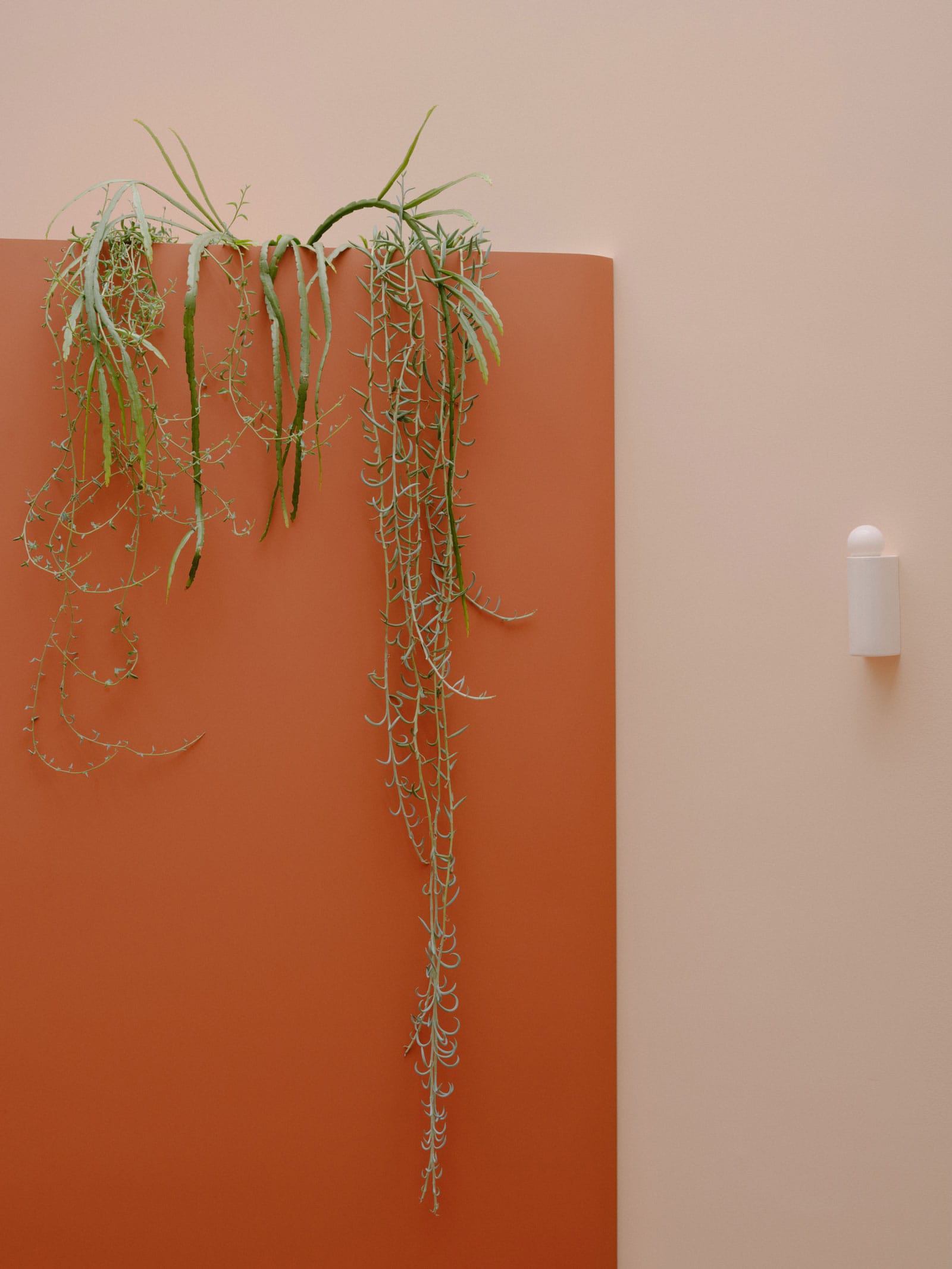
Striking joinery "walls" act as thresholds between the open plan footprint; creating a sense of privacy whilst retaining connection - an important aspect of Jeremy's brief. ‘I think I was also watching heaps of Better Call Saul at the time and was really inspired by the set design there and the overall palette of New Mexico. I think that played a big part.’ says Jeremy, speaking on the vibrant hue of the threshold walls. Finished in Laminex's Moroccan Clay, the custom joinery weaves throughout the home and references Memphis design, which famously coupled colour and patterns in joinery, fixtures and finishes in bold colours.
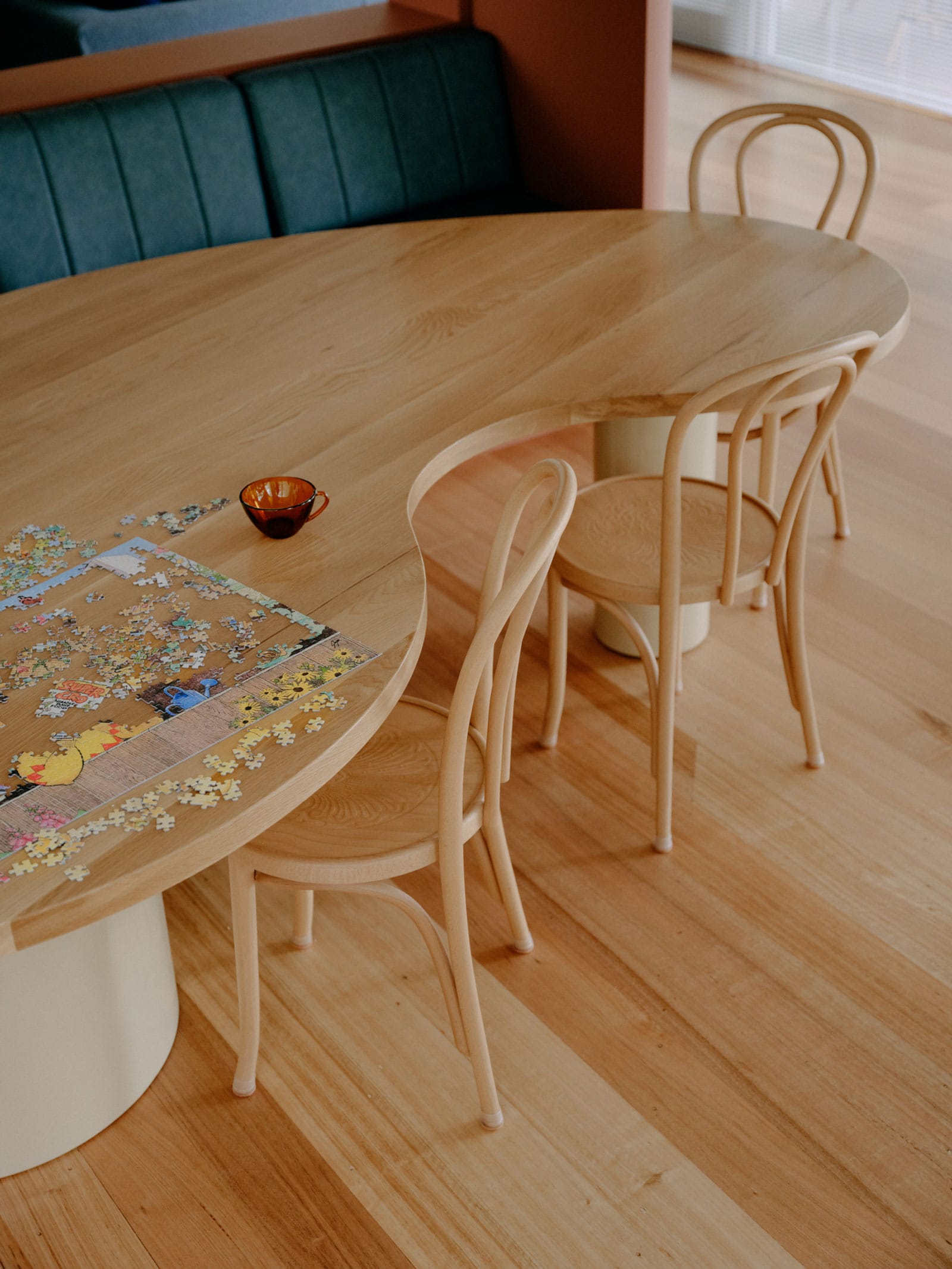
The warm clay joinery is offset with blues in various textures throughout the family home. “Being predominantly a joinery exercise, our palette came from referencing the existing post-modern aesthetic,” says Stephanie. The playfulness of the home, that was so paramount to its homeowners, is further enhanced by the inclusion of custom furniture dotted throughout the space, such as a kidney-shaped dining table. The reimagined interior is counterbalanced by the homes dark exterior and contrasting bush surrounds. "The house itself is in the middle of 10 acres of bush and the whole front area of the house just looks onto this fantastic greenery, so having a way to offset that was important,’ Jack says.
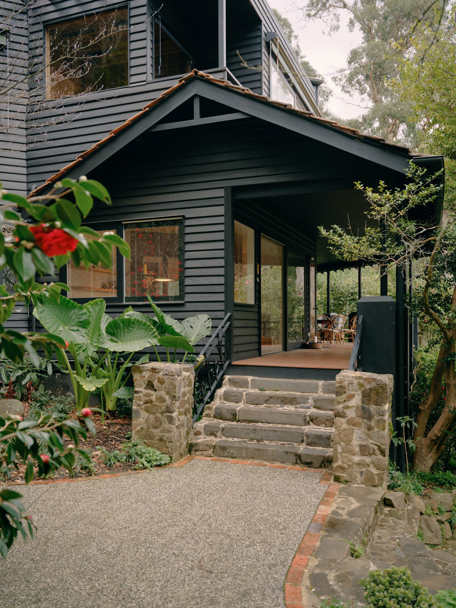
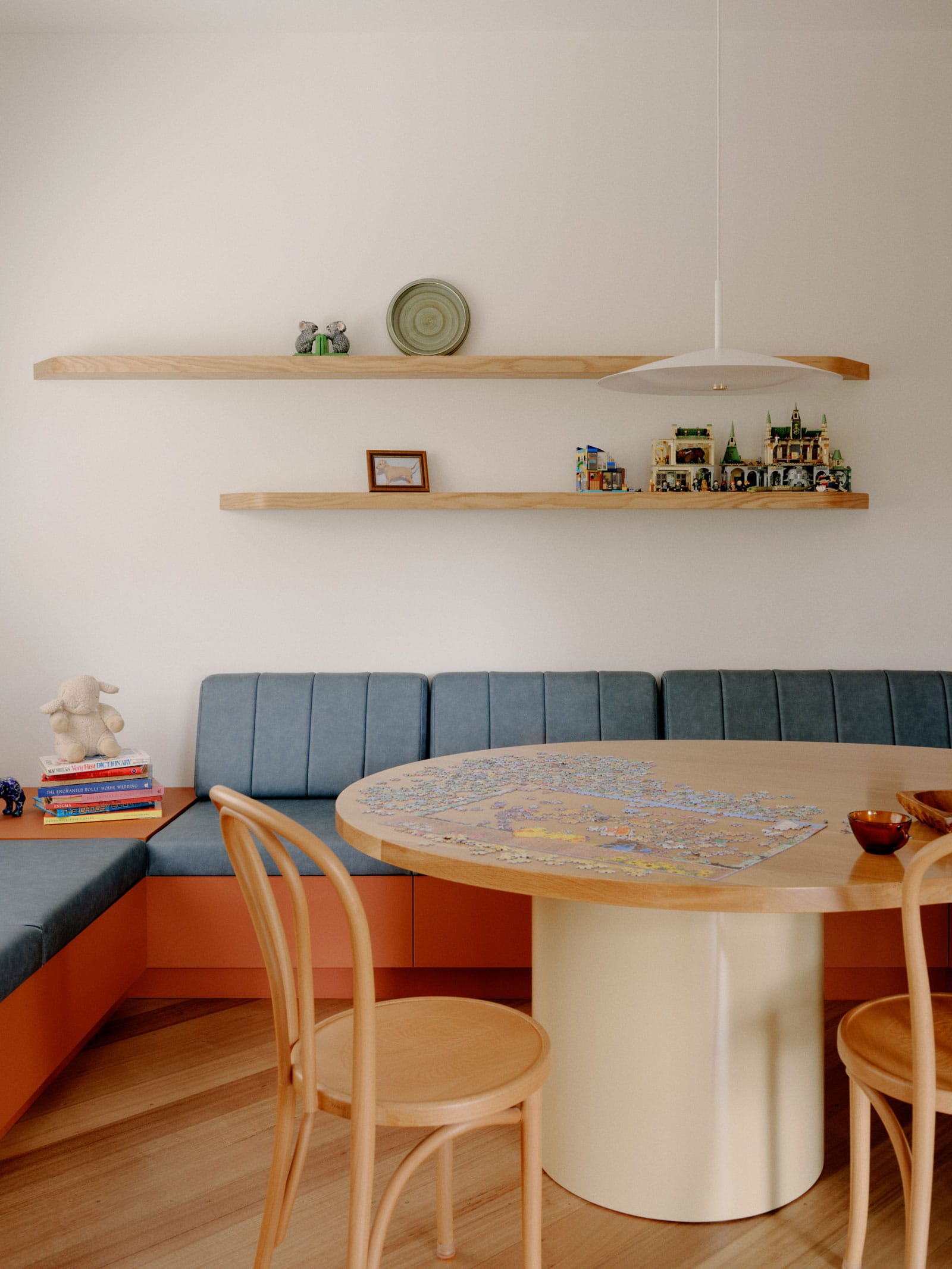
Selby House is an artful demonstration of a symbiotic design relationship: functionality and fun feeding from one another. Placement have explored the potential of the homes initially flawed layout to create a space that is fluidly connected, whilst infusing the home with a palette inspired by the New Mexico desert and Memphis design. The home manages to couple a sense of intimacy with the perception of expanse; a maximalist devotion to colour and form.
PROJECT DETAILS
Architecture: Placement Studio
Photography: Tom Ross
Contractor: Armour Built
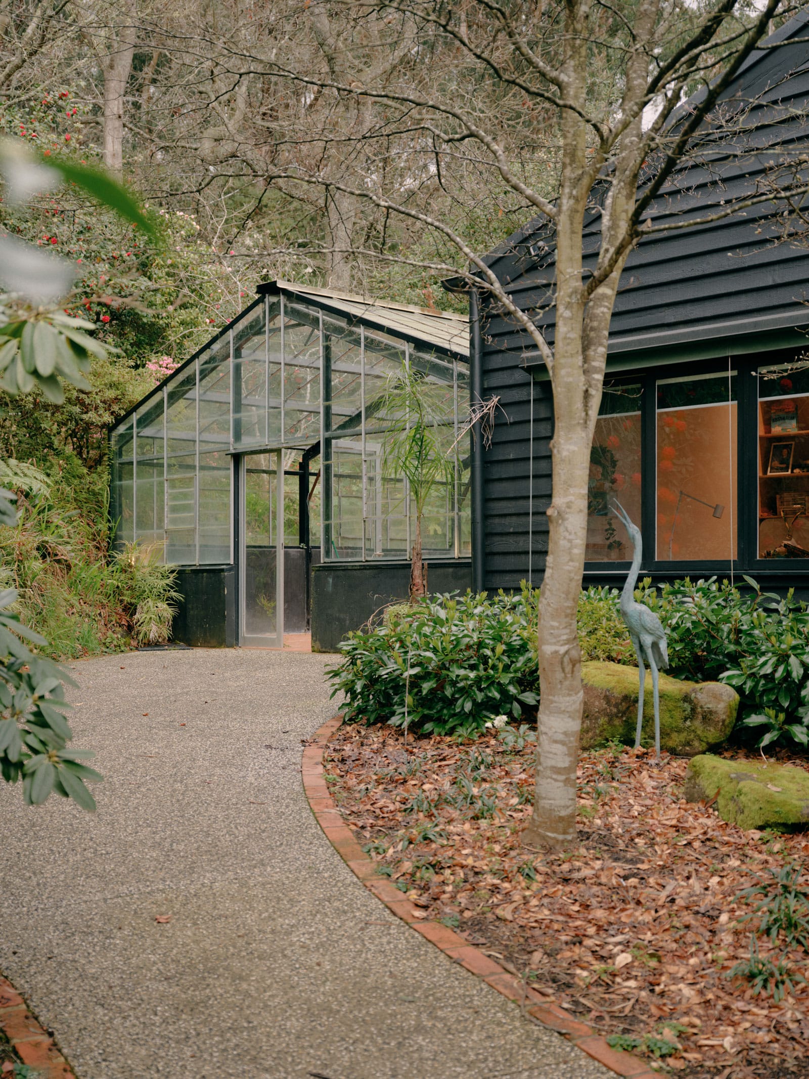
Selby House by Placement. Photography by Tom Ross.

Selby House by Placement. Photography by Tom Ross.
Selby House by Placement. Photography by Tom Ross.


