Words by: Julia van Camp
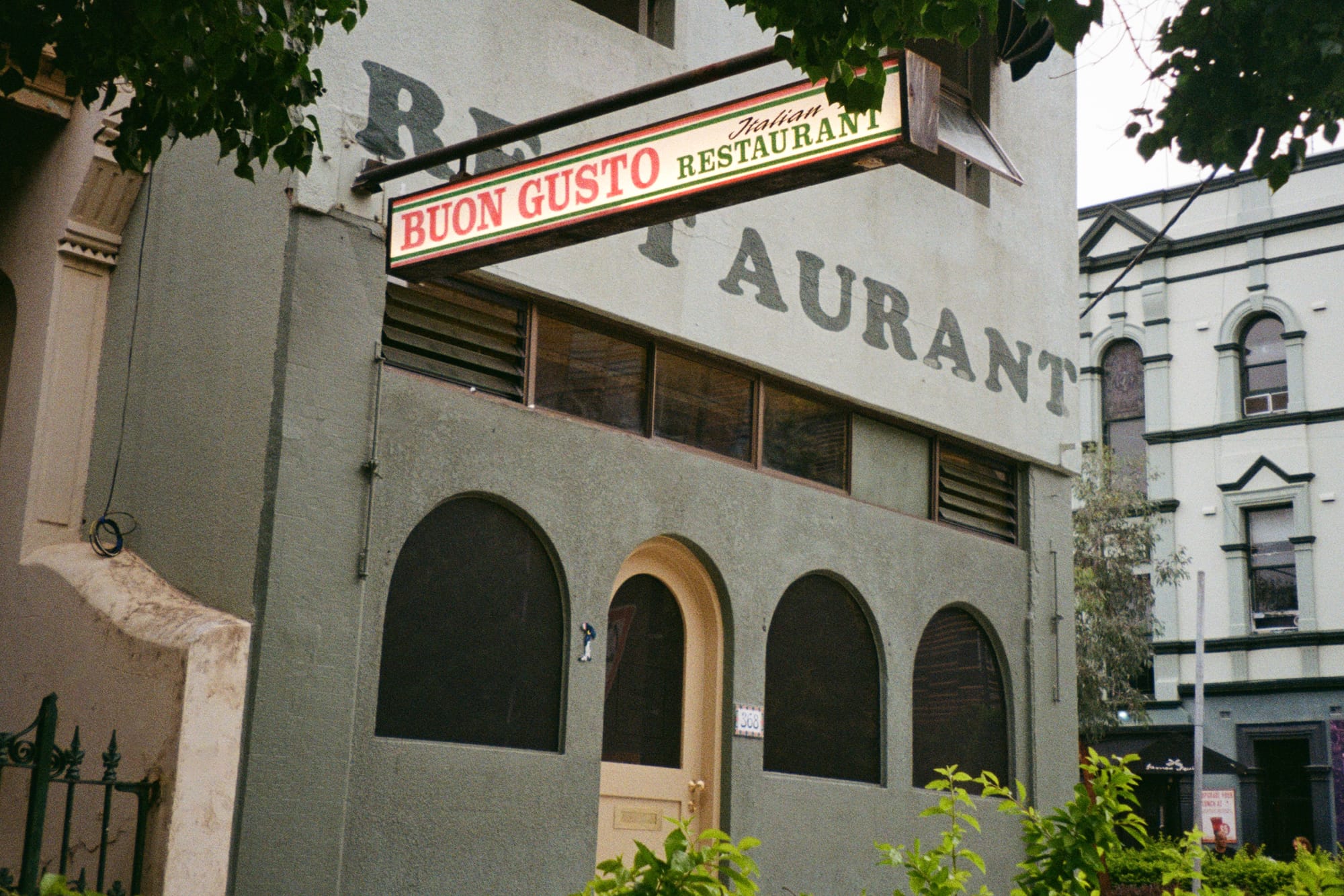
Walking past what definitively looks like an old Italian restaurant, one of those that evoke a sense of playful nostalgia, only a keen eye will spot a simple sign on the arched doorway that is, in fact, an entry to Studio Shand.
Started by the principal architect Benjamin Jay Shand in 2020, only weeks before COVID, the studio boasts a non-discriminatory range, spanning its projects from single residential to commercial to object design to private clients and retail through to sculpture for public display. This diverse portfolio was not an outcome of a desire to transcend the traditional boundaries of architectural craft for the sake of being broad and different. The aim was simply to formalise a love for design without setting limits on which shape and form it may be expressed in.
‘It does not matter if it’s a commercial work largely focused on a facade, or a residential one focused on joinery. Or a collection of tapestries that we’re designing or a sculpture for a new building. They all have to have the same approach, the same detail.’
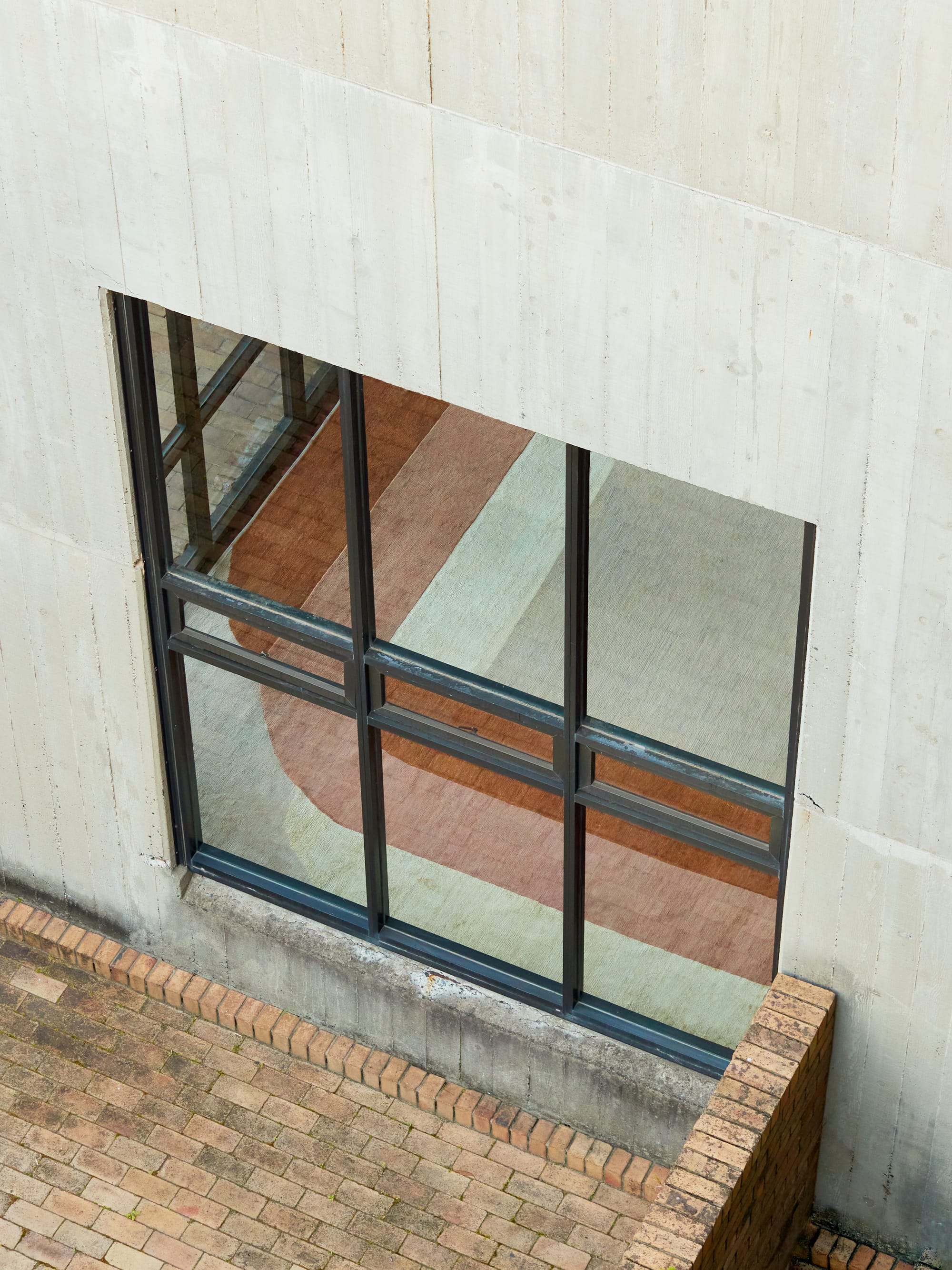
Fascination with materials, objects and ideas is one of the core pillars of the creative process at Studio Shand. The team of three has a running tradition of ‘show and tell’ where every member brings something they like to the table and explains why they like it. The only limitation to what can be presented is in the eye of the beholder. Dozens of references are pinned to the corkboard in the studio and thousands of them are filed. In this library, one can find anything and everything from pieces of dance choreography to architecture, sculpture and photography. The main goal is to find the means to communicate ideas within the team and sometimes even to clients.
'On a practical level, if we are producing a presentation for a new project or a new stage, we can open examples up and lean on them. And that has been helpful in the way of showing things that we find interesting but moreover in developing a shared language.'
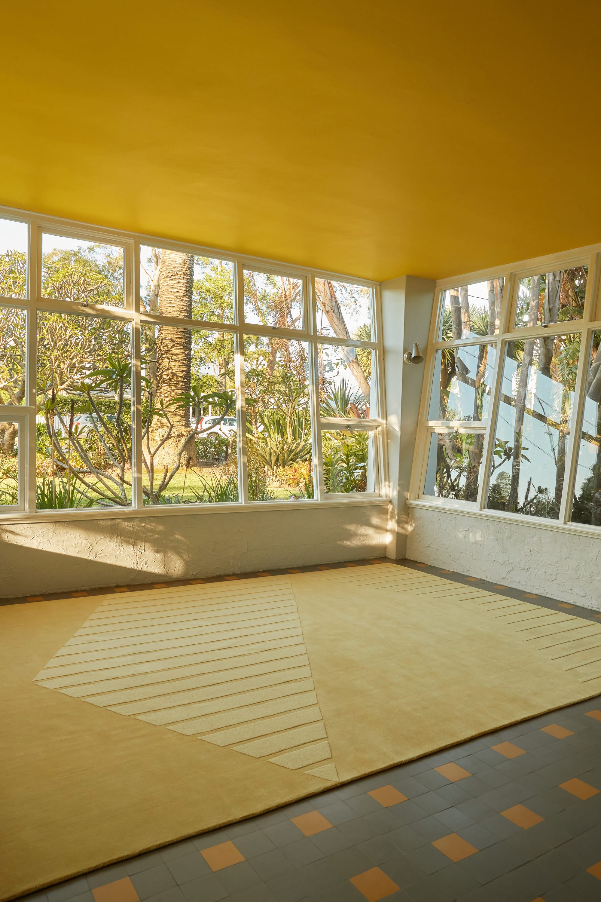
Looking around the studio it’s hard not to feel like you are back in the Tupperware era. From coin-patterned rubber flooring to mustard yellow textured ceilings to built-in display cabinets with thick asymmetrical timber framing - all elements refer to the 20th century. A rich source of inspiration, it is often quoted in Studio Shand’s work for a particular reason.
‘It's daring and there's optimism in that space with a lot of play. We find it exciting as it tries to change your perception of why something looks and works the way it does. And that's what we enjoy, we practice design and it's detailing methodically, but ultimately a lot of the things that we produce and the effect that we want to have needs to be playful and approachable.’
By way of translating the 20th-century influences into the modern context, a matter of sustainability is viewed by Studio Shand in a more holistic way with longevity in focus.
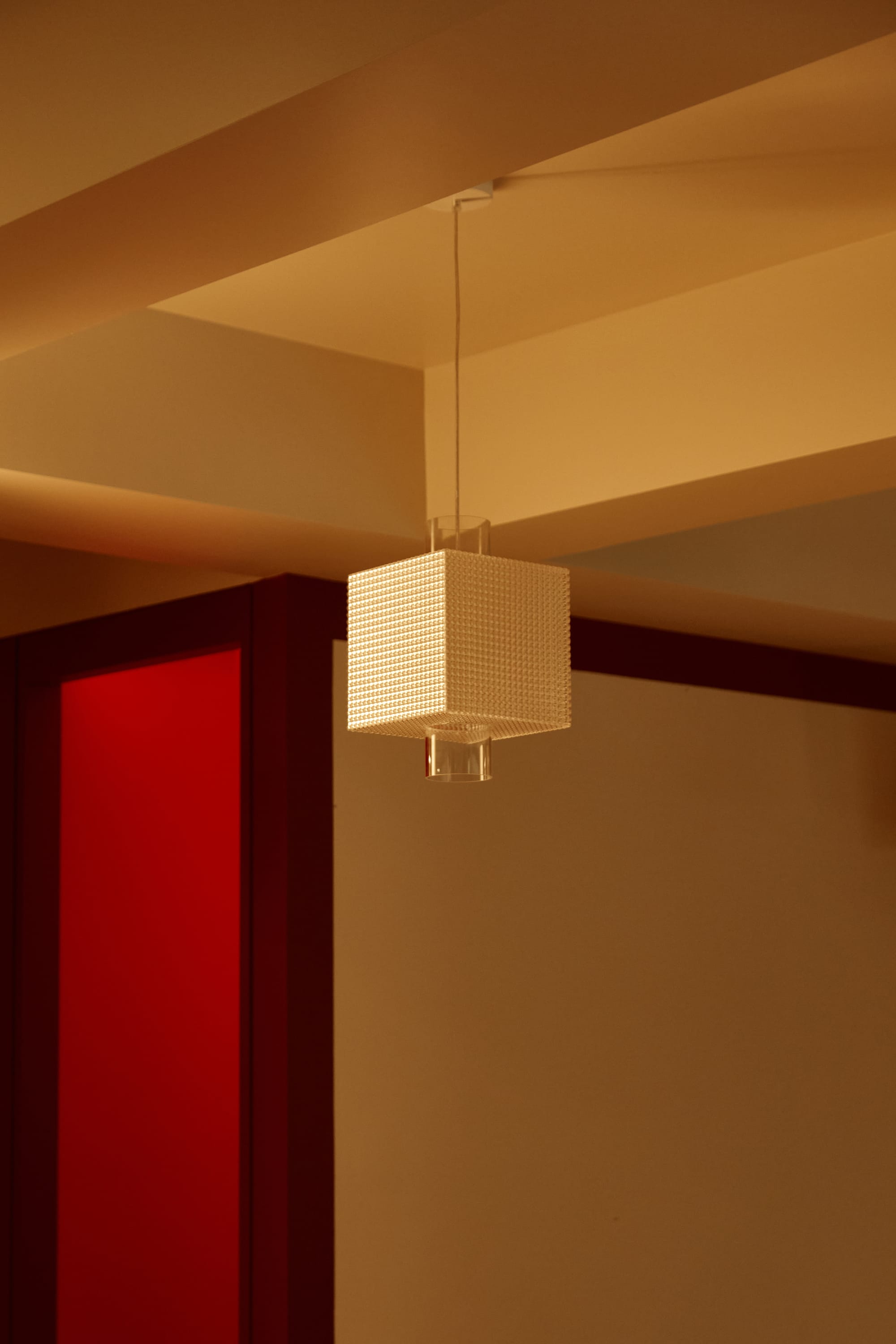
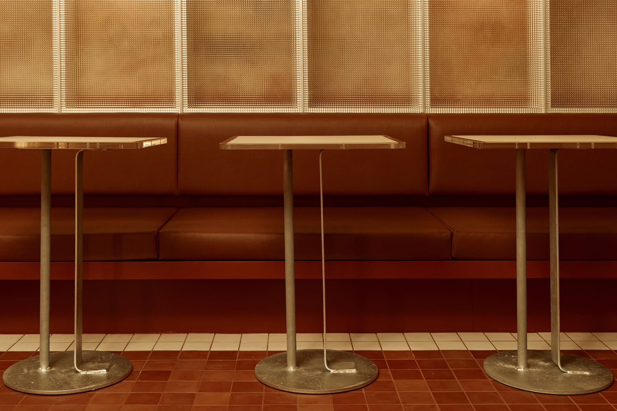
‘Unfortunately sustainability is often perceived as purely the sum of materials, which is a dangerous approach. I think the best thing for sustainable design is lasting design, which a lot of the heroes pinned on our corkboard who practice in the spaces of object design, furniture design and architecture knew well.’
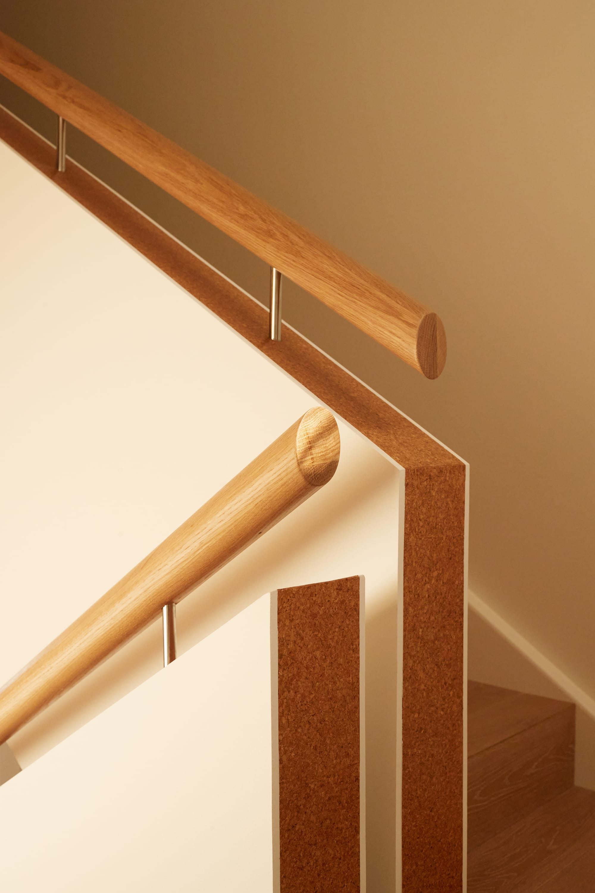
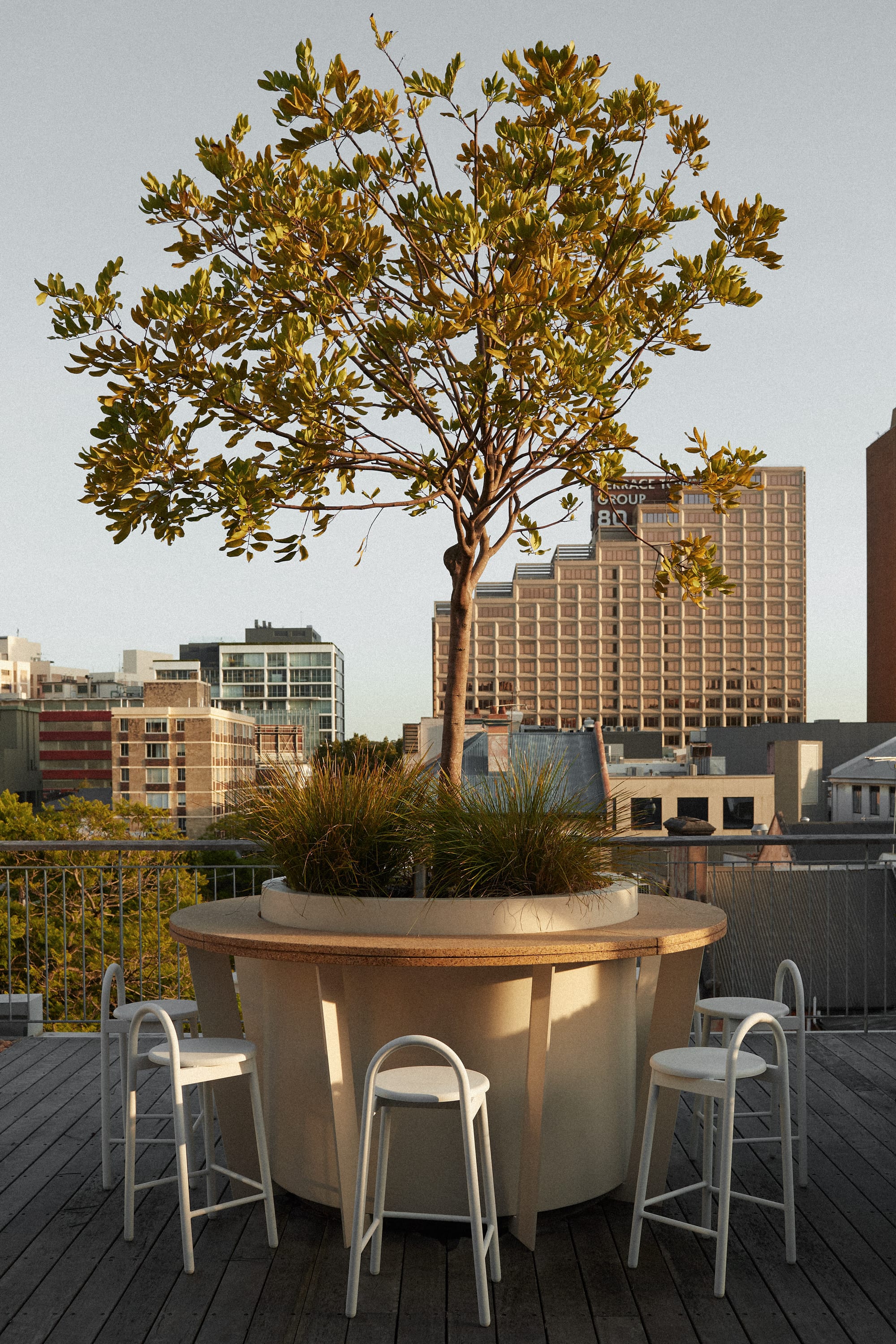
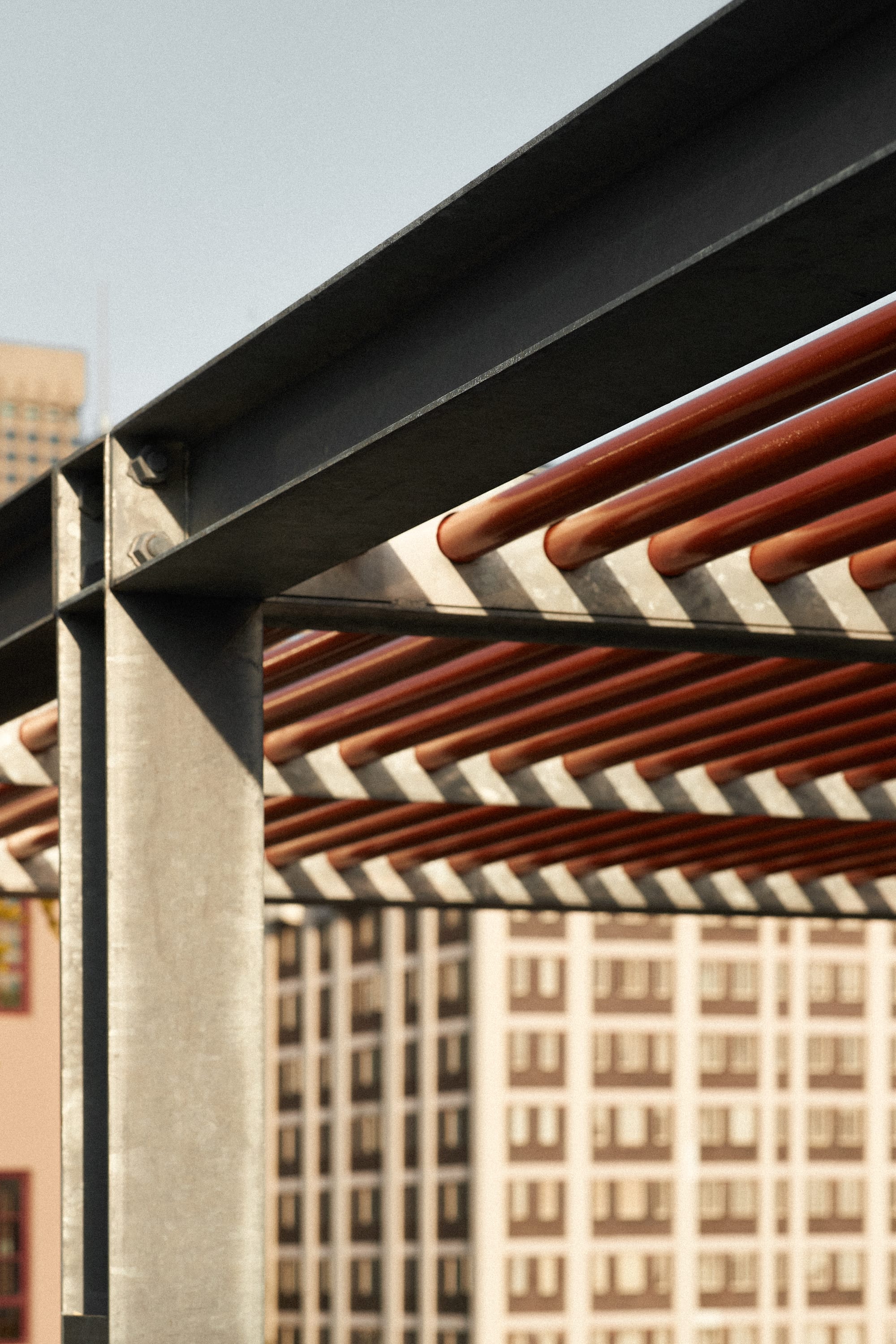
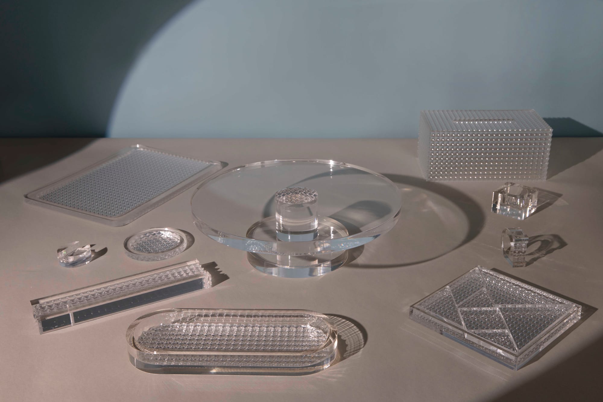
Fluently manipulating tectonic shapes into playful designs, Studio Shand continuously demonstrates how this language can be serious and yet approachable. With a series of simple technical moves, offsets, flips and rotations applied to basic shapes they achieve a result that looks truly dynamic. Elements riff off each other in balanced arrangements where a consistent material palette and a strong colour are offset with something with no colour or galvanised steel is pinpointed by coated steel against acrylic. According to Studio Shand, the key to achieving the desired effect in this context is careful consideration.
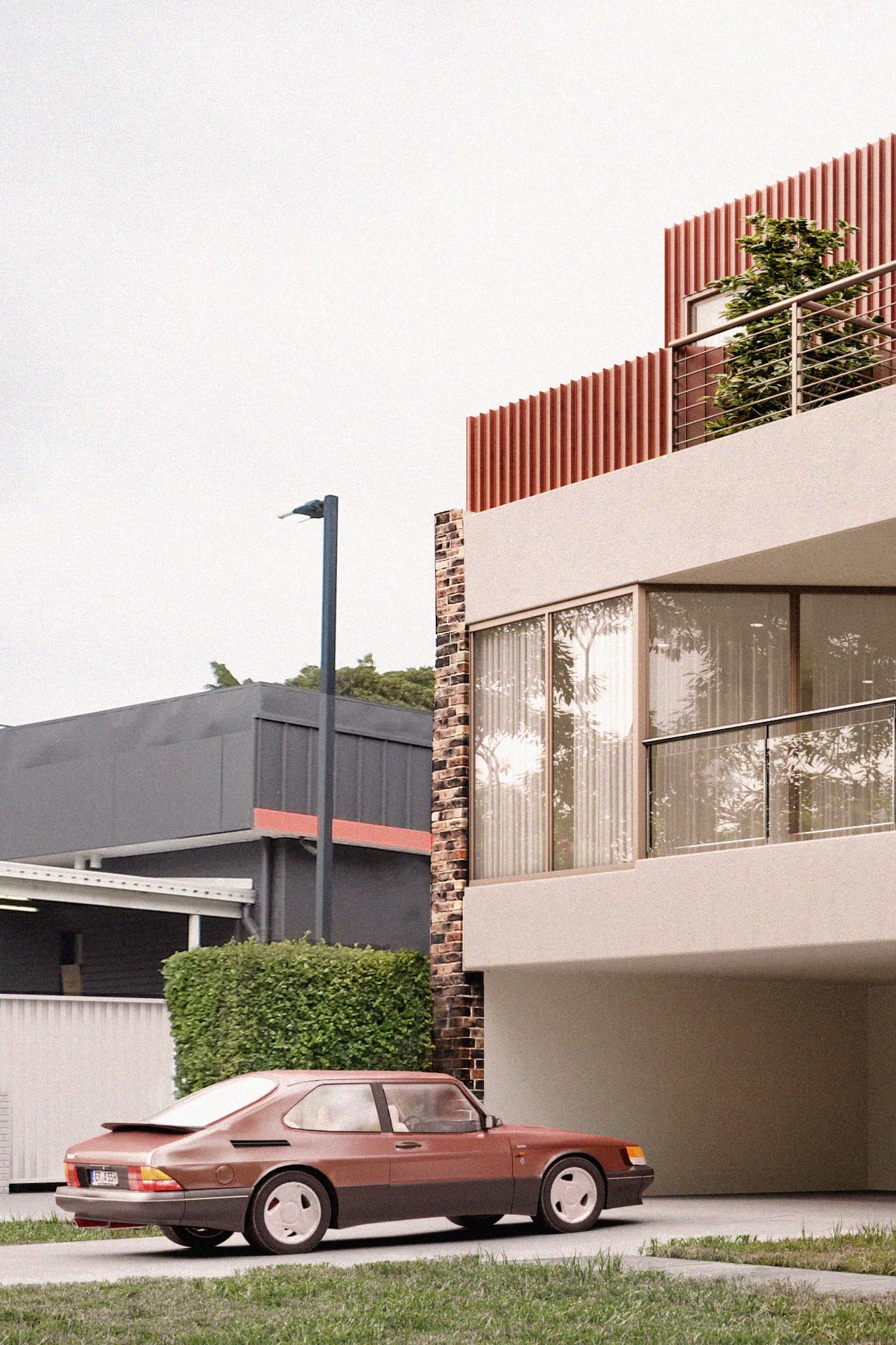
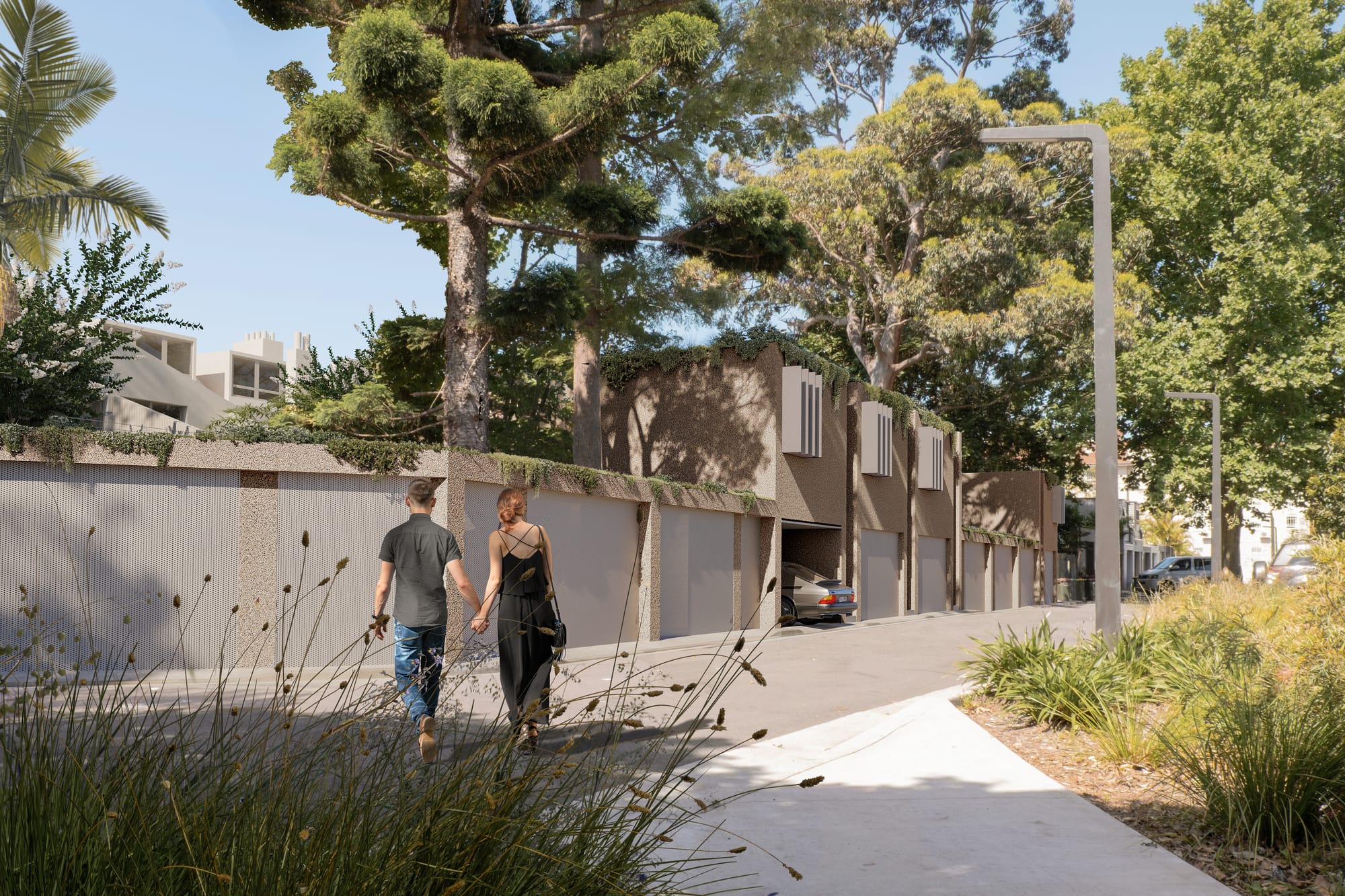
A lot of work done by the studio is site-specific and nevertheless, they manage to maintain their signature design vernacular. This inevitably results in constraints which from the studio’s perspective are the key to creating opportunities and rationalising their holistic design proposition.
‘Everything has limits. Even a sculpture that seems to be sitting on an endless plane of sand needs a very particular footing, and the art is about making it seem completely free. A lot of shapes that we use in our projects are often very simple, such that constraints like sun movement and the way that it will drop shadow against our shapes is key.’
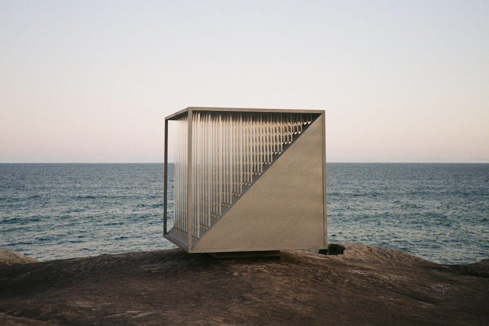
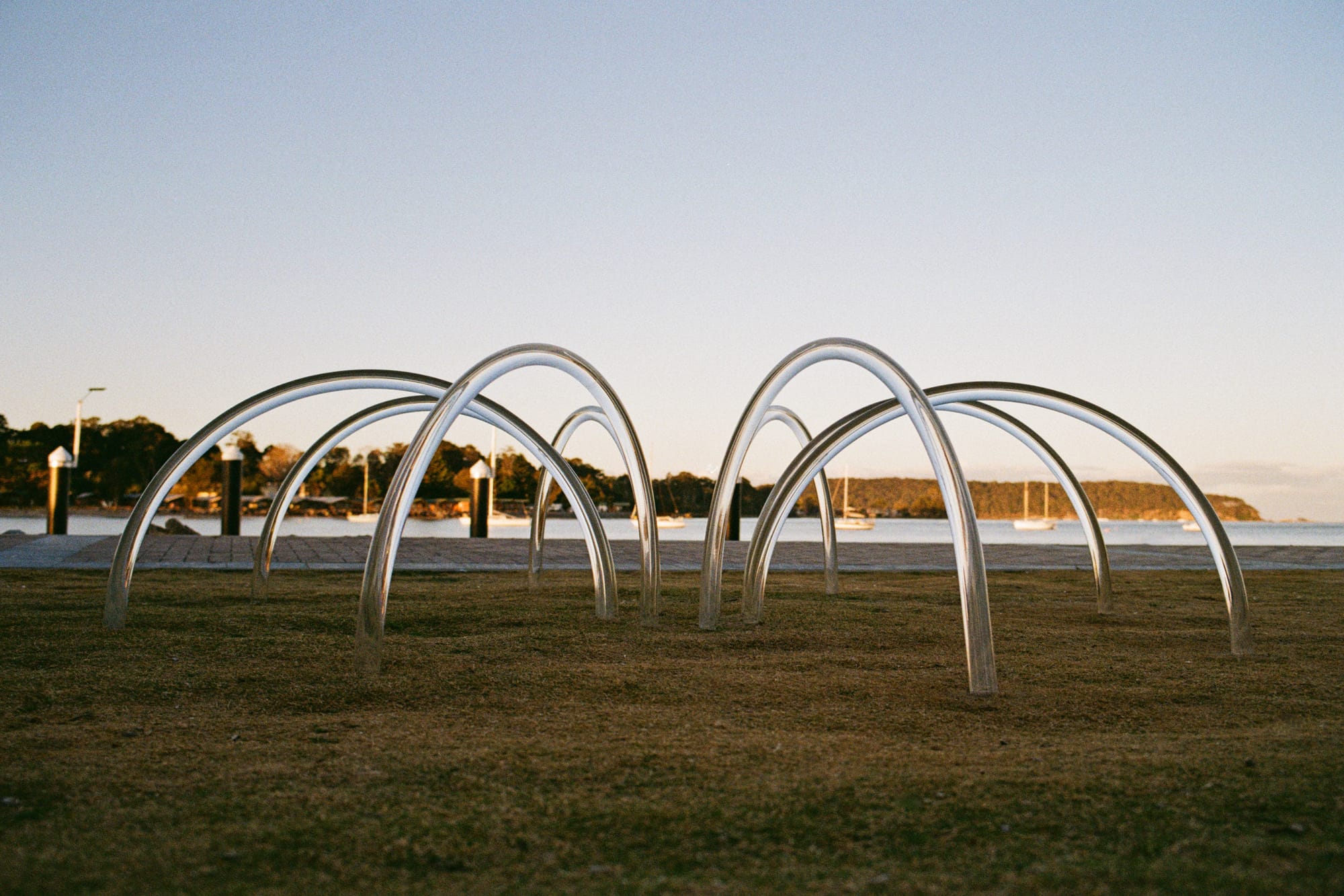
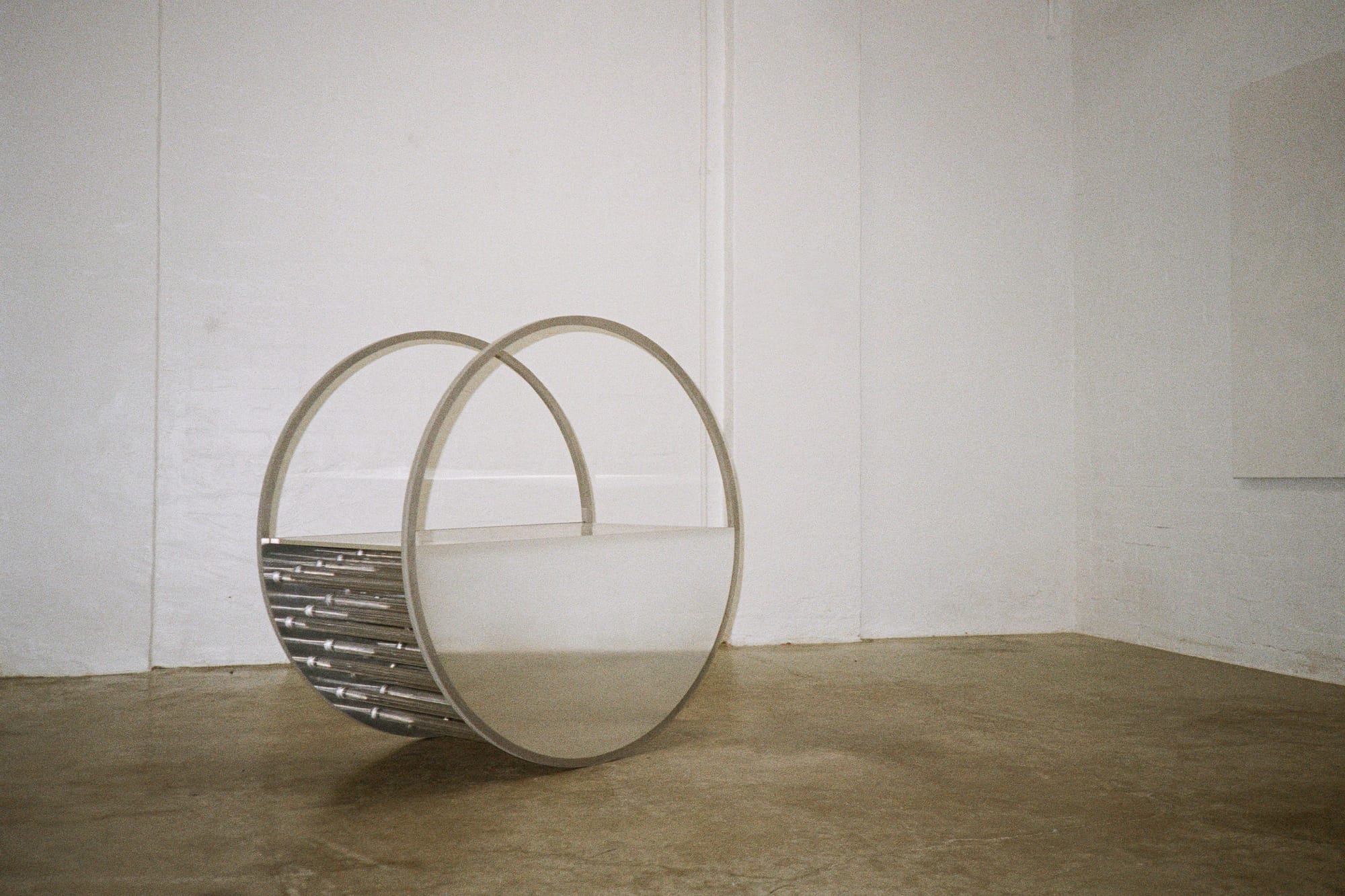
Constraints don’t seem to apply to Studio Shand’s vision as they continue exploring their creativity through various dimensions, whether it’s a collection of table objects branded ‘Table Service’ or the very building that the studio is located in - the old Italian restaurant Buon Gusto.
‘The idea was to find and build something that felt like our work whilst also being the type of space that we could admire for the sum of its parts and enjoy making within its walls. And the exciting bit is that it’s not just our Studio's home but now a home to many other creatives.’
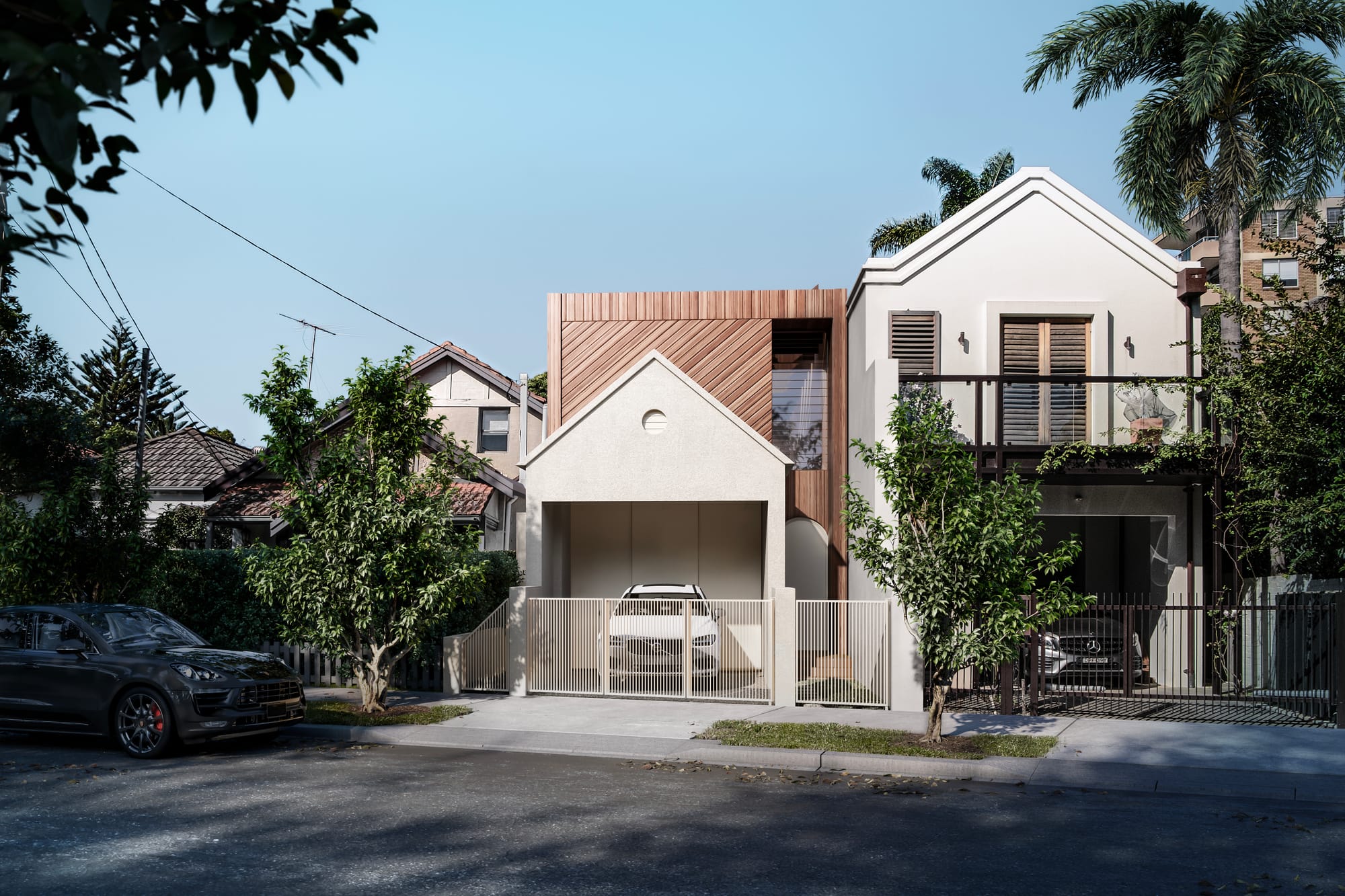
Buon Gusto is set to become a true makers space with eight studios within the old restaurant's walls. Current residents include Studio Shand, artist Eliza Gosse together with a mix of painters, sculptors and designers to round out this hub of visual artists.
‘It’s the idea of shared benefits from the cross-pollination of, say, a painter working next to a designer who get to bounce ideas off each other and perhaps the ceramicist next door. Everyone gets lifted.’
Visit the Studio Shand Instagram or website to explore their architectural and art projects, as well as their conceptual work.
