Words by Reinnete Roux. Photography by Dion Robeson. This story was originally published in The Architect magazine, an official publication of the Australian Institute of Architects.
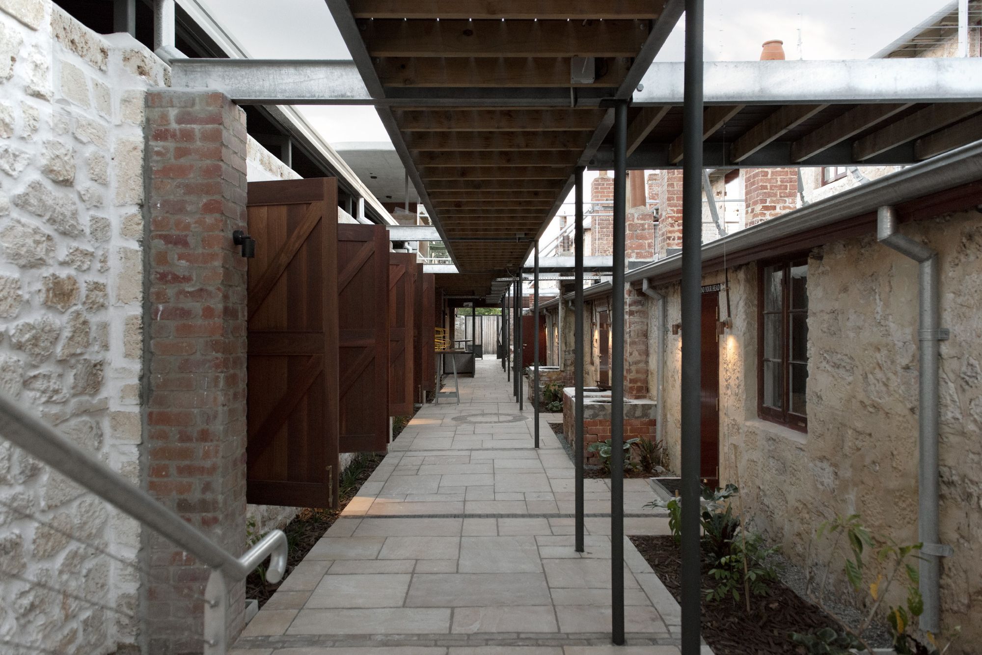
Just north of the Fremantle markets sits the Warders Hotel, guarded by the shadow of the prison after which its image was shaped. As a national heritage-listed building, the project brief tied in very well with architect Matthew Crawford’s view that heritage should be adaptively reused, not changed.
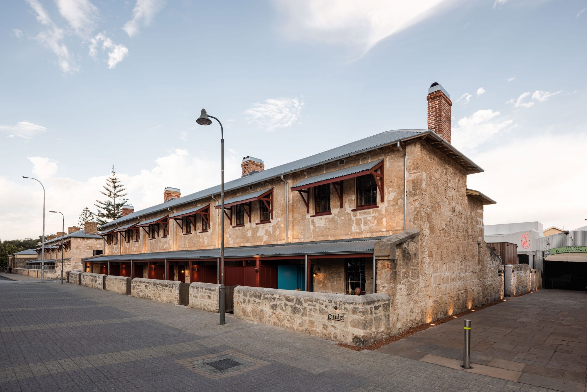
The original entry borders the Fremantle markets, remaining within the constraints of the heritage site as new wall openings are difficult to enforce. Once inside, the warm welcome of the reception is like that of a cabin within a ship – low-height ceilings, existing Jarrah timber sourced from what was before, and a wall adorned with the names of prison wardens over the years. In contrast, the rich austral dream marble slab that encases the reception desk speaks to its local heritage, while elevating the space and introducing the notion of a luxury hotel.
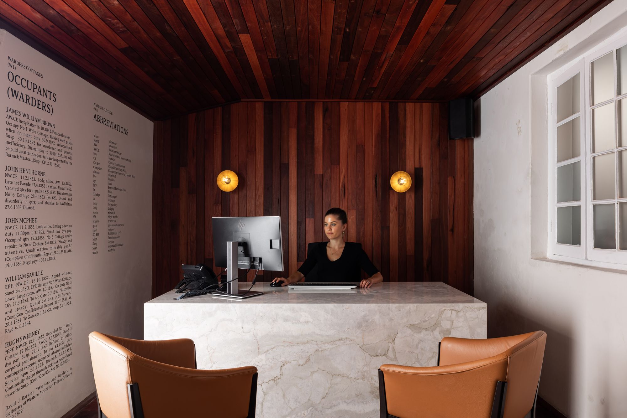
If you were a passer-by on the day, you would also be welcomed as adjacent to the hotel entrance you can find the wine bar ‘Gimlet’, so named after the drink containing citrus, served to the officers who thought themselves above the scurvy rations of the wardens. Gimlet is of course also a great starting point for hotel guests looking to start their evening (or afternoon), perhaps before heading to the conveniently located Emily Taylor’s restaurant tucked in behind the hotel.
The hotel is nothing short of exquisite in its clever reuse of the heritage site and the restoration thereof. With a feel much like that of the French navy, the cabin-esque interiors of the hotel are elevated with a slightly warm royal blue, not a heritage colour but one that was taken from paint samples of the existing window frames. It plays on the maritime feeling that has been introduced throughout and gives the sense of being at sea.
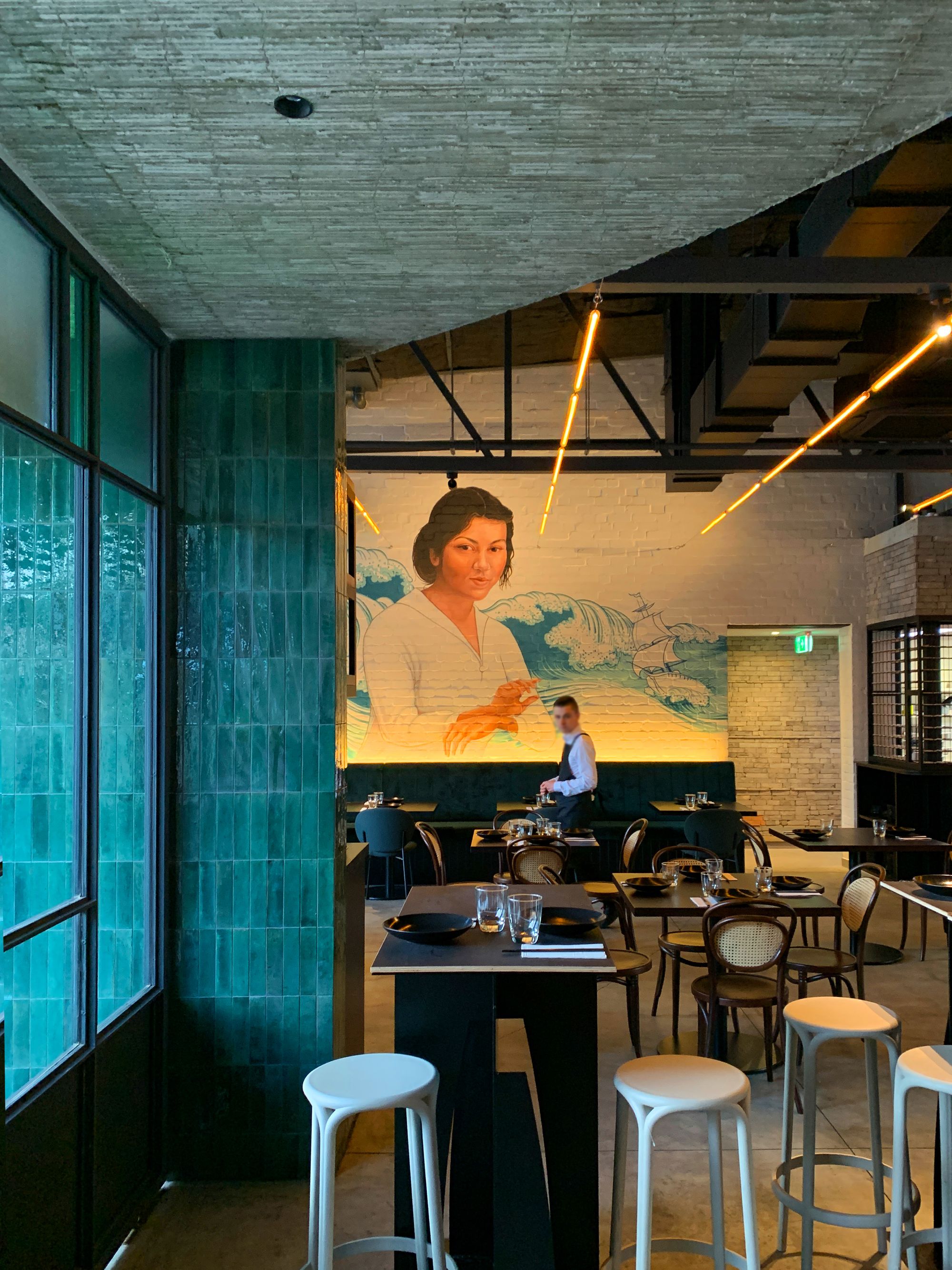
The use of existing stairways connecting the ground floor with the upper level, now not fit-for-purpose, as a manner of concealing services while retaining the architecture of a bygone era is one of the many examples of the architect’s reuse of the space. The small barn-like doors of the previous cottages have been removed from their hinges and placed instead on adjacent walls as a viewing piece, part of the architecture. In other instances, they act as a trick door concealing the newly installed (compliant) doors as an exit onto the market street.
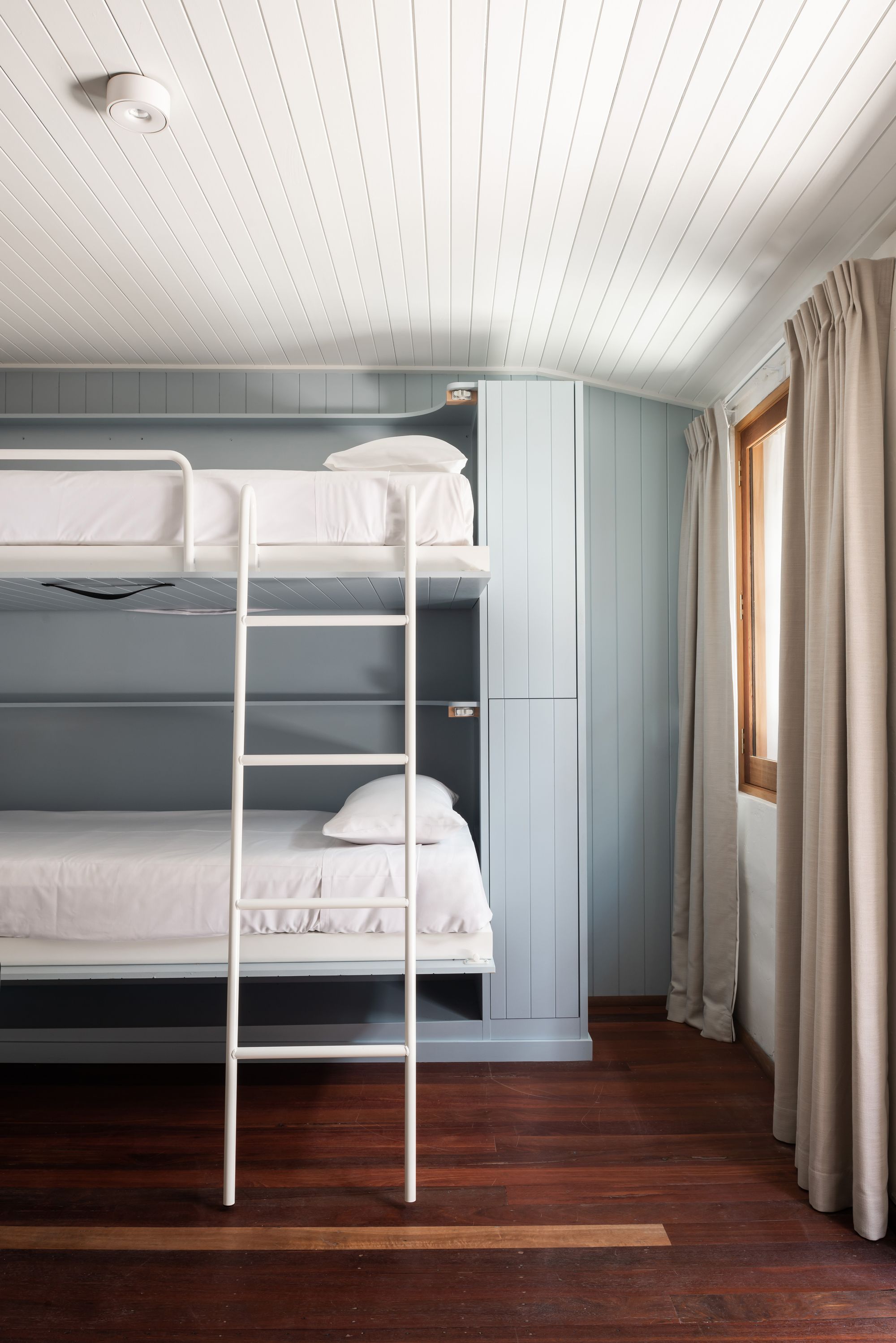
For Matthew it was important to temper the environment and maintain sound attenuation, with acoustic separation from the busy public streets outside achieved through insulated ceilings and double-glazed windows, to further reinforce the luxury-stay status of the rooms. Inside, bunkbeds are concealed behind large pivoting panels, adding to the maritime look and feel as well as creating a sense of adventure for those who stay, both adults and children. Further to this, a clever play on a private reading light enables the bunk-dwellers to not encroach on each other’s sleeping time.
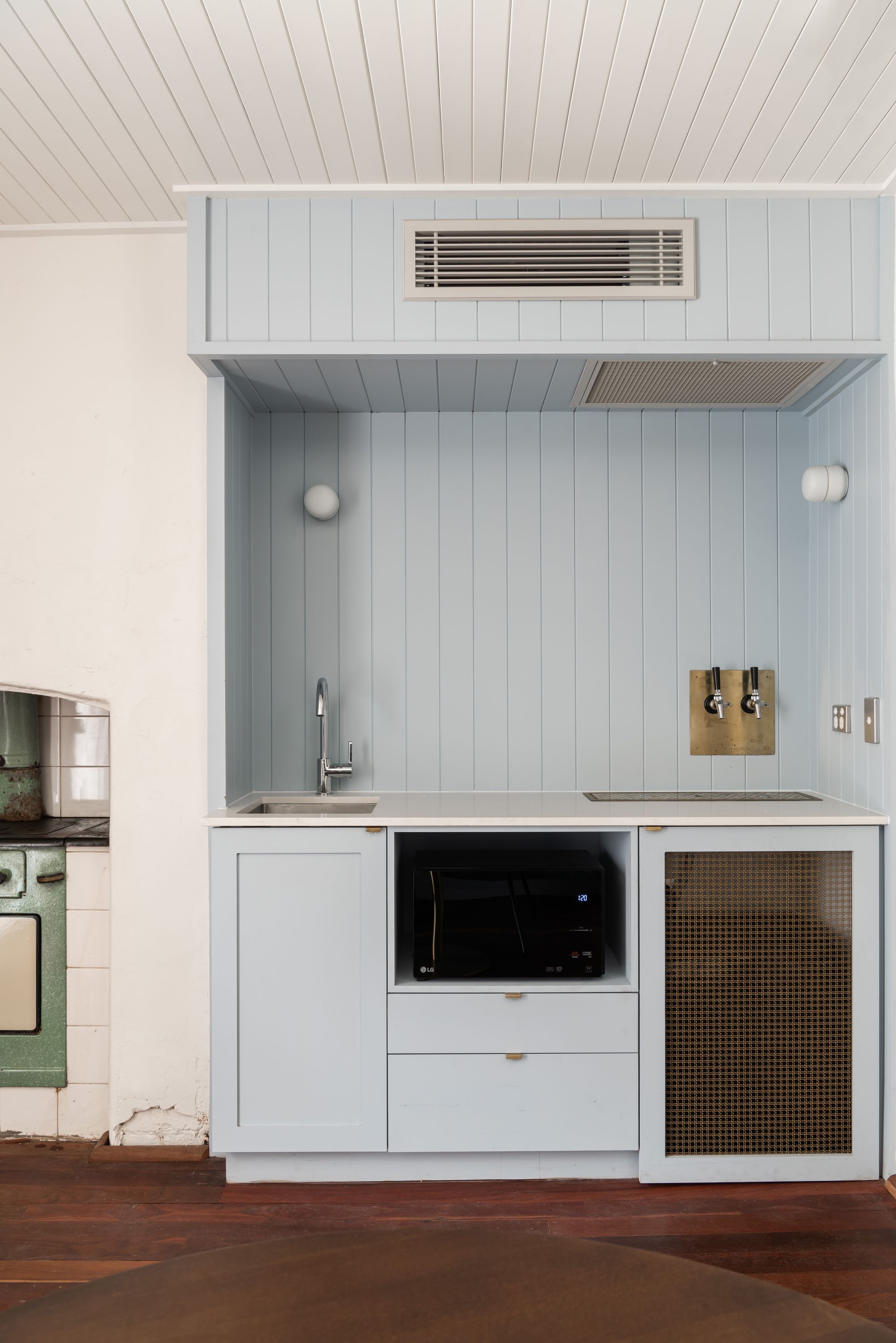
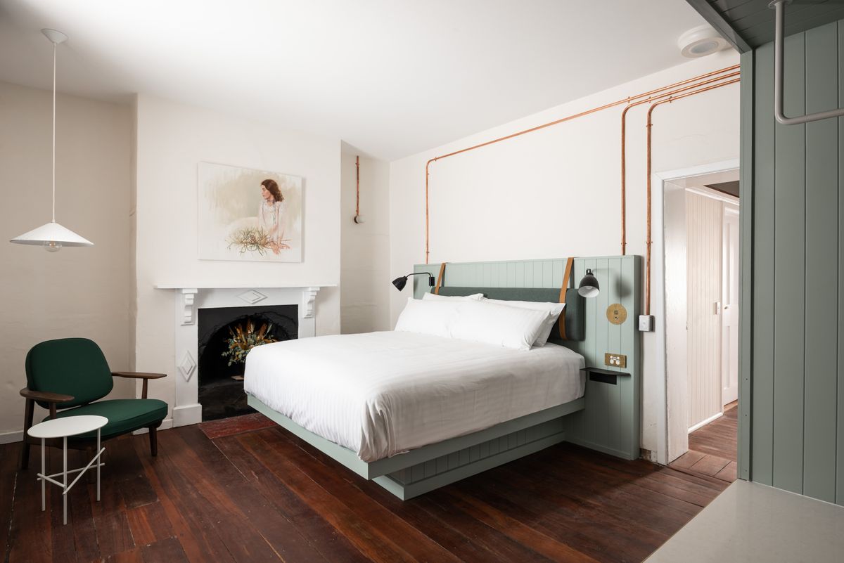
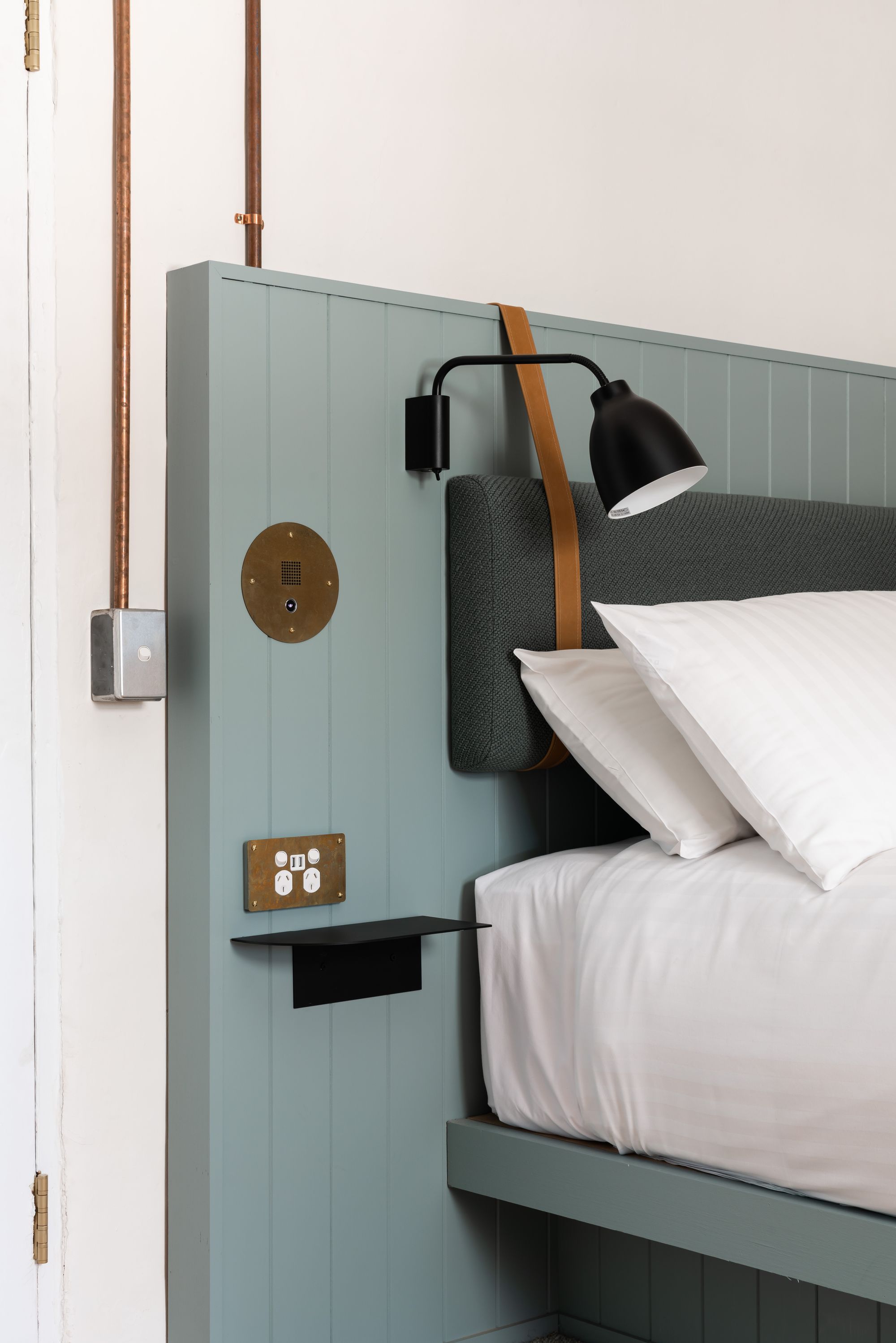
In each bedroom, a brass-plated intercom can be found in lieu of a phone, tying in with the brass light fittings and hardware throughout. The interior colour palette was deliberately soft and harmonious, and chosen to enhance any light coming into the space, as a limited amount of natural light was a constraint that had to be considered.
The project represents a clever juxtaposition between classic and contemporary design. Matthew Crawford Architects has captured the essence of Fremantle and the history associated with the prison and its wardens, highlighting the rich background to the suburb and our city, and the role architecture plays in capturing this.


