Words by Pip Smith. Photography by Dion Robeson. This story was originally published in The Architect magazine, an official publication of the Australian Institute of Architects.
Central Park has been a business icon in Perth since its introduction to the Terrace in the early 1990s. As one of the tallest buildings, and the only public green space in the heart of the CBD, it has long been an attractor of people. After winning the masterplan design competition for the area, Woods Bagot led the team that transformed Central Park’s public ground-floor space.
Although the project focuses on bringing new life to the lobby, the revitalisation extends to an impressively bold new street facade, strengthening the visual and pedestrian connection between the park and terrace, and drawing the community around the park into the lobby.

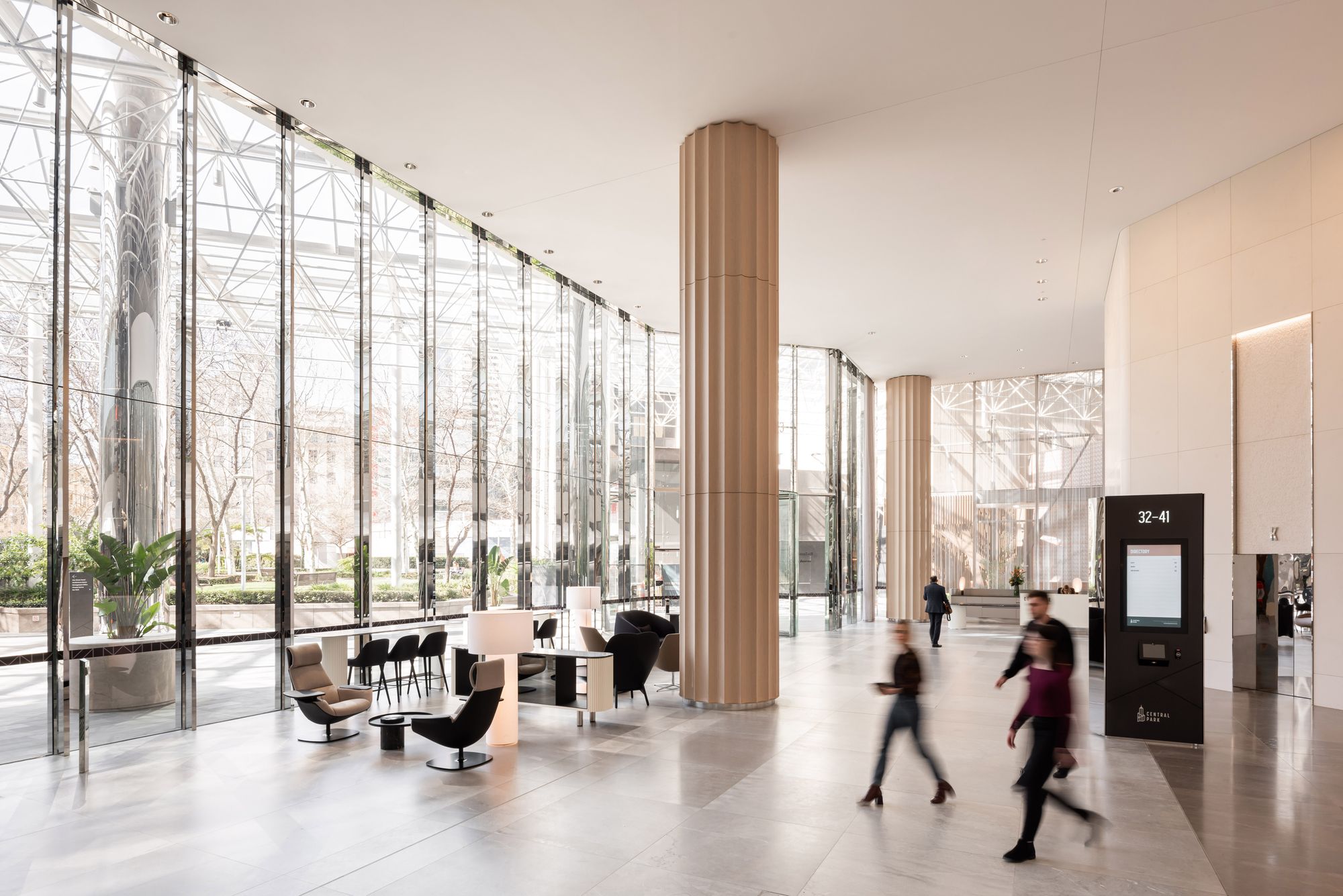
Woods Bagot’s multifaceted design approach has created an elegant and welcoming atmosphere centered on user experience. While the previous fit-out was a formal transitional space experienced en route, the new foyer is strategically layered inviting people to stay, use, and connect.
Functionally the floor plan offers a variety of spaces encouraging activation, from open business lounges, reservable pods and meeting rooms, function spaces, galleries, and the energetic Hemingway Cafe.

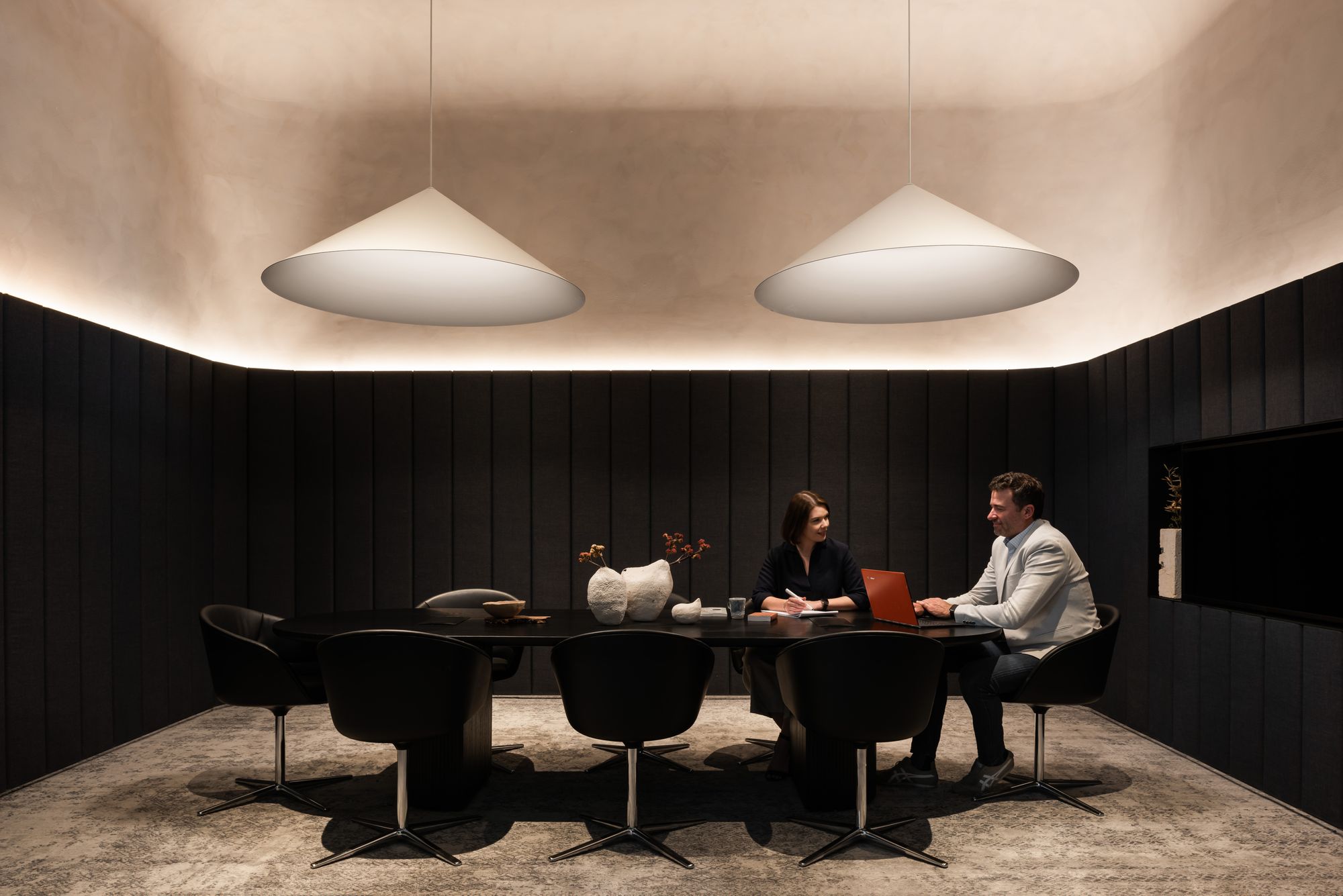
The reservable meeting space pods are intimate but accessible, scooped out from the surrounding monolithic walls. As user experience is key, the pods are not only beautifully designed but free and easy to use. Simple controls customise the pod lighting for adaptability, and the furniture and finishes work together for superior acoustics and spatial comfort.
The business lounge areas that open onto the foyer are carefully curated. The furniture selection includes pieces which are intentionally ample in size, to envelop the user with a sense of shelter inside the vast open space. Wireless charging is also integrated into many of the furniture settings, further encouraging you to stay.
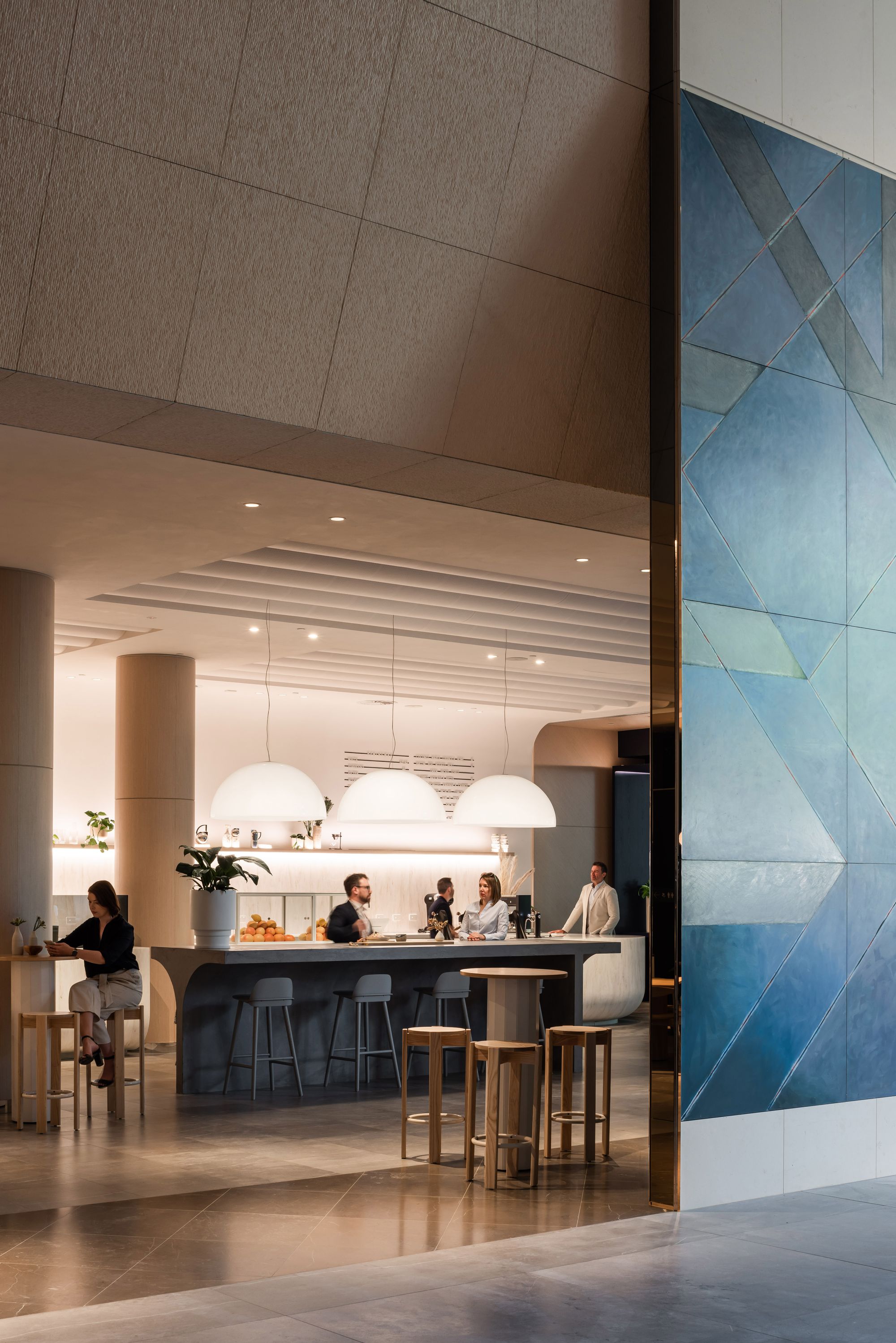
It was identified early in the design process that the inclusion of a cafe would be key to drive renewed use. The Hemingway fit-out is an extension of the lobby – large enough to have its own mood but very much in the same tone. With a variety of spaces, Hemingway serves as both a meeting point and place to socialise, and easily adapts into a function space for tenants.

The warm, natural material palette and subtle lighting scheme create an ambience of sophisticated comfort in the lobby. Light, natural materials with matte or textured finishes absorb light, rather than reflect it. Working in harmony with the matte finishes are what lead designer Melanie Porrins describes as “moments of reflectivity” – polished stainless steel clads the curtain wall mullions, load-bearing pillar bases, lift car insets, and is scattered sparingly throughout the furniture. The window mullions add a delightful mirror effect, bouncing the park greenery back into the lobby as you move through it.
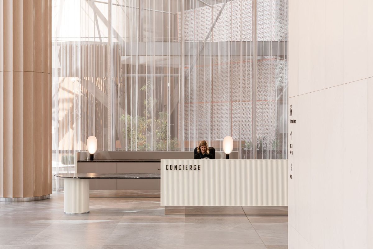
Some elements of the redesign echo the warm, approachable mood of a hotel foyer: a wide concierge desk set against a semi-translucent curtained backdrop; temperate, low lighting within the lift cars; slightly curved walls inviting exploration around corners; and, even a signature scent for the building which lingers into the lifts and accompanies you to your floor.
As well as refreshing the building, the original lobby artwork – several immensely sized pieces by local artist Brian McKay – have also been given an updated backdrop. The new walls that house the art have been seemingly sized and arranged to suit the pieces, not the other way round. Carefully retained and reinstalled, the preservation of these beautiful historic murals adds to the redesign being thoughtful and respectful of what was there before.
There are so many layers to this impressive refurbishment working cohesively to achieve a simple yet elegant outcome: the next chapter for the Central Park Lobby is here, and it welcomes you not just to pass through, but to stay, use, and connect.


