Australian Architecture showcases the high quality of architecture and design in Australia. Check out the latest projects which were featured last week on the platform.
Phoenix House by Harley Graham Architects
Byron Bay, NSW


From the Architect: The design was an exercise in restraint. How could we create a three bedroom house within 140m2 that felt much bigger that the square metres suggested. The spatial acrobatics included a huge skylight over the living space that defines the lounge area within the larger kitchen living dining. A large 3x3m sliding door pulls back to reveal a framed view of the park. The whole project could be seen as a refined piece of joinery with a carefully curated palette.
A strong decorative blockwork pool and a series of blockwork planters spilling with native vegetation anchor the old timber house to the site. Adjacent to the house is a small 1 bed studio which is a prototype for a series of future ‘tiny homes’. It is 50m2 and only 2.8m wide internally, but once again feels deceptively big with nearly 4m high ceilings in the main space.
We are constantly trying to convince clients to build smaller. I love when people come to the house and use phrases such as ‘this feels like a really comfortable home’ or, ‘the spaces feel humble and warm’.
Phoenix house bridges the nexus between the old and new ‘Byron Lifestyle’. It reflects on the past while also providing cues on how we can build sensitively into the future as these beautiful coastal towns in Australia find themselves under more pressure than they have ever been.
.
www.harleygraham.com
@hga.architects
#hgaarchitects#publishedwithbowerbird
.
Photographer: @andymacpherson.studio
Builder: @moradabuild
Landscape: @fig_landscapes
Engineer: @westera_partners
Autumn House by Studio Bright
Carlton North, VIC
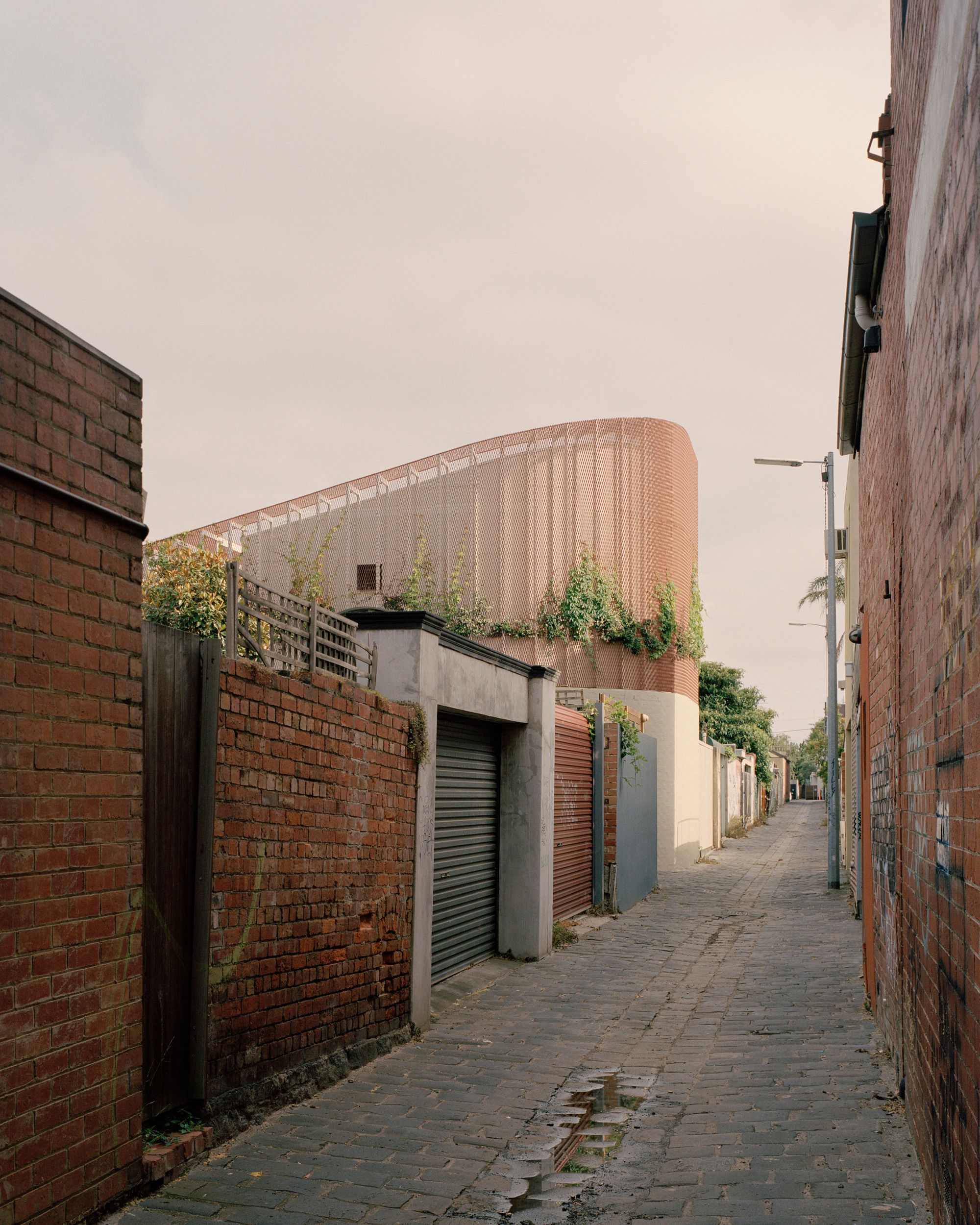


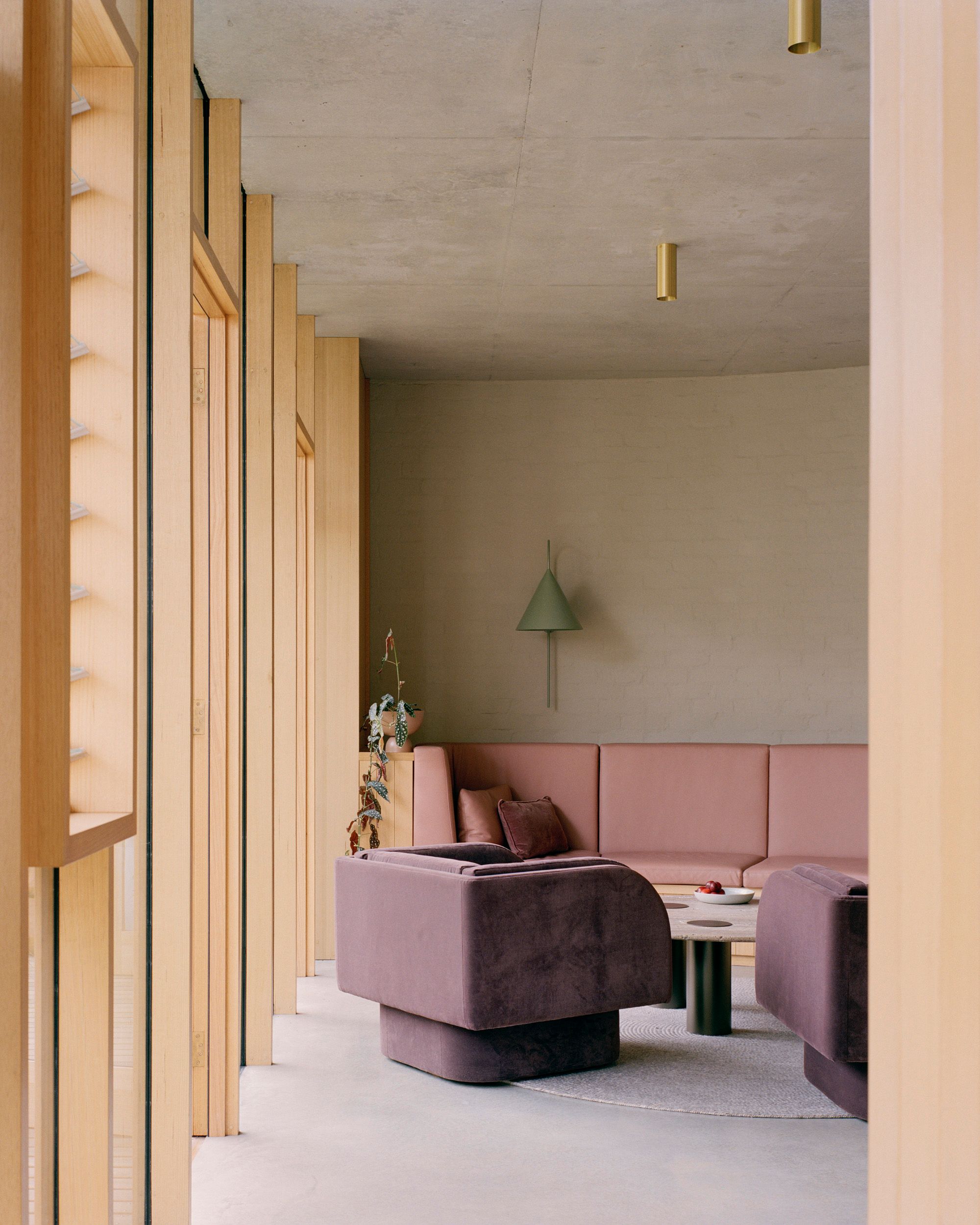
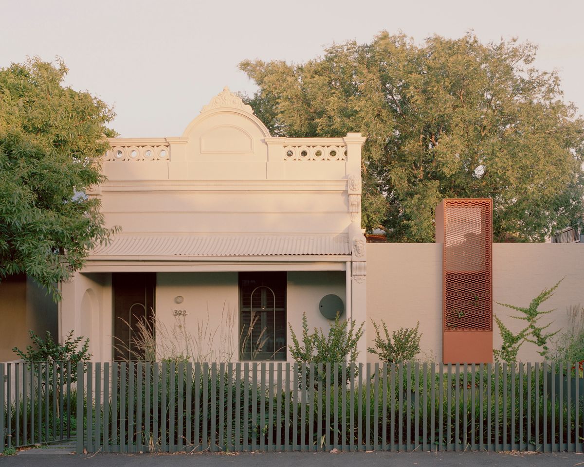
From the Architect: This project, an extension to a Victorian terrace with a 1980’s renovation by architect Mick Jörgensen and a mature elm tree in the backyard, in effect adds a careful new layer stitched into and around these constraints. The project attempts to sympathetically balance the architecture of the Victorian, the Jorgenson addition with a new contribution by our studio.
Jorgenson had extensively reconfigured the interior of the original Victorian terrace, and, to the rear of the site he added a studio, storerooms and garden buildings around courtyard spaces. These spaces, however, offered little to help accommodate the living requirements of a young family and no northern sunlight. The space, however, is much loved – its raw-timber-lined ceiling, red brick floor and outlook to the elm tree were all highly valued. This part of the house has been sensitively restored and the main entry made operable again, conceived as night-time spaces, it holds kids’ bedrooms and an informal living area.
Wrapping the southernmost edge of site and negotiating the tree,
the existing building, and pushing right to the rear of site, the new work forms a series of curving and angled moves at ground level that holds the new north facing, living, kitchen and dining spaces and an activity space at the front of site. The form that results from these interventions presents a continuous solid brick perimeter wall to the laneway edges, entirely consistent with the adjoining conditions.
.
www.studiobright.com.au
@studio__bright
#studiobright
.
Photographer: @arorygardiner
Builder: @provanbuilt
Landscape: @eckersleygardenarchitecture
Engineer: Meyer Consulting
The Church by Michiru Higginbotham
Sydney, NSW
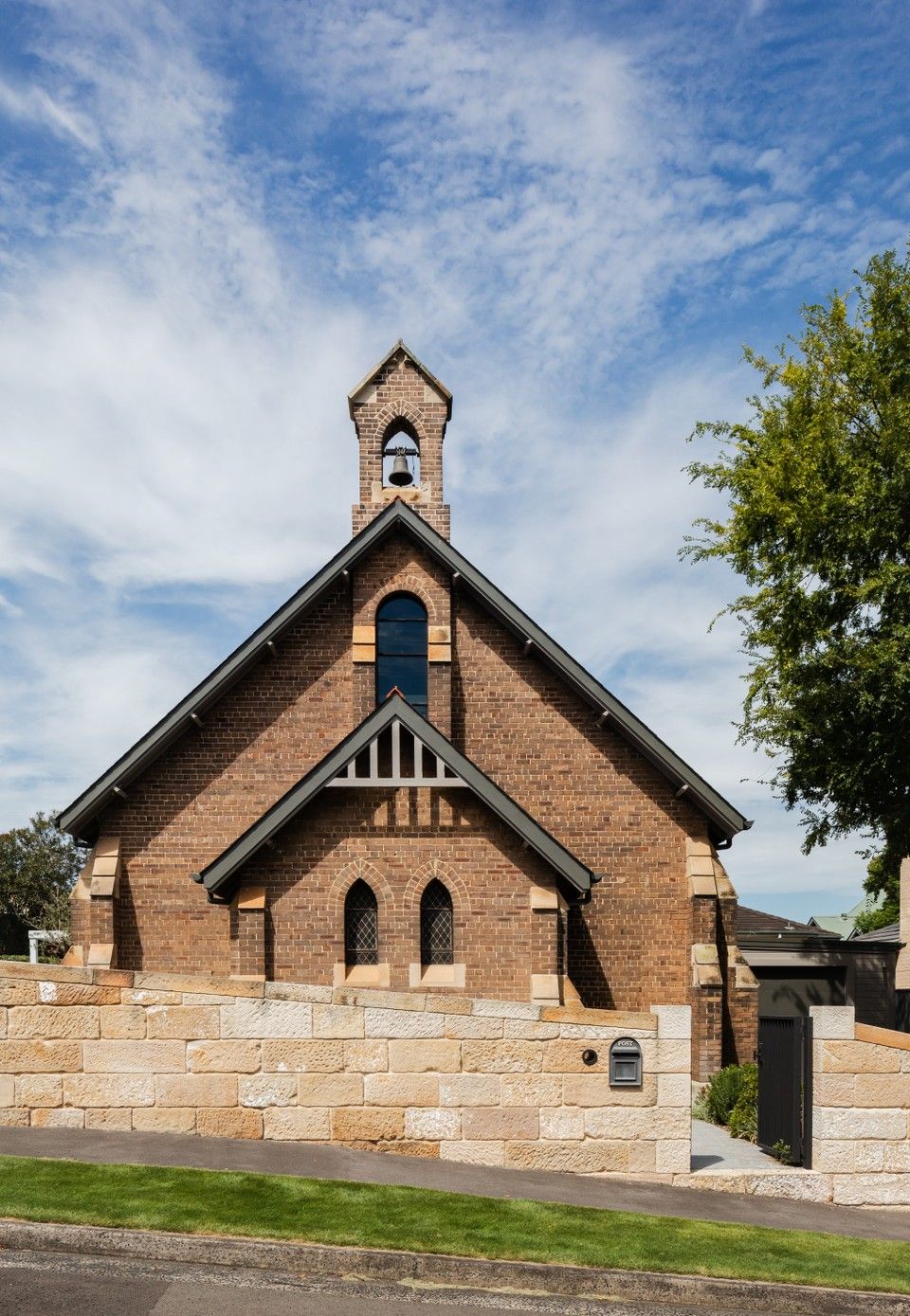
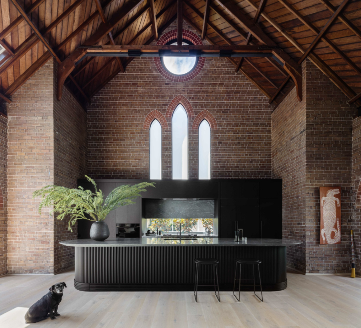
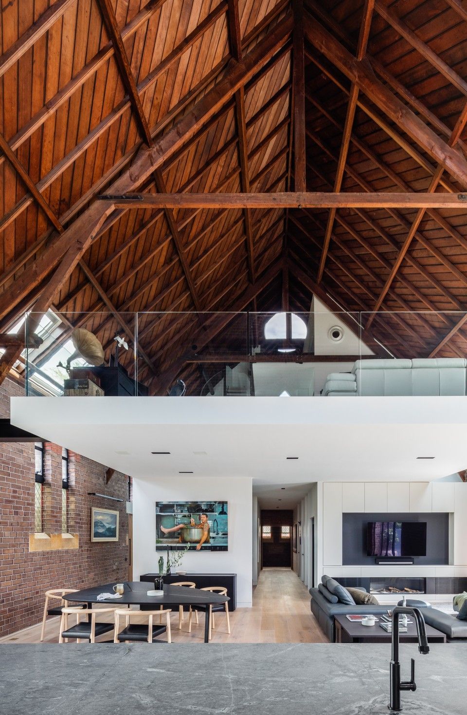
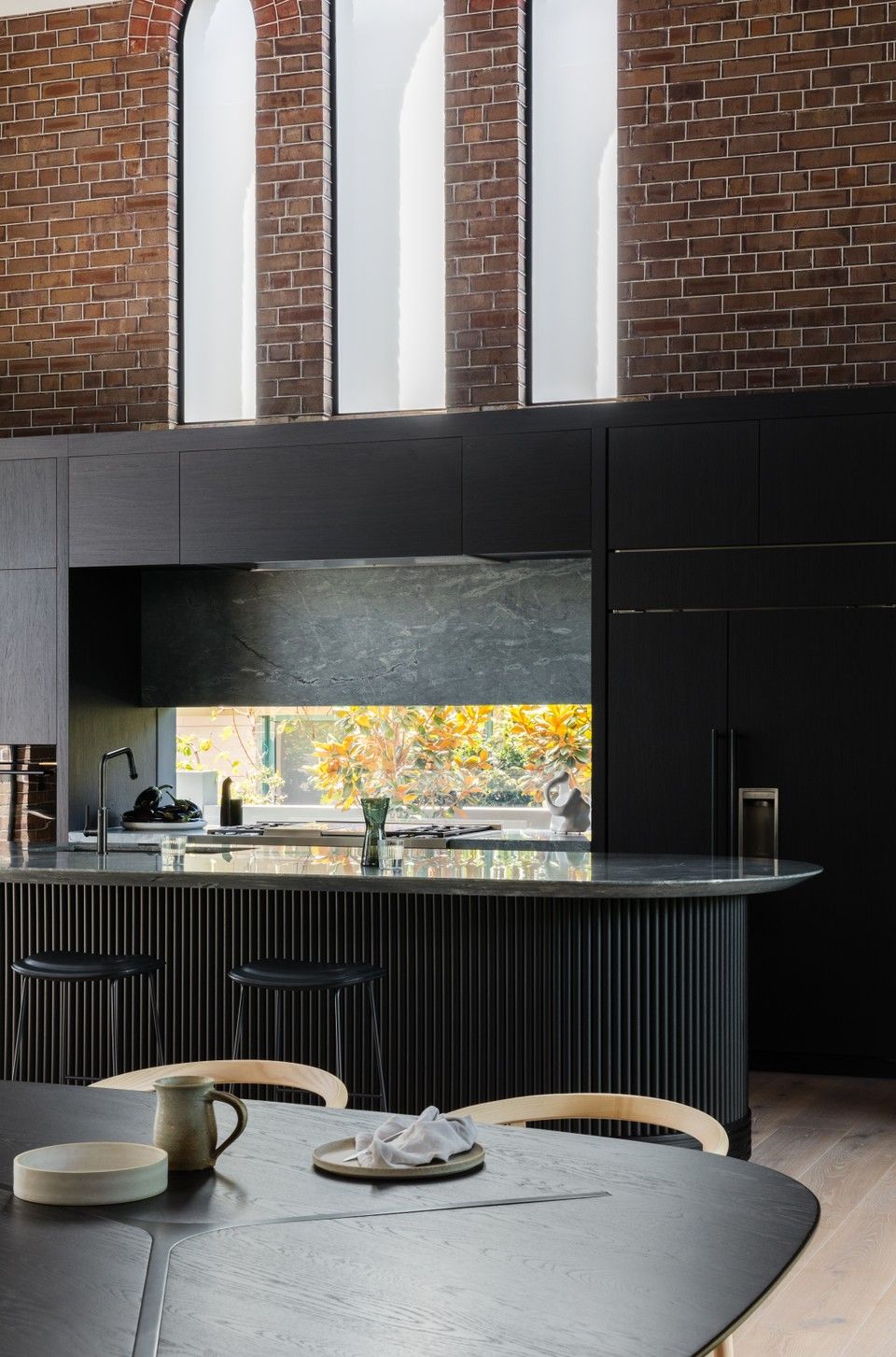
From the Architect: Once a community church and theatre, The Church, has been rejuvenated into a three-level contemporary dwelling, while providing a sympathetic adaptation to a historic building. Heritage listed, the brick and sandstone façade is preserved to the public elevations. It’s legacy lives on to support the progressive lifestyle of our clients.
Inserting minimal partitions, floating mezzanine levels hovering off the existing brickwork walls and modified glazing provide a light filled interior to the once dormant building. The new glazing respected the format and scale of existing fenestration, by inserting large, glazed arches to frame sightlines out to the garden, harbour views and sky. It maintains the original rhythm of the exposed roof structure with the brickwork buttresses and patina of the timber trusses.
.
www.michiruhigginbotham.com.au
@michiru.higginbotham
#michiruhigginbotham
.
Photographer: @_katlu
Builder: @straight_up_built_
Styling: @hollyirvinestudio
Wallaby Hill House by Frank Faelli and Avver
Bright, VIC
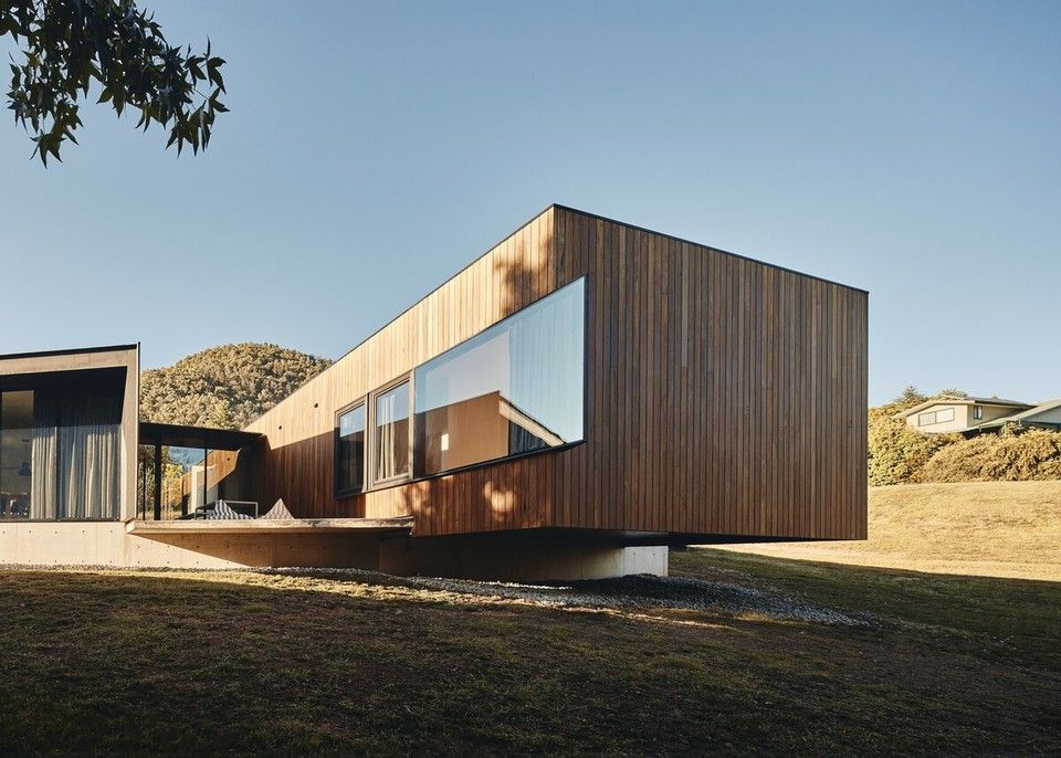


From the Architect: The quality of light throughout the seasons, the views and the sense of calmness that has been achieved at Wallaby Hill house reflect the outdoor lifestyle of the young couple. A first house for two mountain enthusiasts.
he original brief for the house was a holiday home - however due to the global pandemic, the brief changed to a full-time residence. A few minor changes to the service areas during construction has enabled the house to fulfil the slightly modified brief. From client feedback, the house has exceeded expectations for liveability and flexibility of the space.
The built form is direct response to a difficult hill side site. A large portion of the site was unsuitable for building due a natural swale draining the hill behind. The levels were considered so that minimal excavation was necessary to bring the house into the landscape. The roofline takes its cues from the slope of the land and the cantilever respects the continued fall of the ground below. Blackbutt cladding was selected to be complimentary to the surrounding greenery. Heavy concrete elements anchor the house into the earth with a sense of permanence.
.
www.avver.com.au
@avver.aus
#avver
#frankfaelli
.
Photographer: @peterbbennetts
Architect: Frank Faelli
Builder: @avver.aus


