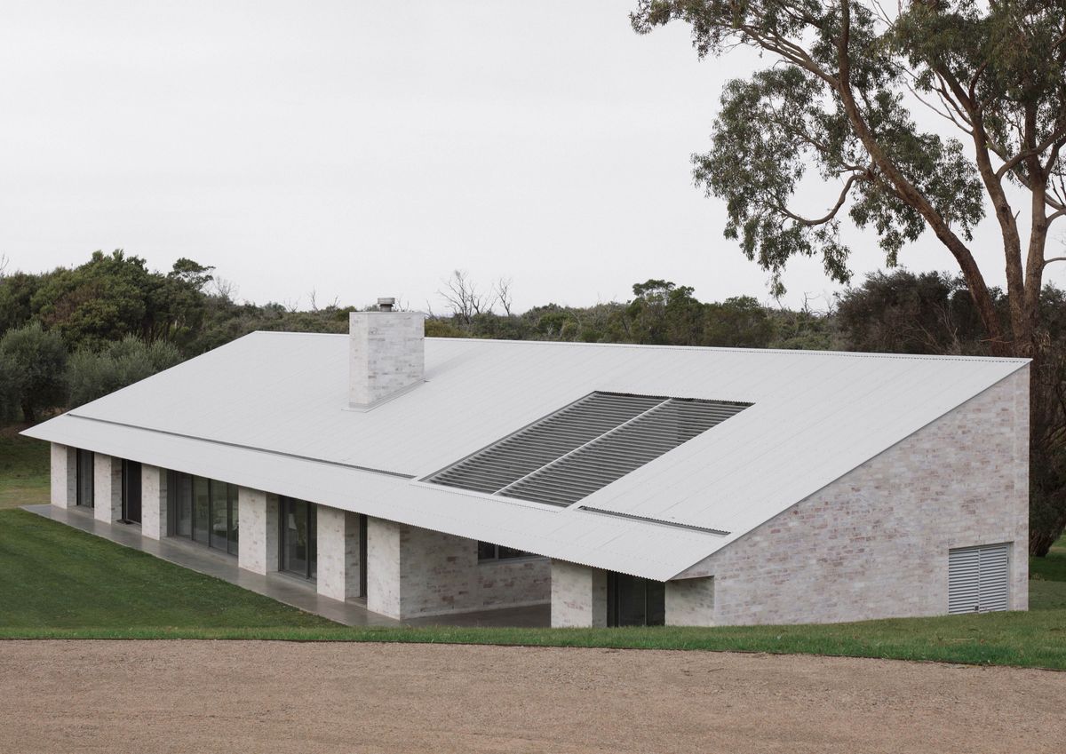
Australian Architecture showcases the high quality of architecture and design in Australia providing daily inspiration to the CO-architecture community. Check out the latest projects which were featured last week on the platform.
Pokolbin House by Matthew Woodward Architecture
Pokolbin, NSW

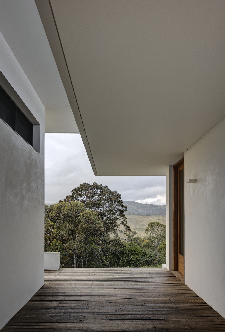
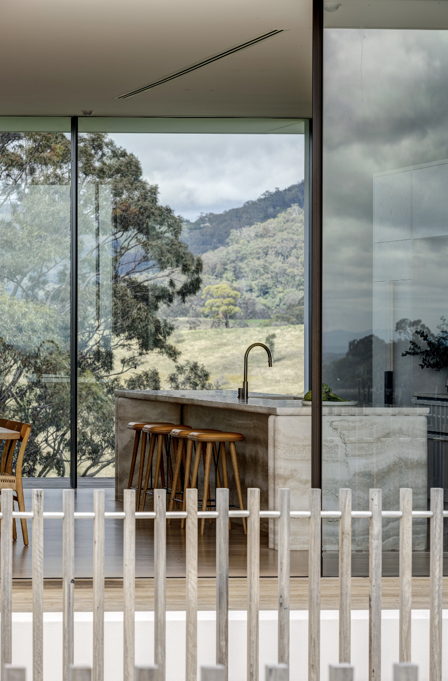
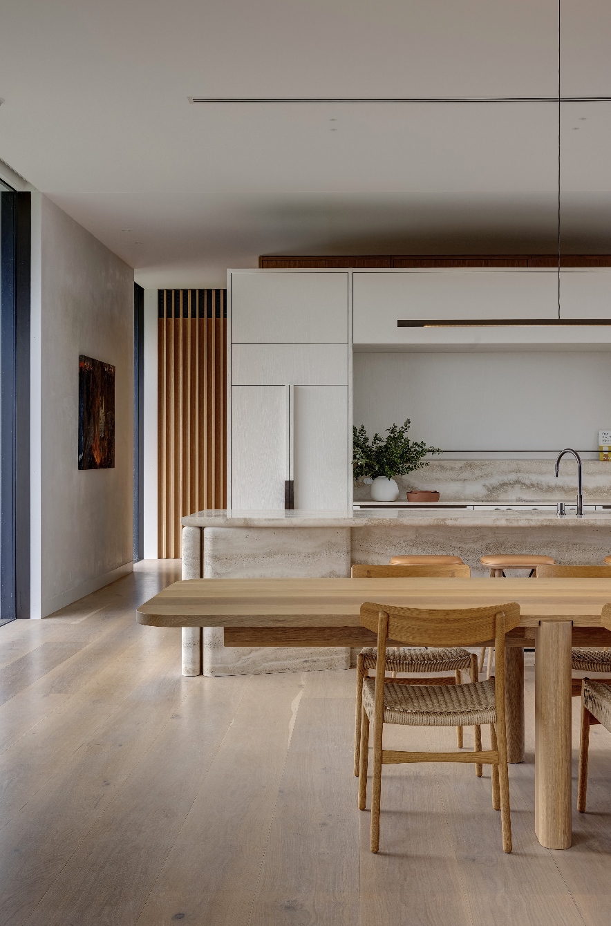
From the Architect: Across a natural ridge over a slope of heritage vineyards, lies a sequenced ternary of interconnected pavilions. Here, the pragmatic demands of a working estate in one of Australia’s most established wine regions are combined with the refined easiness of a Sydney family’s country retreat.
The house is arranged with poetic rationality and is unified by a series of open-air connections. As you arrive at the
stone blade entry, you are first greeted by the memory conjured by the heritage wine vat under the ridge. A recycled hardwood carport provides shelter and a point of arrival delineating the entry to the garden. As you gently ascend alongside a meadow of native grasses, you are greeted by two pavilions at the crest; one for living and the enjoyment of wine, and the other for sleeping. Here, the 360 degree views over the valley are experienced featuring rolling
greens toward the Barrington Tops, Brokenback Ranges & Mt Pleasant.
.
www.matthewwoodward.com.au
@mwoodward_architecture
#matthewwoodwardarchitecture
.
Photographer: Brett Boardman
Interiors: @lot1design
Builder: @pcm.projects
Structure: @sdastructures
Rosso Verde by Carter Williamson Architects
Camperdown, NSW
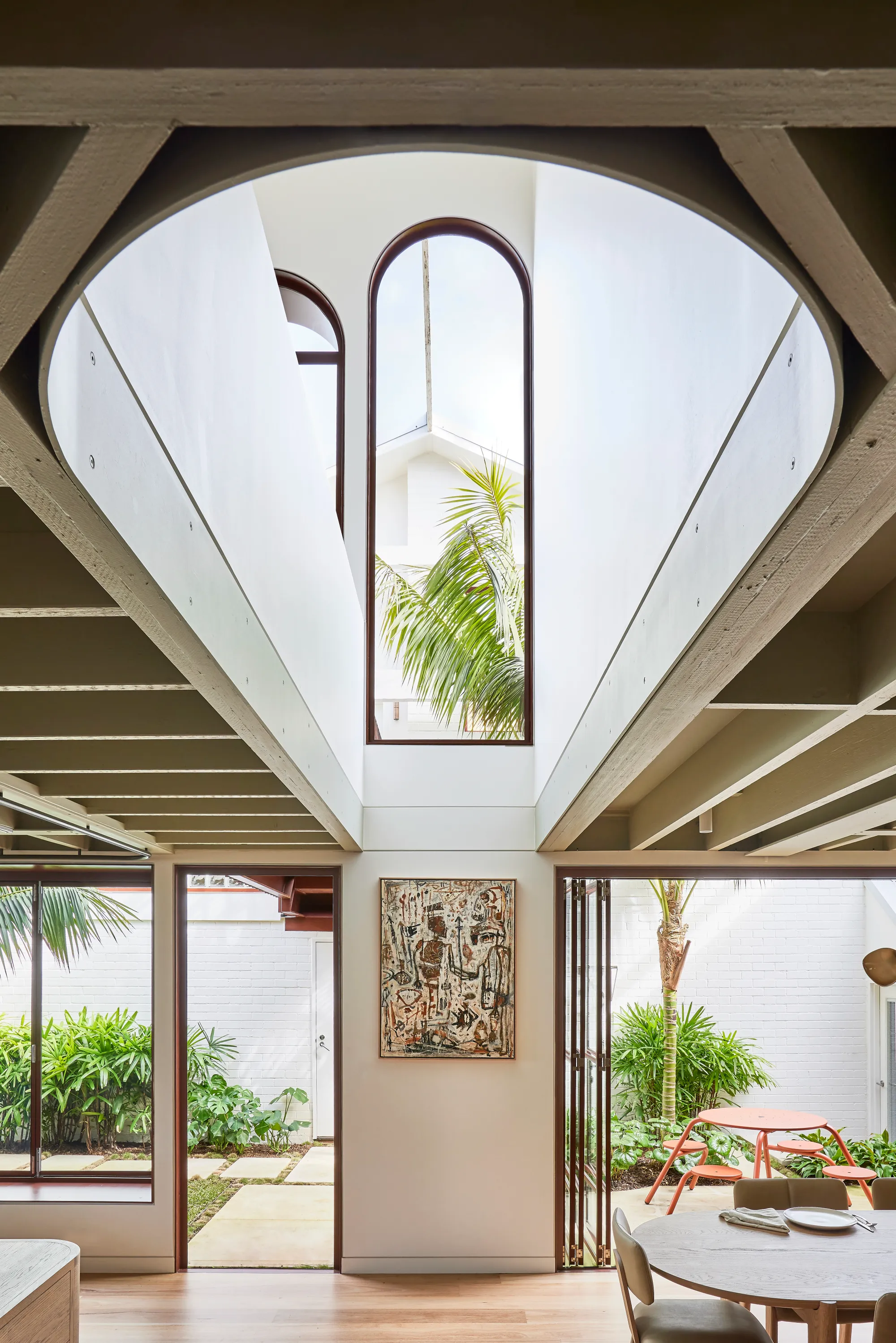
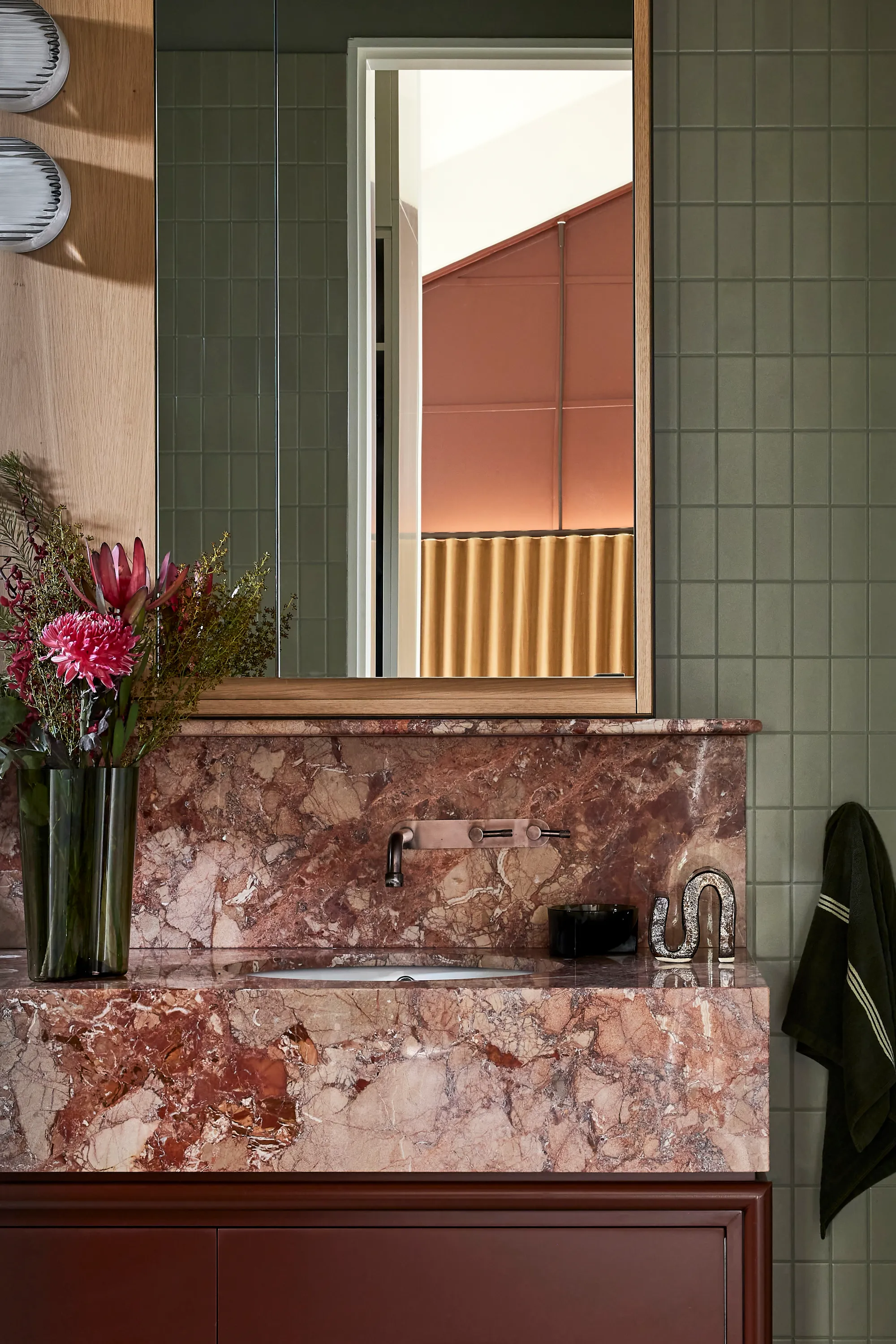
From the Architect: An alteration to an existing warehouse conversion on Gadigal country in Camperdown, Rosso Verde is quality over quantity personified. In an area where space is at a premium, this project rejects the prevailing notion that bigger is always better, instead focusing on the quality of each room, access to the garden, and abundant natural light.
Removing close to a third of the roof, the built fabric has been carved away to create a central landscaped courtyard, bringing light, air, and greenery deep into the plan. Relinquishing interior space in this way helped to meet a brief that called not for more space, but for a more clearly defined and rational plan within the former warehouse. As the design process unfolded, the structure revealed many unsuspecting qualities and developed into a set of interiors with a unique character.
The courtyard flows directly into the combined living, dining, and kitchen space, its ceiling punctured by an arch-shaped double-height void that joins the two storeys, drawing the eye up and the light in. Its sculptural form is a motif repeated throughout the design in arched windows and doors framed in the same elegant, deep red steel that defines the courtyard façade, softening the building’s industrial bones. Tucked away behind the kitchen is a butler’s pantry and laundry, with bedrooms, bathrooms, and a study occupying the first floor under a centrally peaked roof.
.
www.carterwilliamson.com
@carterwilliamson_architects
#carterwilliamson
.
Photographer: @_pabloveiga
Builder: David Fletcher Constructions
Landscape: @dangarbarinsmith

The Arndt Residence and Artbarn by CHROFI
Mornington Peninsula, VIC
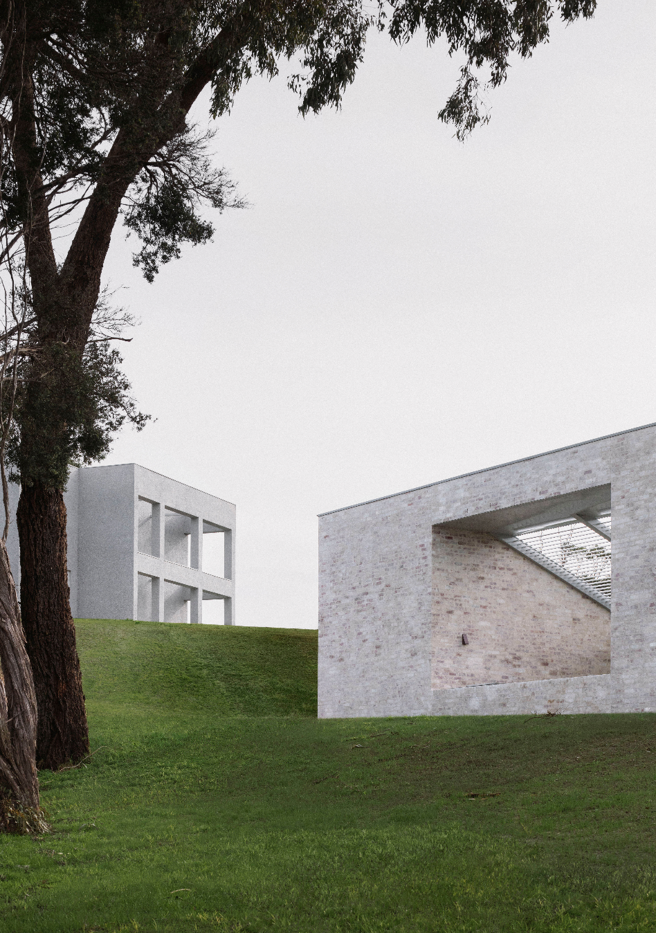
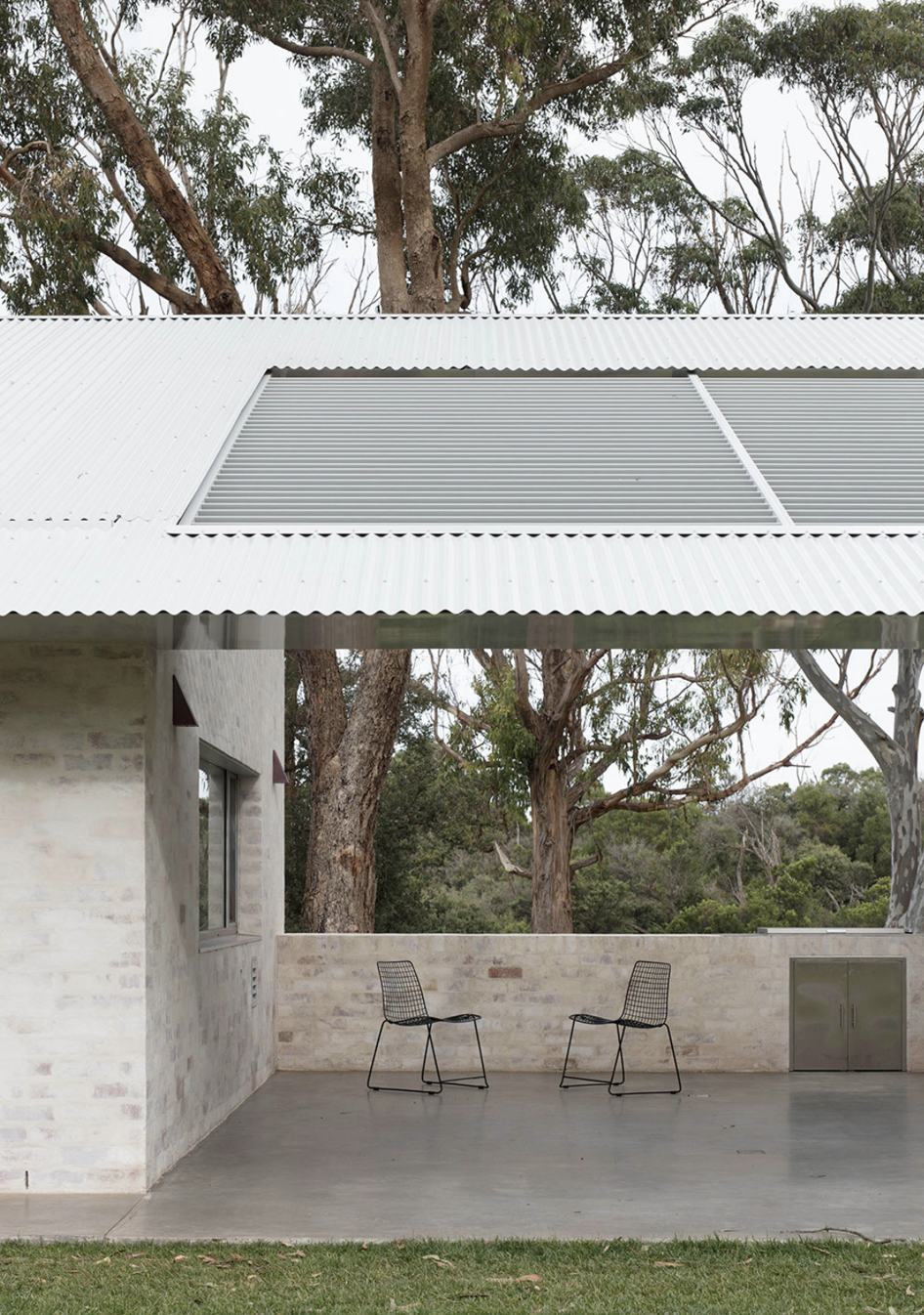
From the Architect: The Arndt Residence and Artbarn is located on a 5 acre site on the fringe of Mornington Peninsula National Park. The area is characterised by typical coastal formations, relatively flat land, and significant pockets of remnant coastal vegetation.
The client brief was to consider the property as an estate with buildings and spaces designed to suit their needs as a family, but also as a place to collect, display and make art. A key aspect was to be able to receive visitors and have guests stay overnight at the property.
The site features a small rise in topography at the centre of the site where an existing dwelling was located.
.
www.chrofi.com
@chrofi_architects
#chrofi
.
Photographer: @benhoskingphotographer
Builder: @basisbuilders
Landscaping: @heathlandscape
Parkside House by Studio Gram
Parkside, SA
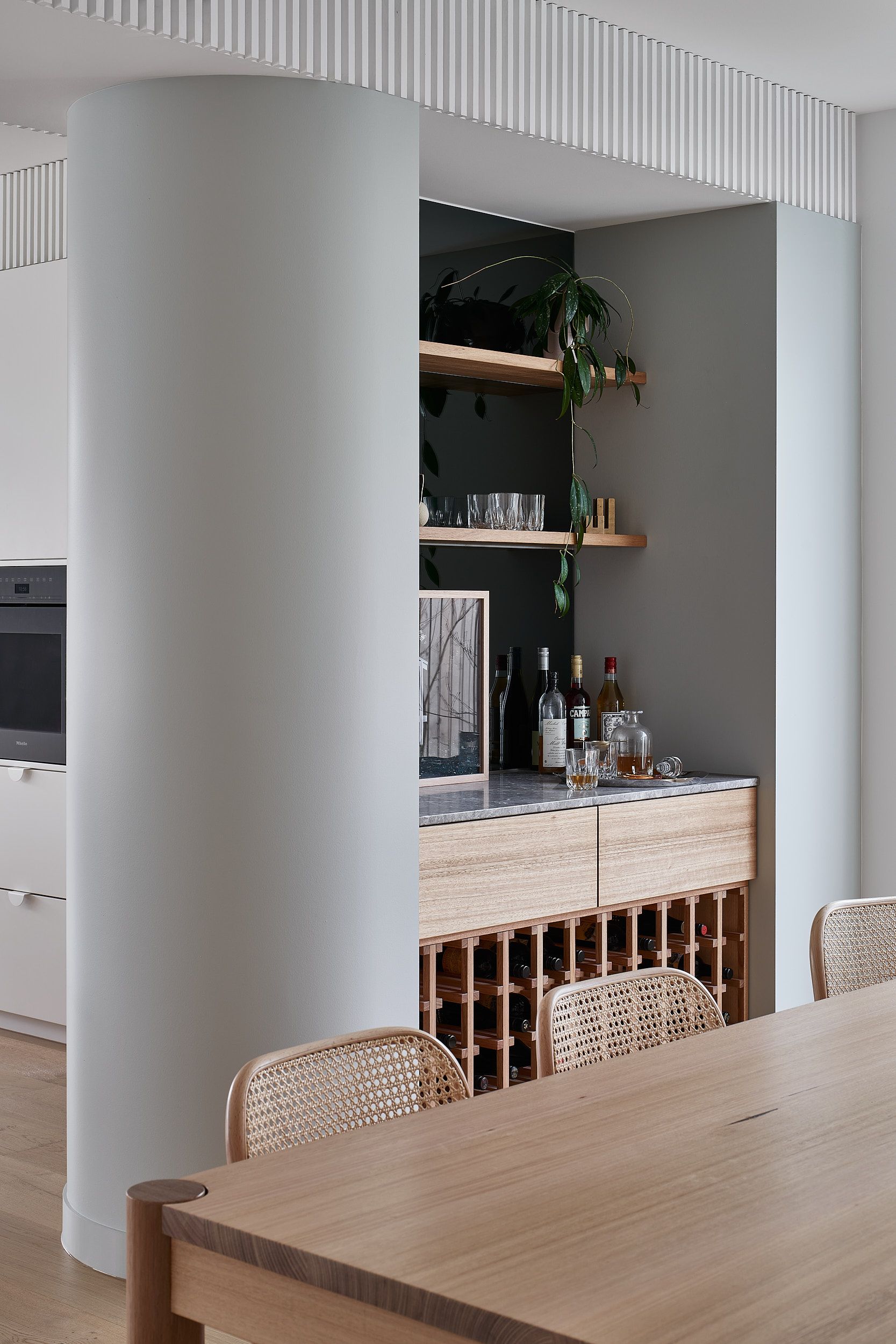

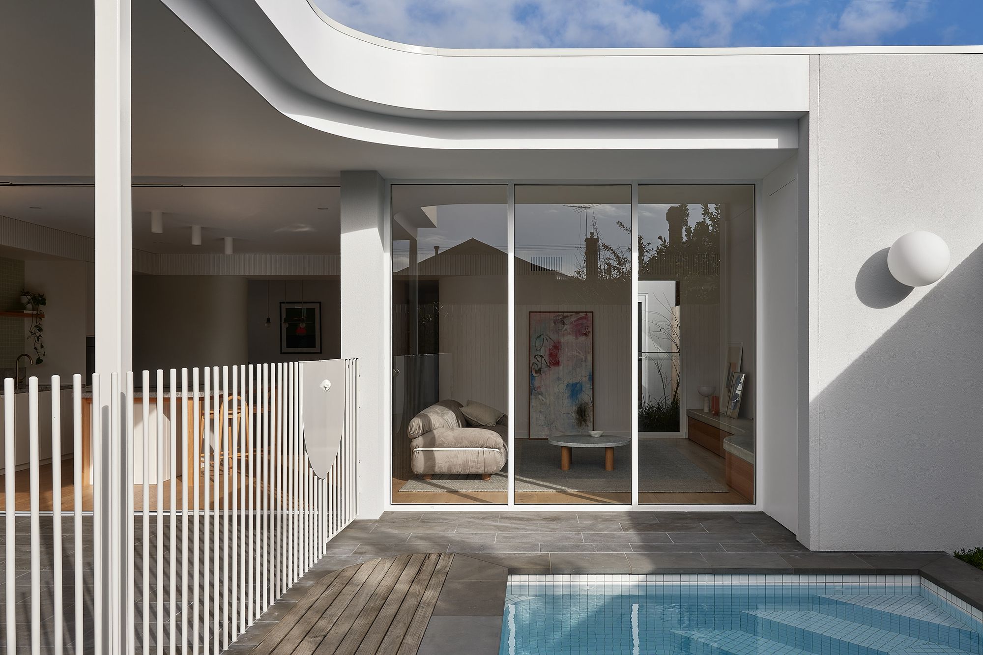
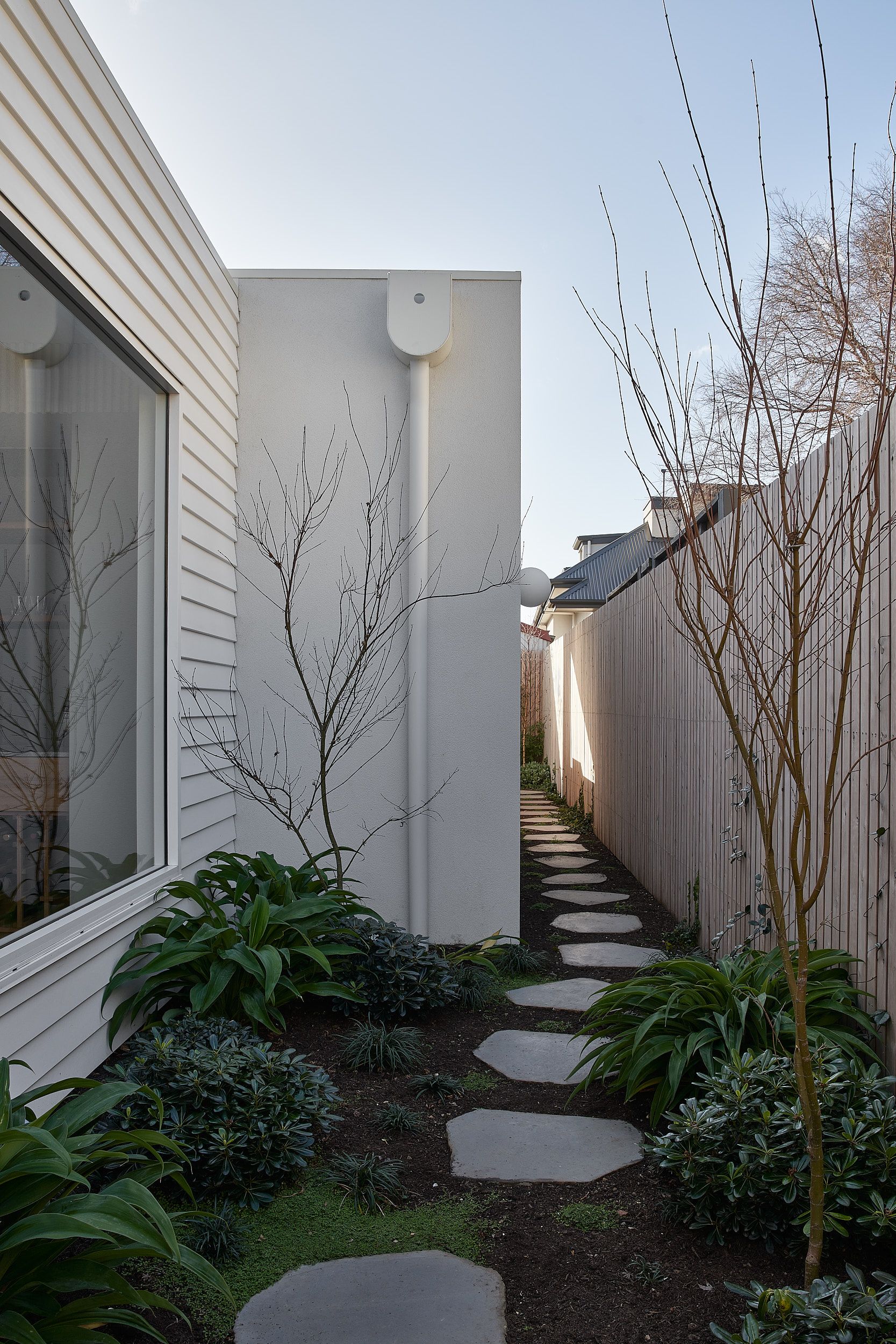
From the Architect: The existing Parkside residence is a ‘turn of the century’ Villa. The aim of the design was to maintain the current character of the existing building with the introduction of a complimentary, yet distinct extension to clearly delineate old and new.
The Villa was brought back to its original form, by removing the small extension. The north - south axis is maintained through the interior, strengthening the ‘corridor’ whilst simultaneously opening the floor plan to allow morning light from the east to penetrate into the circulation zone of the home.
Where the site allows, the plan is condensed to allow gardens to creep along the boundaries of the property and small courtyards are introduced to enable cross ventilation and enhance opportunities for light and connections to the greenery.
The house is modest in scale, efficient in its use of space and rich with skillful details and subtle curves to draw your eye around the otherwise compact spaces.
.
www.studio-gram.com.au
@studio_gram
#studiogram
.
Photographer: @anthonybasheer
Builder: @built.by.ben
Landscape: @husk_projects


